Brand strategy, corporate design and brand guidelines for the Smart City project of the city and district of Würzburg
Smarte Region Würzburg
Smarte Region Würzburg
01 Context
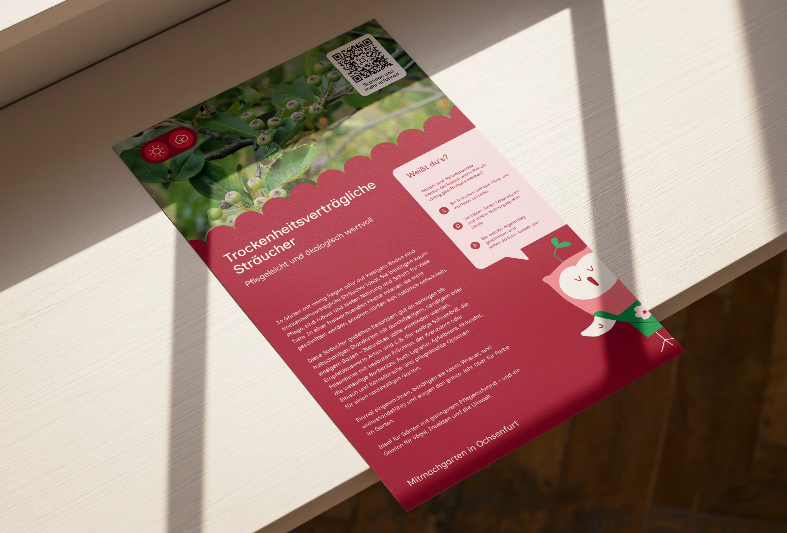
City and district of Würzburg show up as one region. In the federal programme "Modellprojekte Smart Cities" they want to strengthen social cohesion and make people more resilient. Over the run so far, the project "Smarte Region Würzburg" had grown - ever more offers, many people involved, and no connecting communications strategy. What remained was a stack of project names, logos and one-off initiatives. A brand matryoshka that gave the people it was meant for little orientation. The job was not simple unification. What was needed was a brand strategy that orders this complexity without pressing everything under one uniform umbrella brand.
02 Method
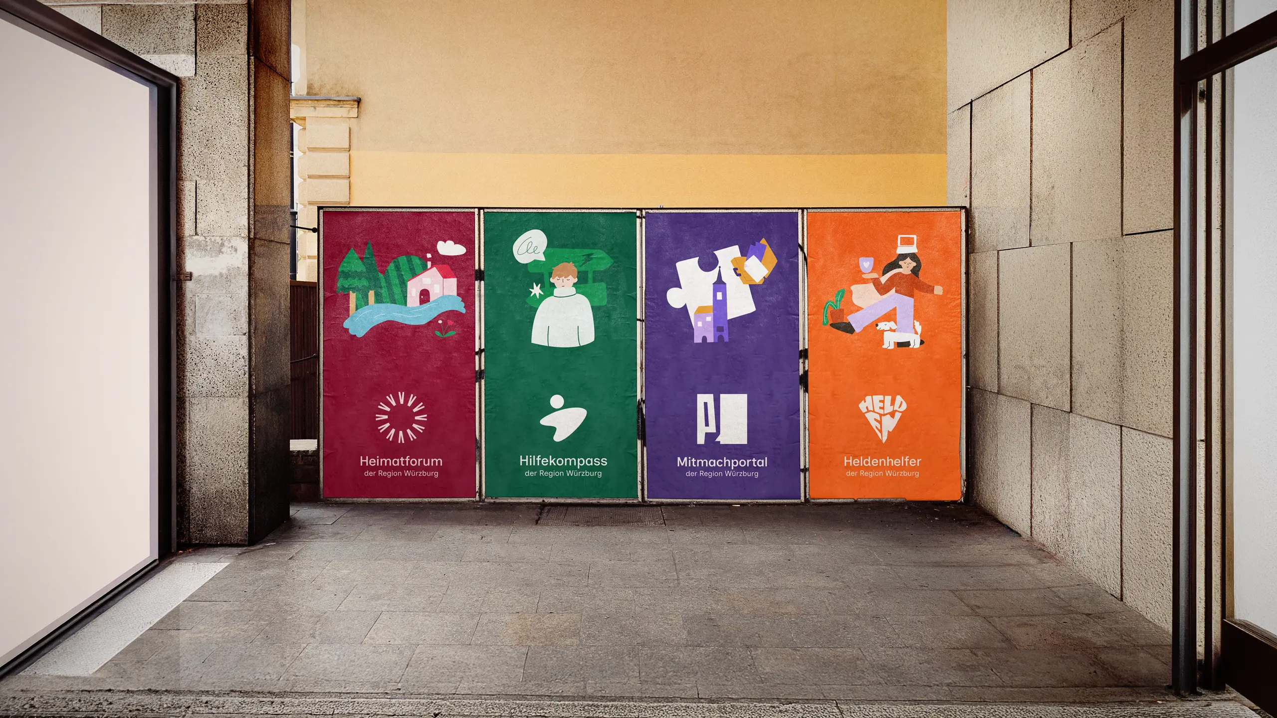
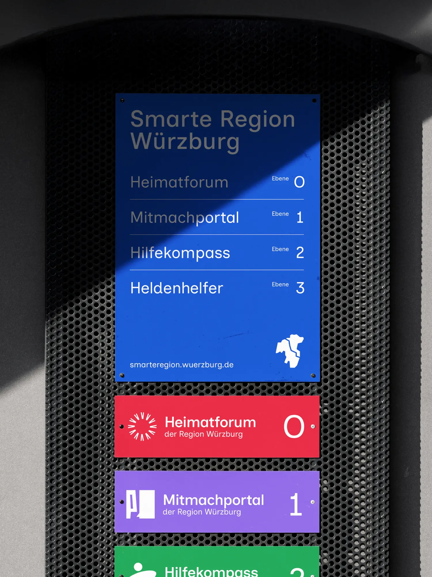
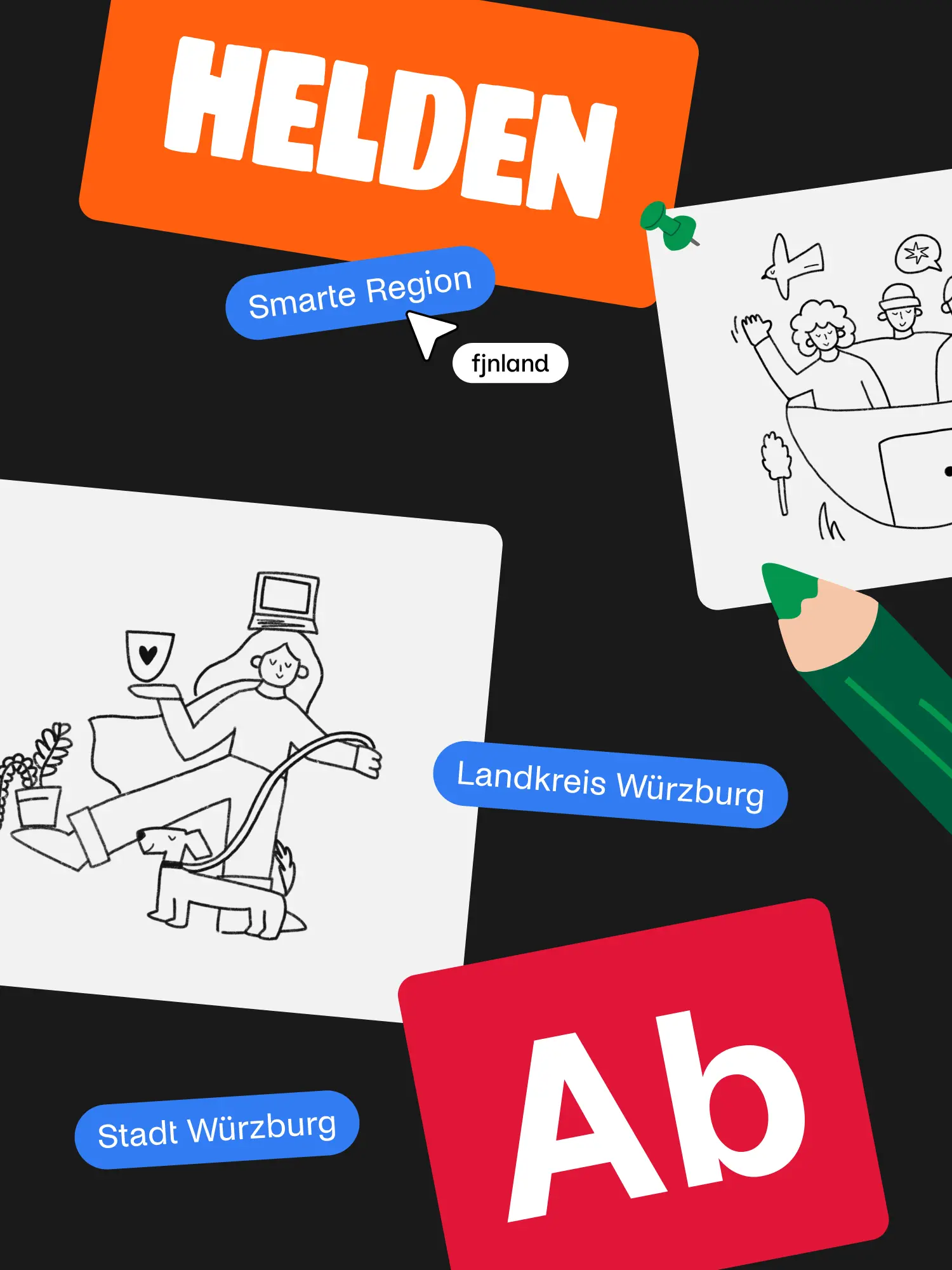
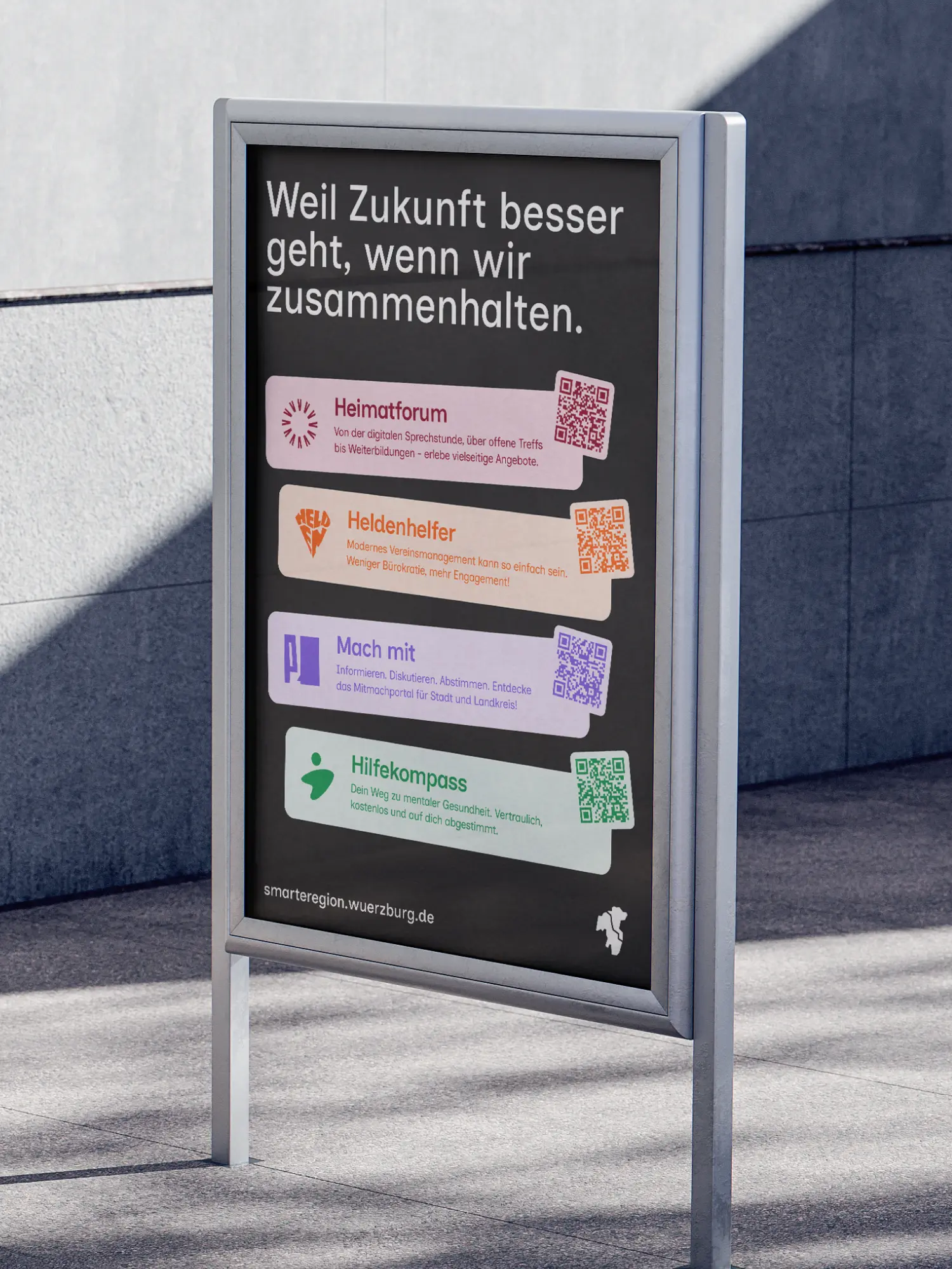
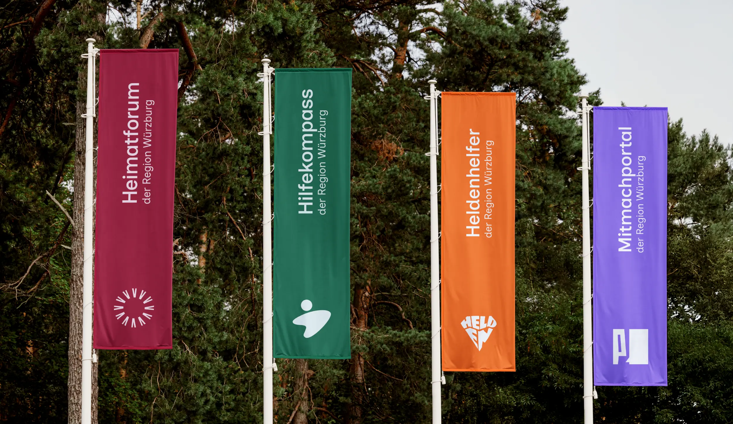
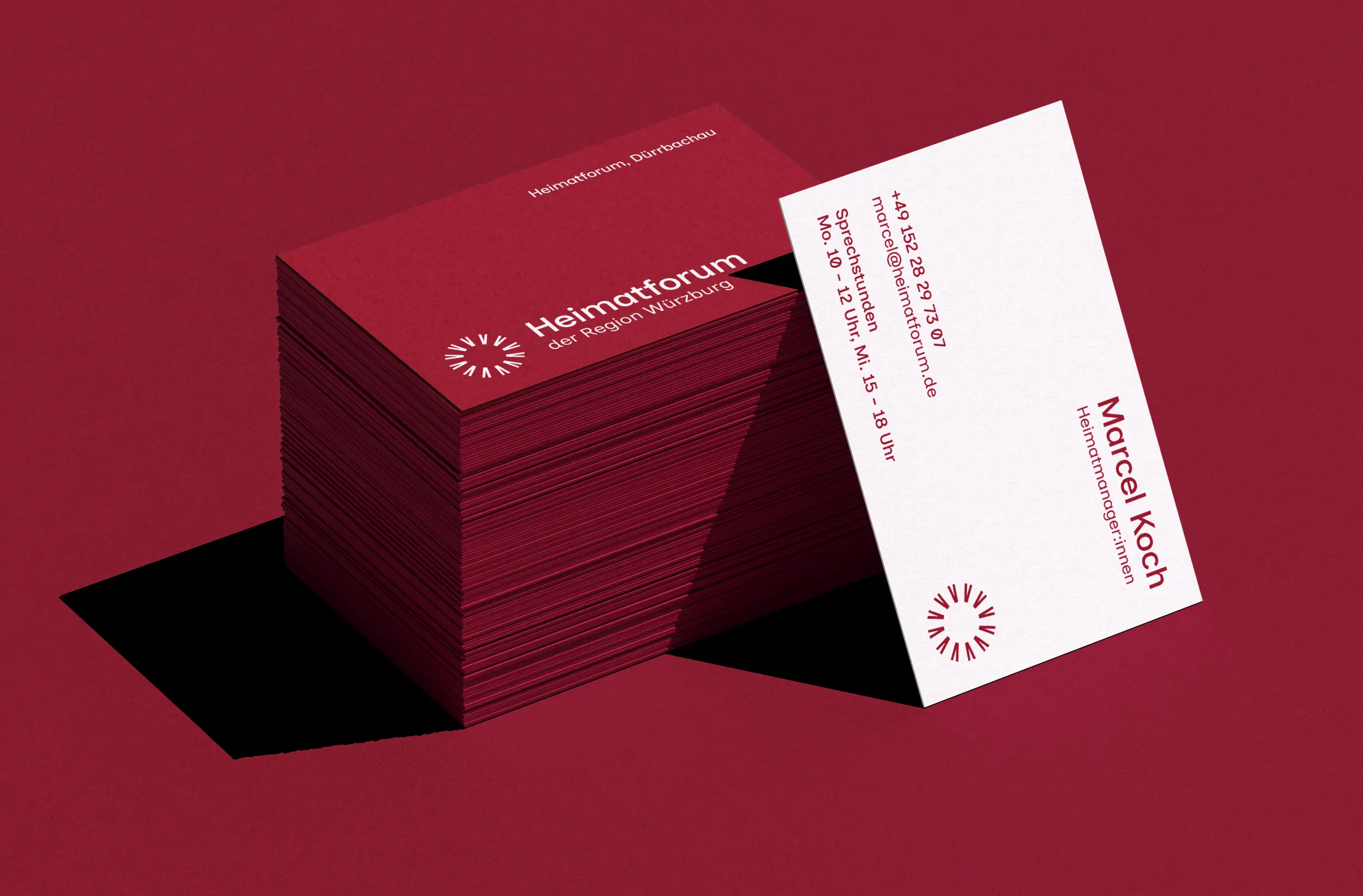
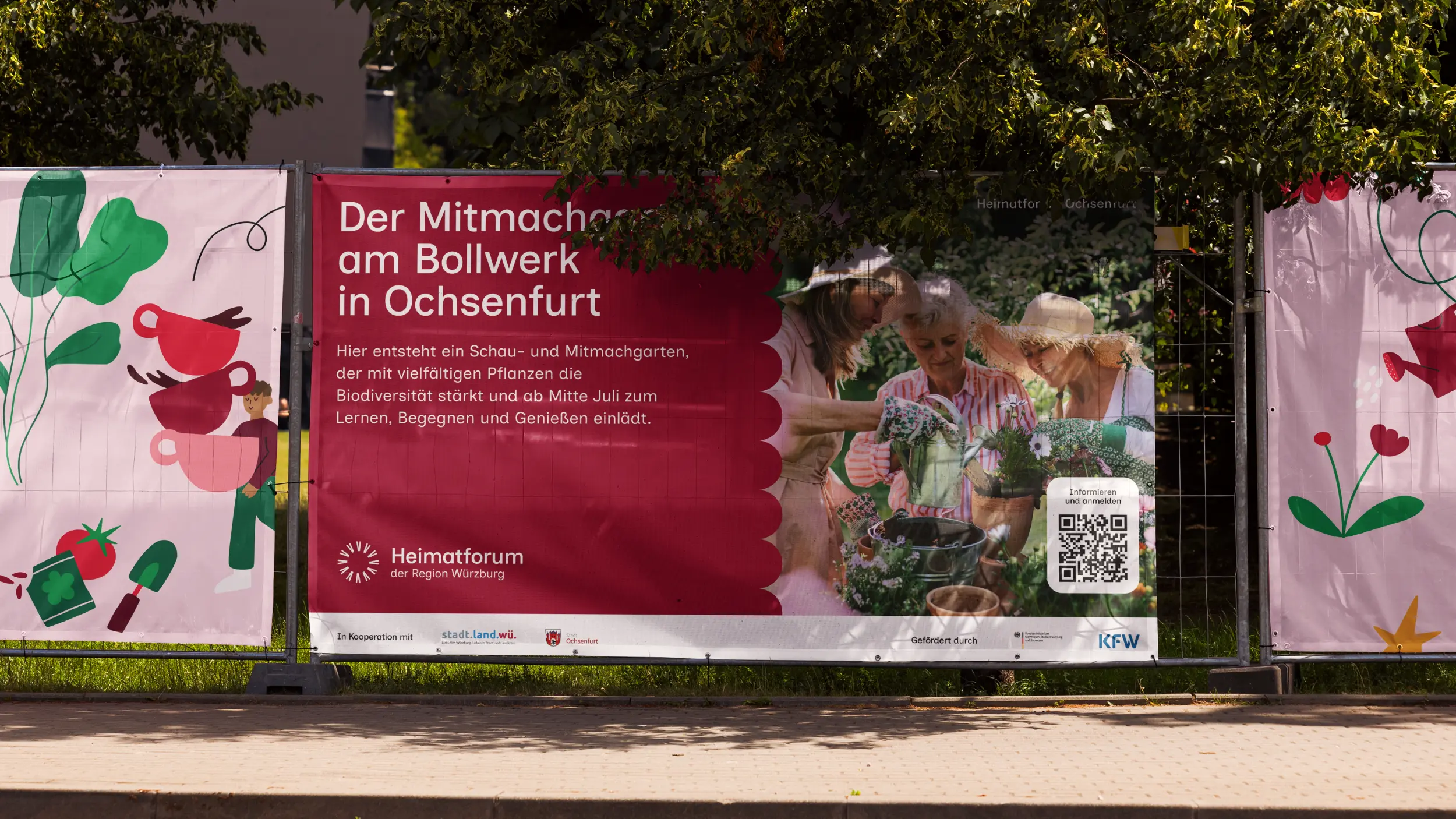
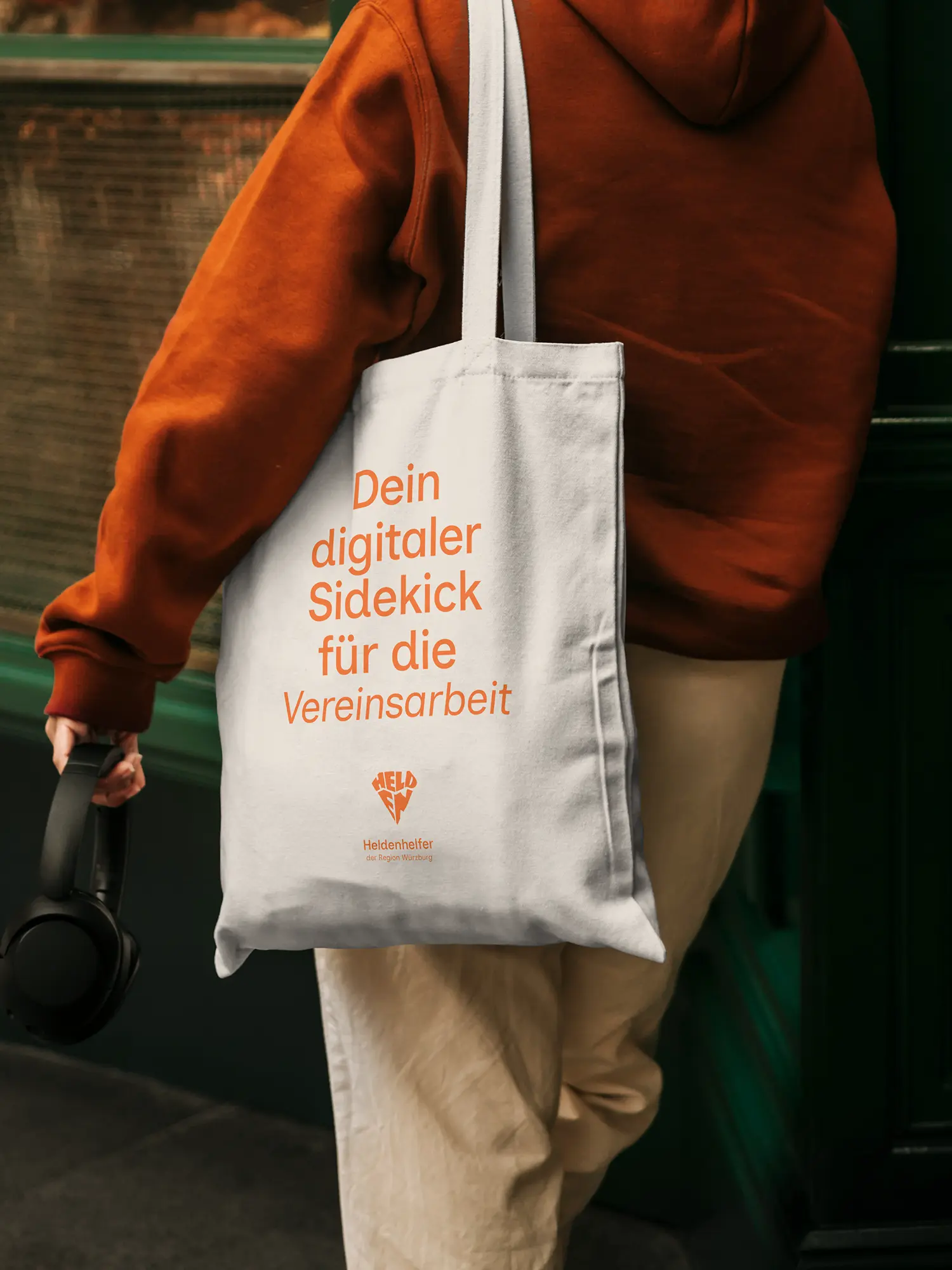
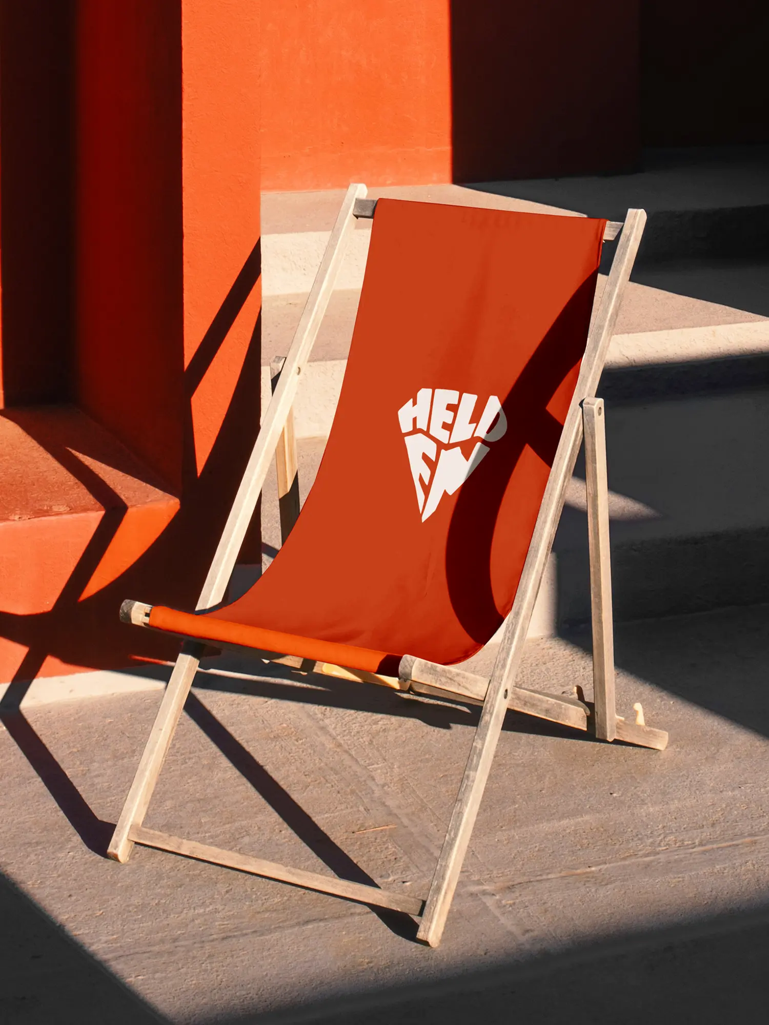
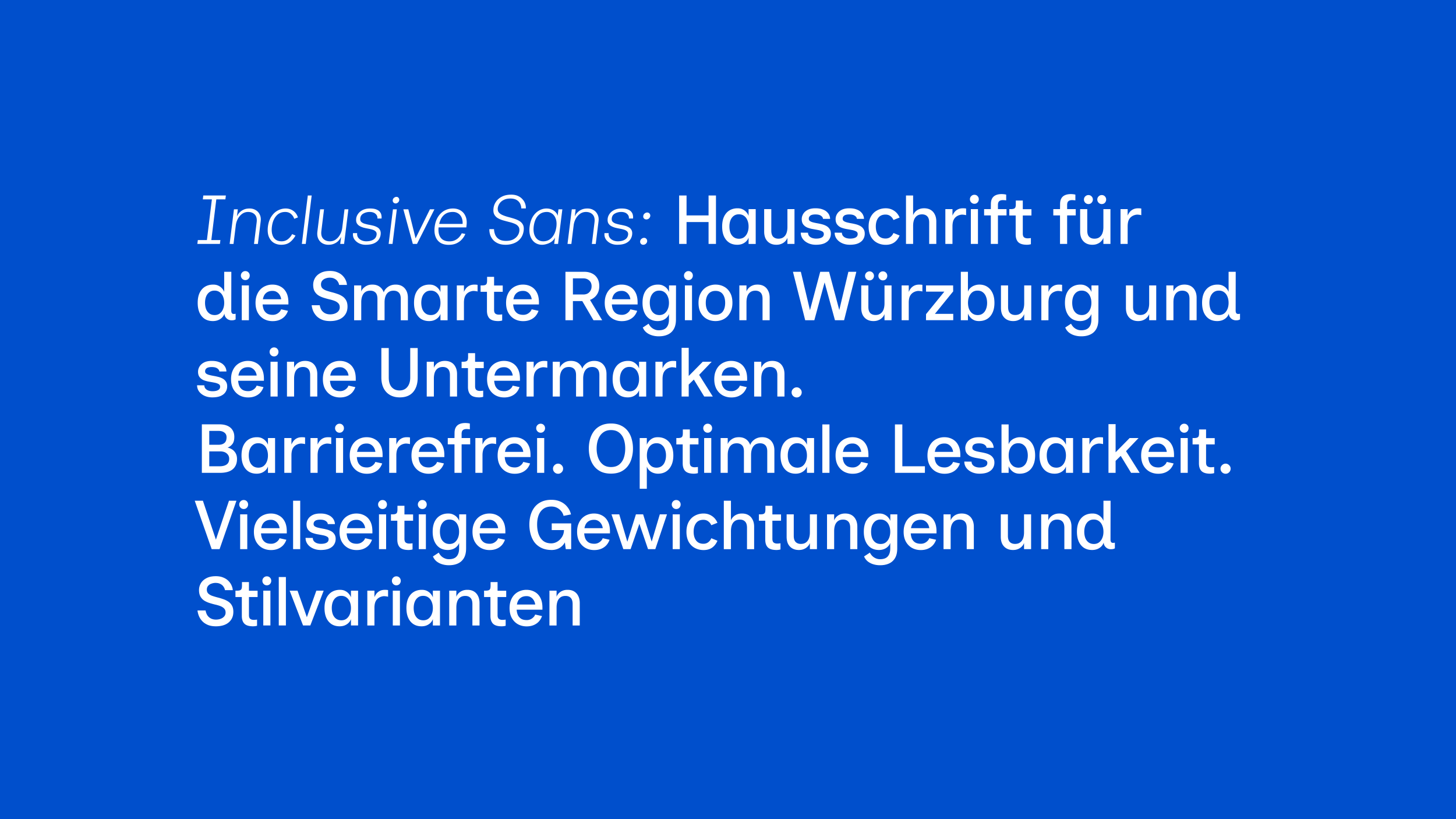
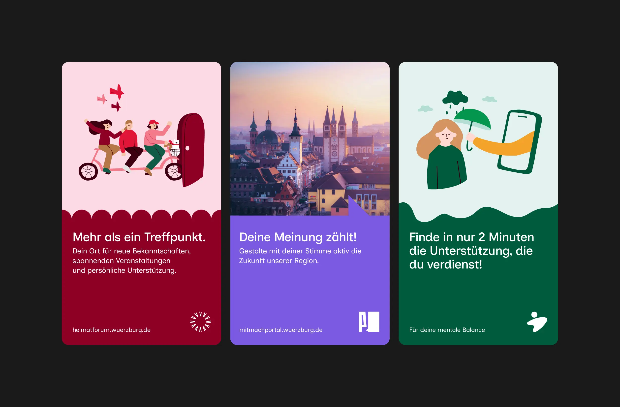
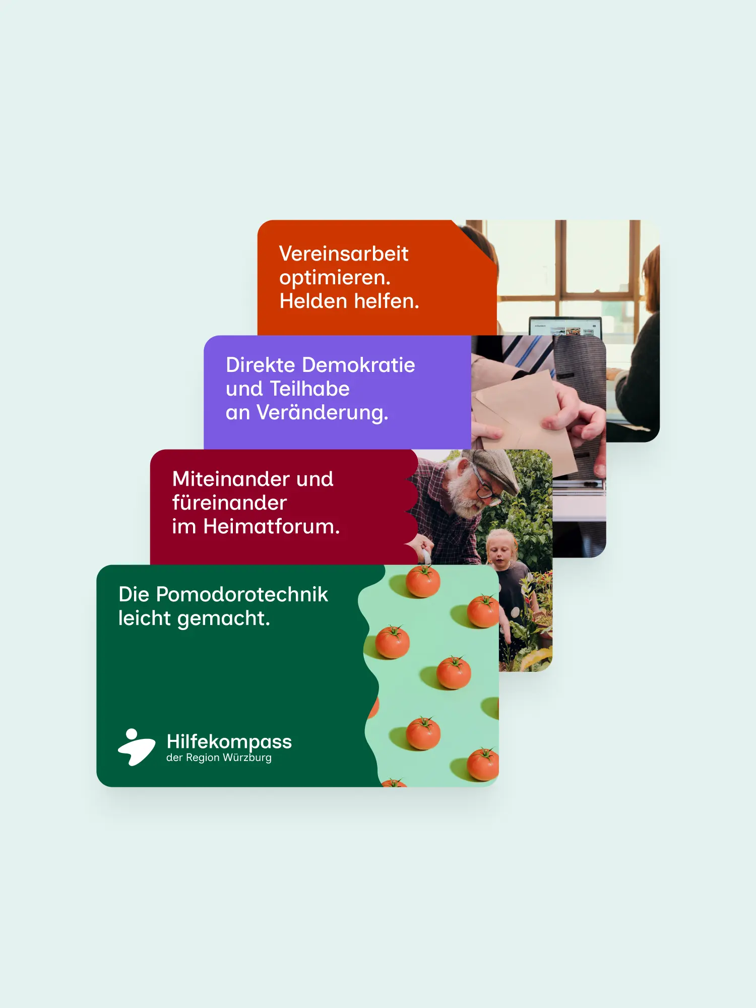
We first took the view of the people the offers are meant for. They shouldn't see an abstract strategy project. They should see reliable, understandable offers. From that came a brand architecture that puts the single offer brands at the centre. A multi-brand system as a deliberate build, instead of a forced umbrella. Each offer brand carries its own name, own focus and own visual identity, speaks to its audience directly, and will still exist beyond the funding period. The time-limited project "Smarte Region Würzburg" steps back as a bracket and makes room for "Region Würzburg", an umbrella that joins city and district and makes the shared work visible. So a small team can steer all of it, every brand follows the same principles: one typeface, one grid, recurring base elements, clearly defined room to play.
03 Result
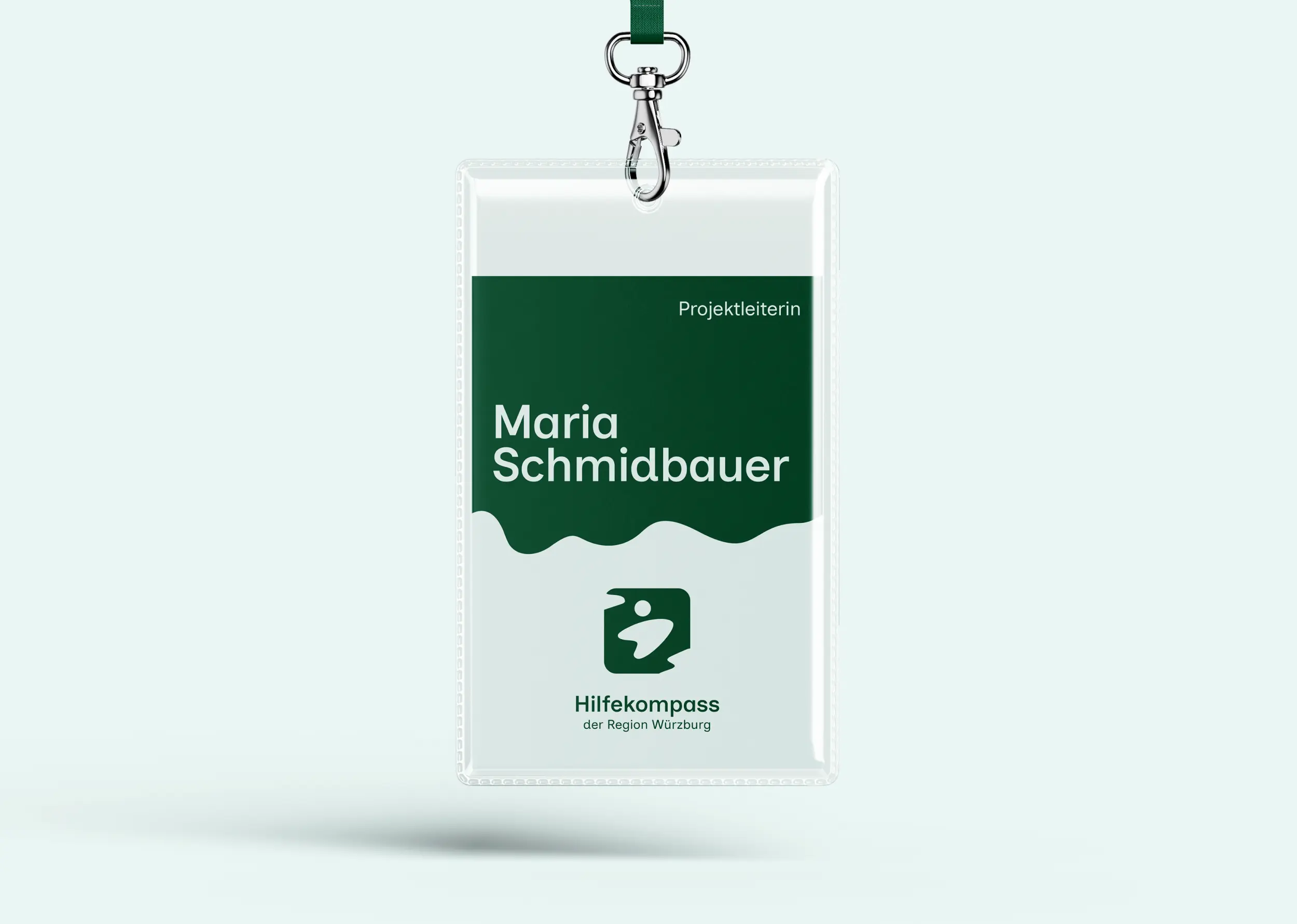
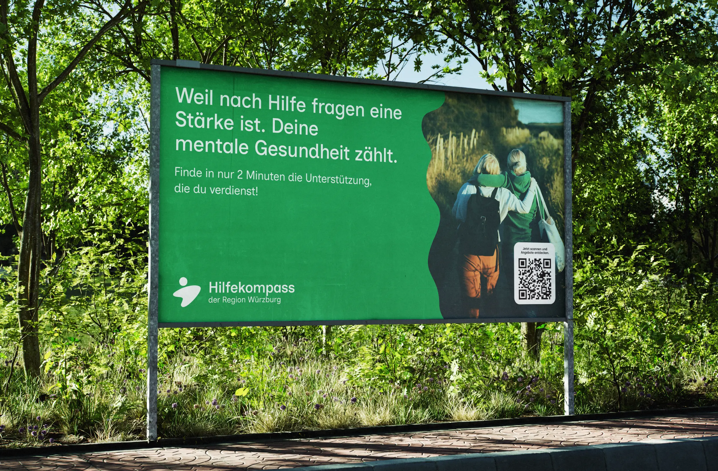
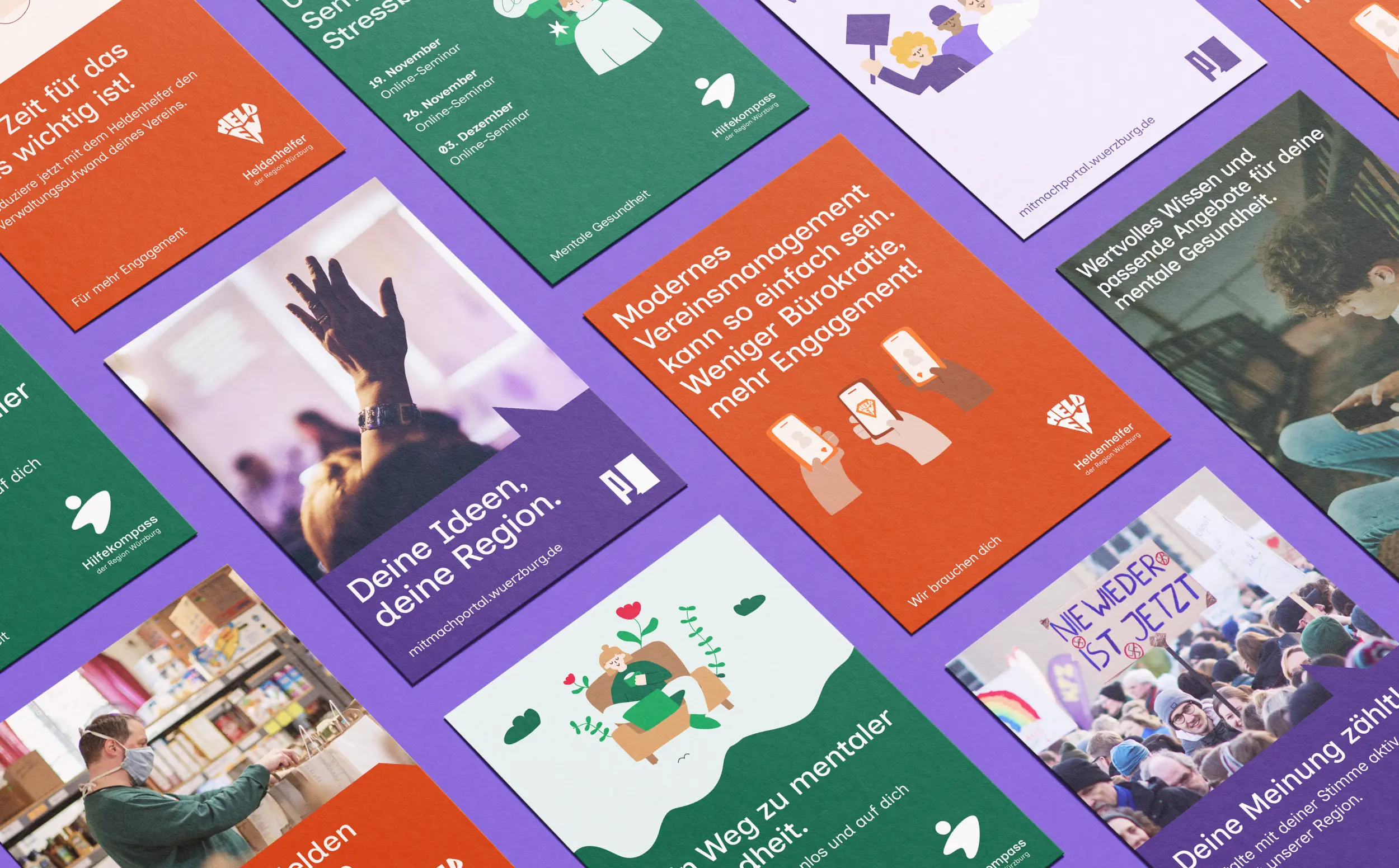
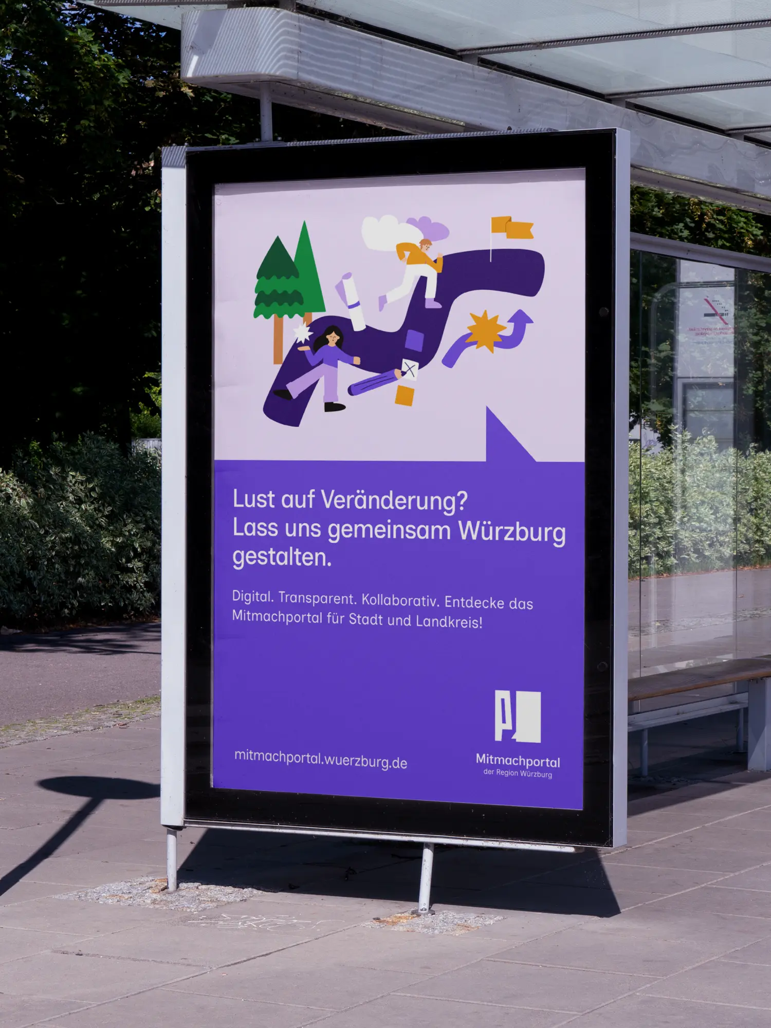
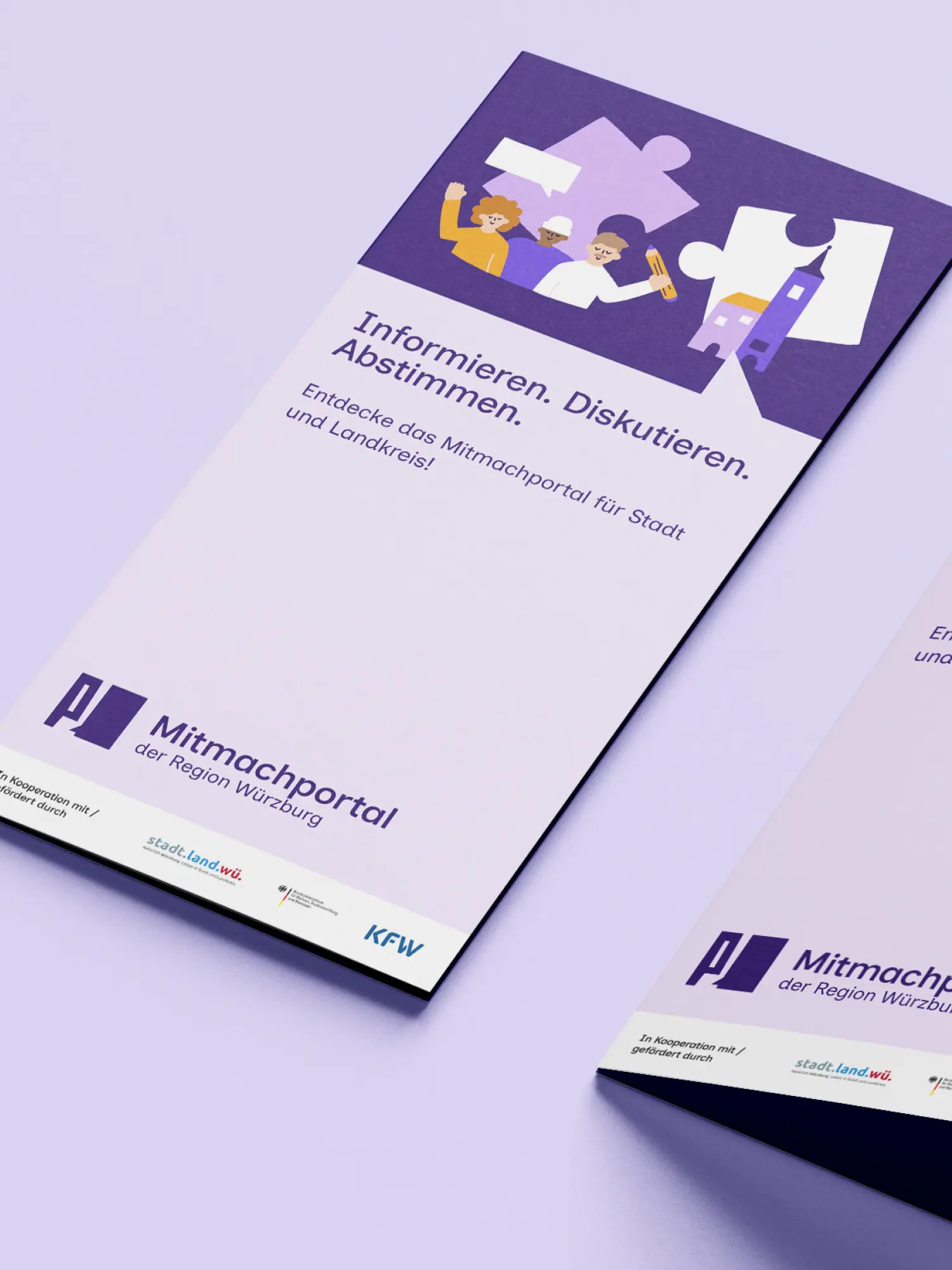
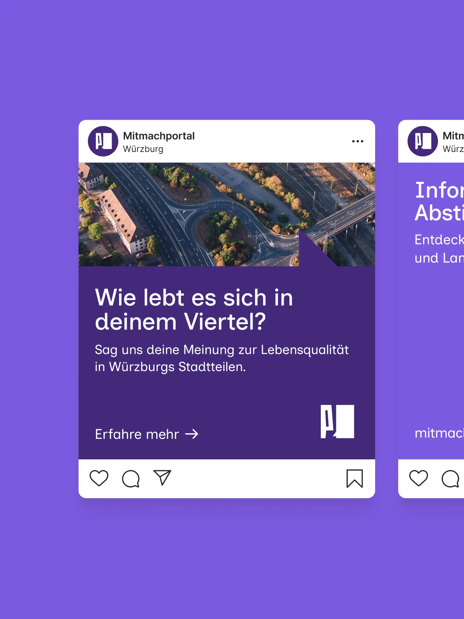
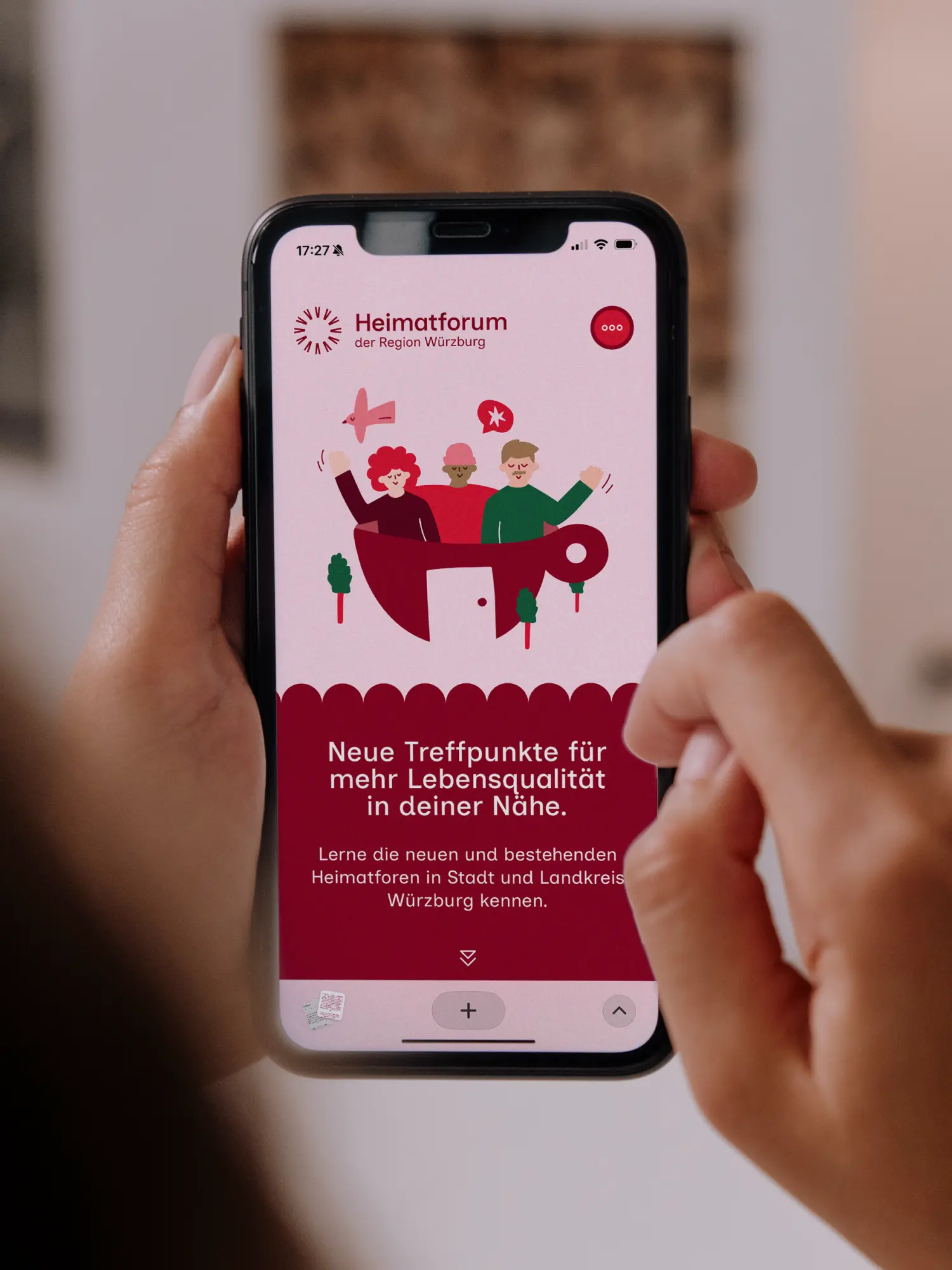
From a hard-to-parse tangle of names, logos and initiatives came a clear brand ecosystem. The architecture is flexible enough that service brands can live on independent of who runs them, and that "Region Würzburg" can gather new themes underneath. The inter-municipal team today works with a corporate design that joins strategy, content focus and visual delivery - and stays manageable in day-to-day use. We documented everything in a web-based brand handbook, plus print, presentation templates and guidelines for digital touchpoints. Strategic thinking becomes tools you can actually use, so administration, partners and residents can take on the region's social tasks together.
Client
Stadt Würzburg
Industry
Release
– today
Team




Book a call
01 Context
City and district of Würzburg show up as one region. In the federal programme "Modellprojekte Smart Cities" they want to strengthen social cohesion and make people more resilient. Over the run so far, the project "Smarte Region Würzburg" had grown - ever more offers, many people involved, and no connecting communications strategy. What remained was a stack of project names, logos and one-off initiatives. A brand matryoshka that gave the people it was meant for little orientation. The job was not simple unification. What was needed was a brand strategy that orders this complexity without pressing everything under one uniform umbrella brand.
02 Method
We first took the view of the people the offers are meant for. They shouldn't see an abstract strategy project. They should see reliable, understandable offers. From that came a brand architecture that puts the single offer brands at the centre. A multi-brand system as a deliberate build, instead of a forced umbrella. Each offer brand carries its own name, own focus and own visual identity, speaks to its audience directly, and will still exist beyond the funding period. The time-limited project "Smarte Region Würzburg" steps back as a bracket and makes room for "Region Würzburg", an umbrella that joins city and district and makes the shared work visible. So a small team can steer all of it, every brand follows the same principles: one typeface, one grid, recurring base elements, clearly defined room to play.
03 Result
From a hard-to-parse tangle of names, logos and initiatives came a clear brand ecosystem. The architecture is flexible enough that service brands can live on independent of who runs them, and that "Region Würzburg" can gather new themes underneath. The inter-municipal team today works with a corporate design that joins strategy, content focus and visual delivery - and stays manageable in day-to-day use. We documented everything in a web-based brand handbook, plus print, presentation templates and guidelines for digital touchpoints. Strategic thinking becomes tools you can actually use, so administration, partners and residents can take on the region's social tasks together.
Client
Stadt Würzburg
Industry
Release
– today
Team
Book a call
Not enough? Ask your AI about us
Let's find out if we're a fit.
Let’s get to know each other and see whether we’re the right fit for your project. From there, we can shape a solution around what you actually need.
Friday, October 9, 2026
1
2
3
4
5
6
7
8
9
10
11
12
13
14
15
16
17
18
19
20
21
22
23
24
25
26
27
28
29
30
31
10:30
11:30
14:30
15:30
16:30
17:30
Let's find out if we're a fit.
Let’s get to know each other and see whether we’re the right fit for your project. From there, we can shape a solution around what you actually need.
Friday, October 9, 2026
1
2
3
4
5
6
7
8
9
10
11
12
13
14
15
16
17
18
19
20
21
22
23
24
25
26
27
28
29
30
31
10:30
11:30
14:30
15:30
16:30
17:30