Product design, labels and packaging for Distel Bier from Distelhäuser Brauerei
History, newly labelled
History, newly labelled











01 Context
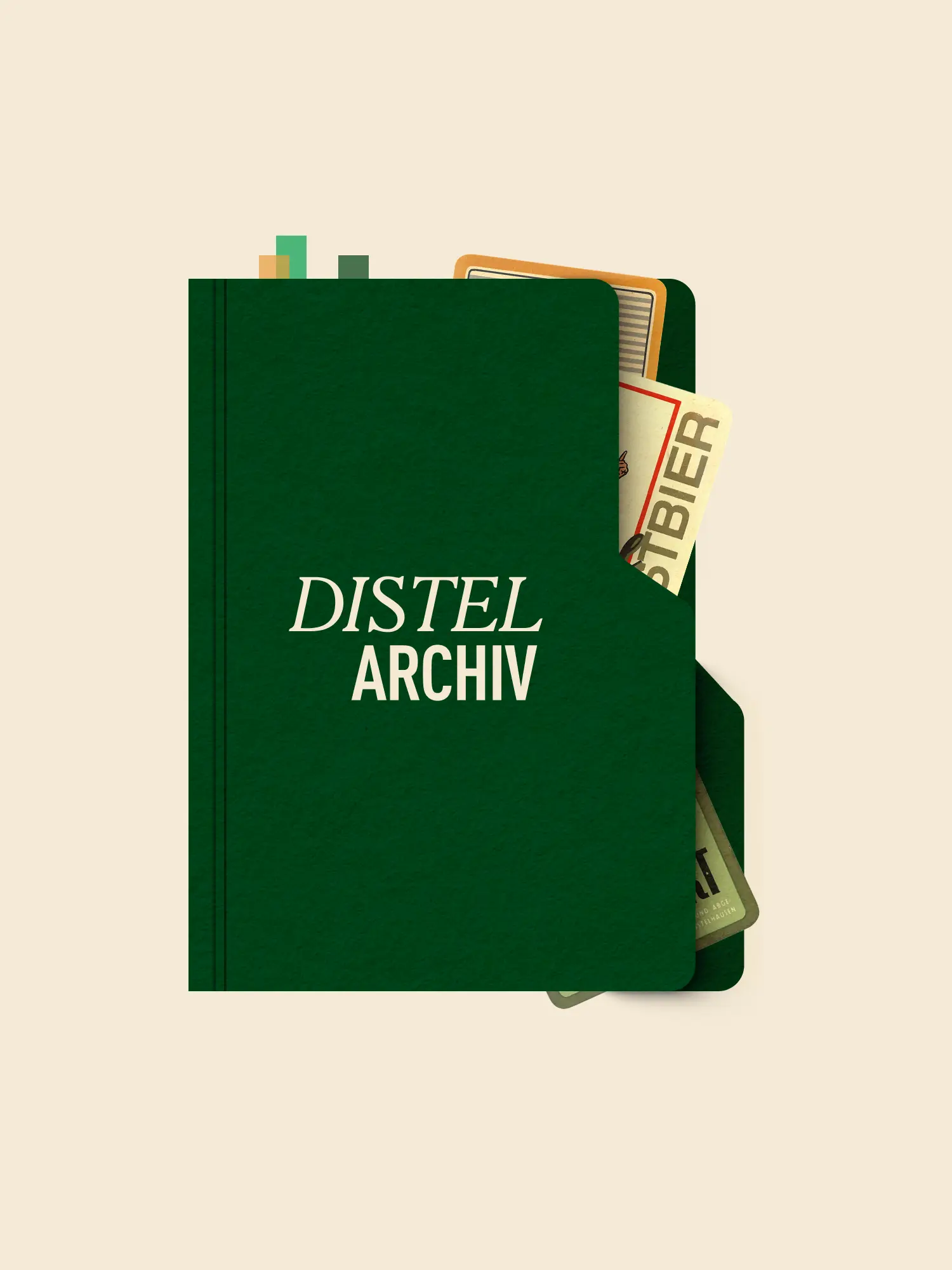
Since 1876 Distelhäuser Brewery has been brewing in the Tauber valley, in family hands for seven generations. A brand with patina, grown over decades: several greens side by side, gradients in the logo roof, a coat of arms full of detail. From the outside it read cooler and more industrial than how the brewery actually works. And what still works on a beer crate falls apart in a social feed and on the smallest label. How do you sharpen an identity like that for today's channels and a younger audience, without betraying where it comes from? Neither a clean break through relaunch nor simply conserving what is there answers it.
02 Method
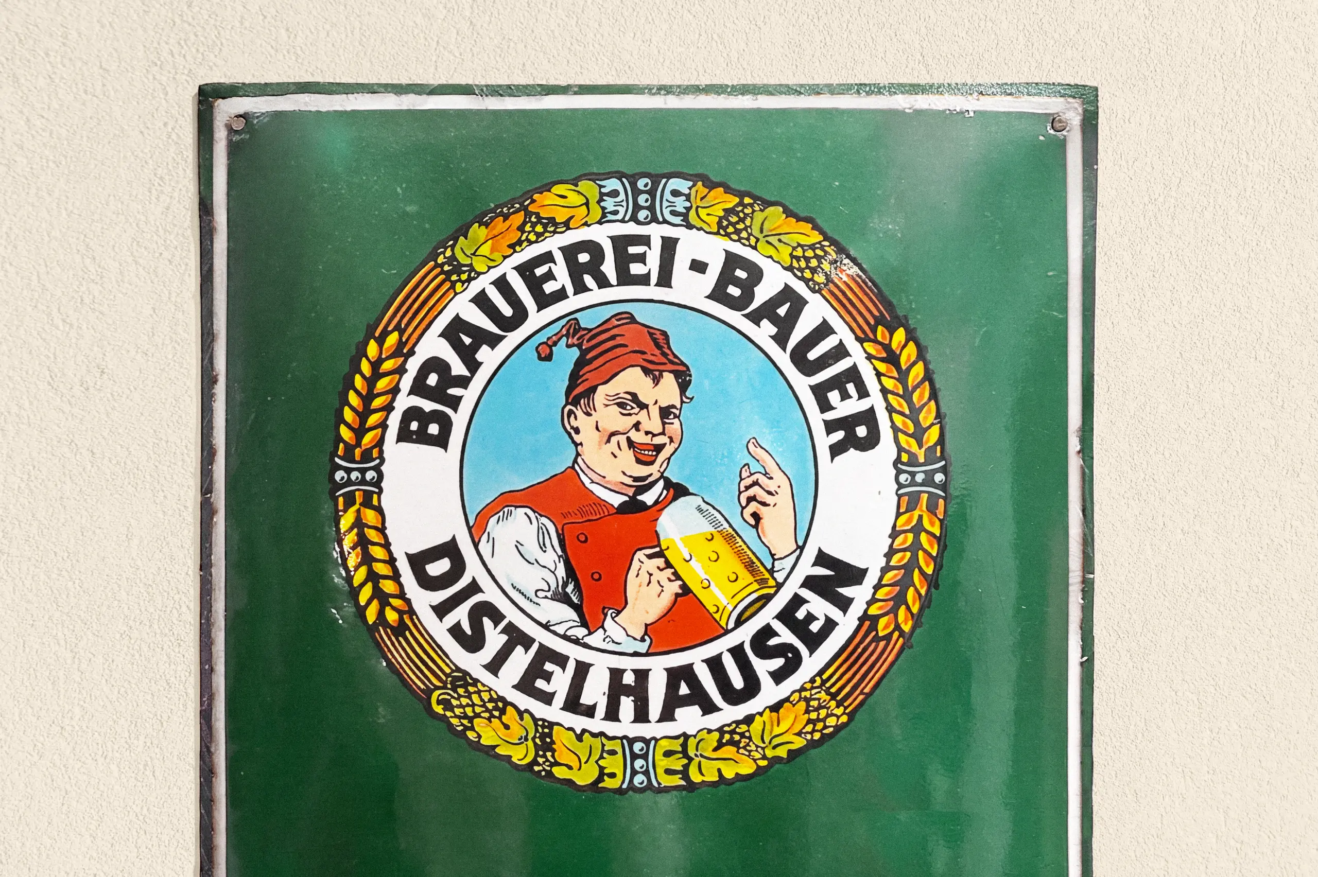
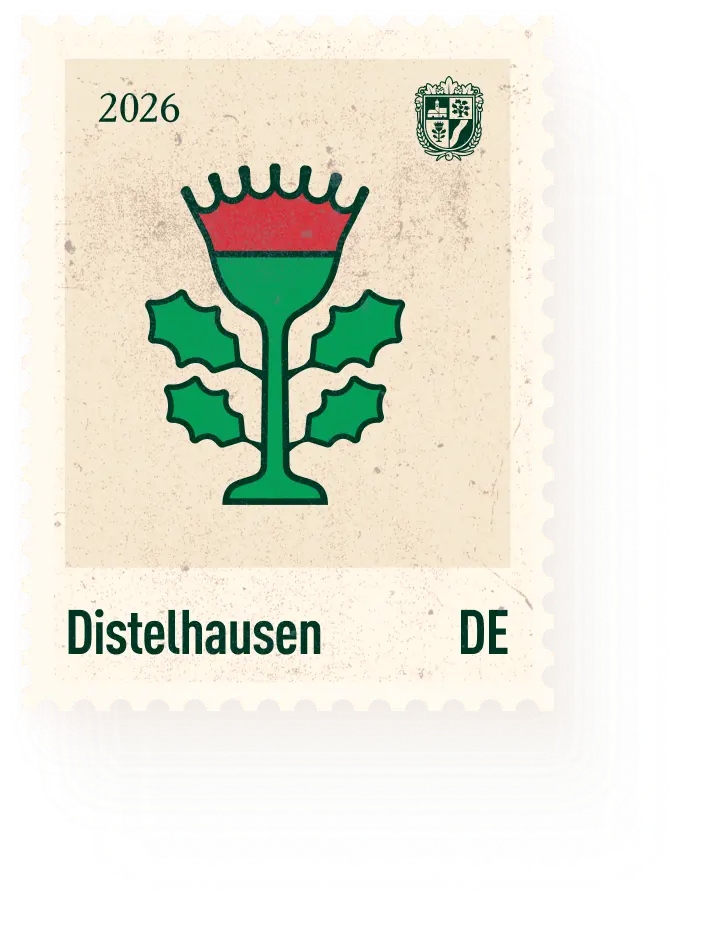
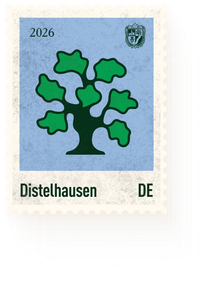
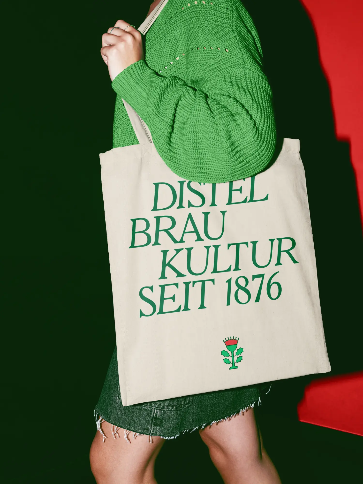
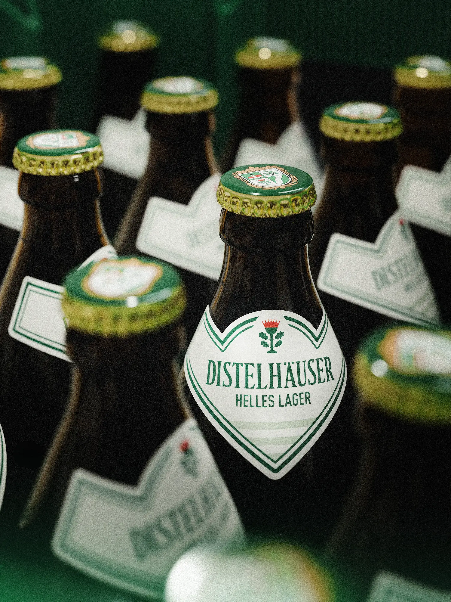
A brand can be brought into form without inventing it again. The harder decision is not what changes. It's what stays. Since early 2025, fjnland has been the lead agency for Distelhäuser Brewery. We cleaned the coat of arms carefully: fewer details, clearer proportions, clean contours. The symbols of brewing and origin remain, and now print cleanly down to the smallest label. In the colour system the gradients are gone. Several greens became one house green, warmer than before. A cool green reads as a corporation. A warm one as craft. And instead of pure white, beige now carries the surfaces: a small detail with a large effect on the character of a family brewery. We defined every tone across Pantone, RAL and CMYK and checked it in hard proof, because the same green comes out differently on paper, bottle and crate. We tightened the wordmark and moved the brand claim into the house typeface Cheltenham.
03 Result
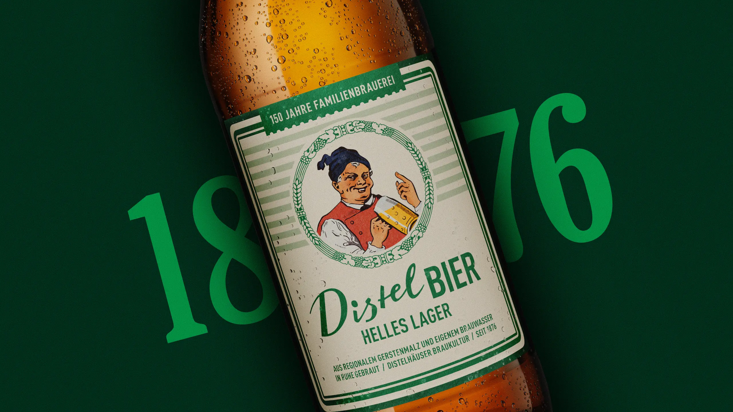
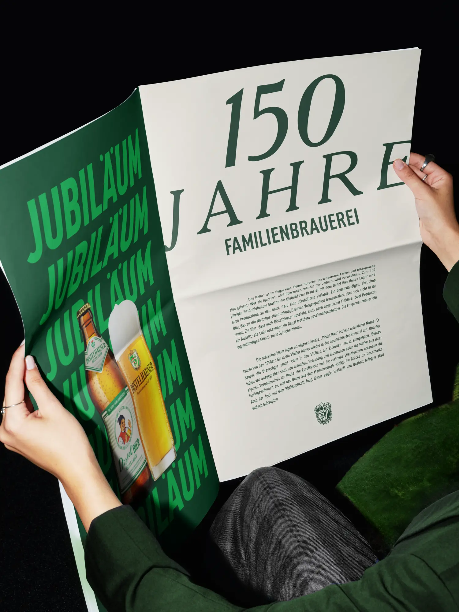
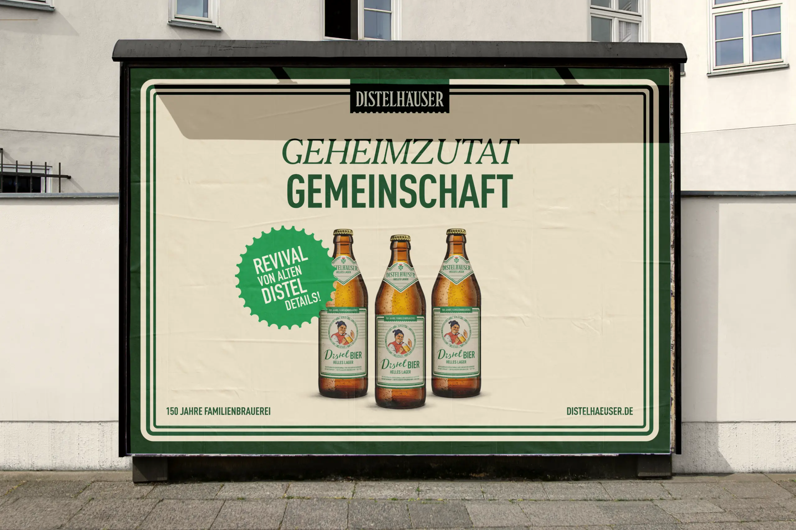
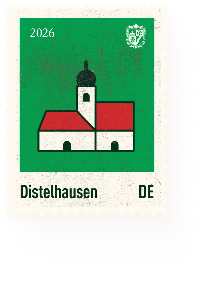
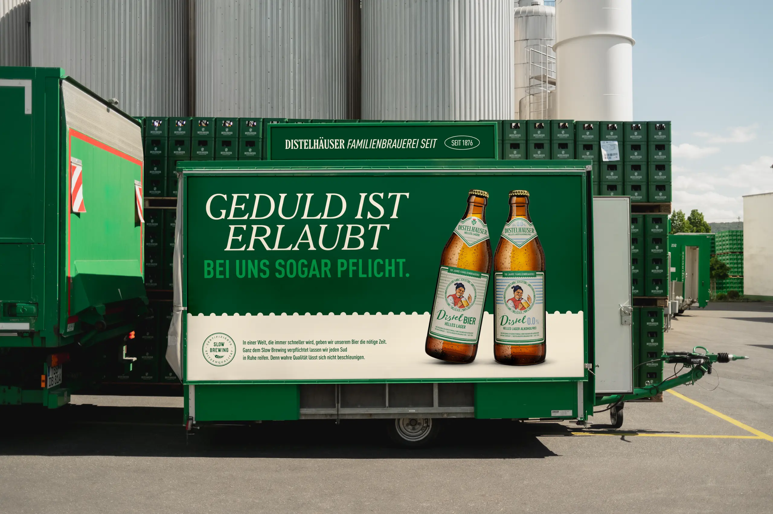
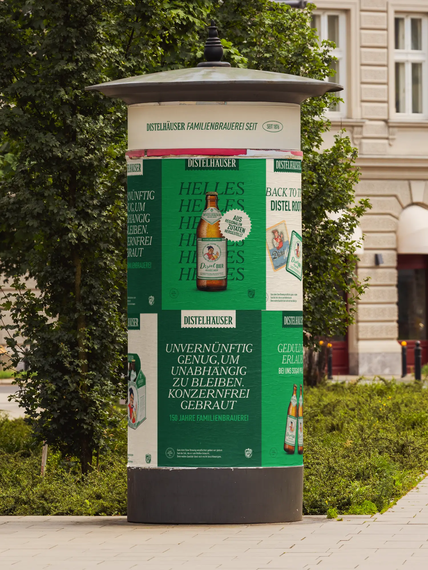
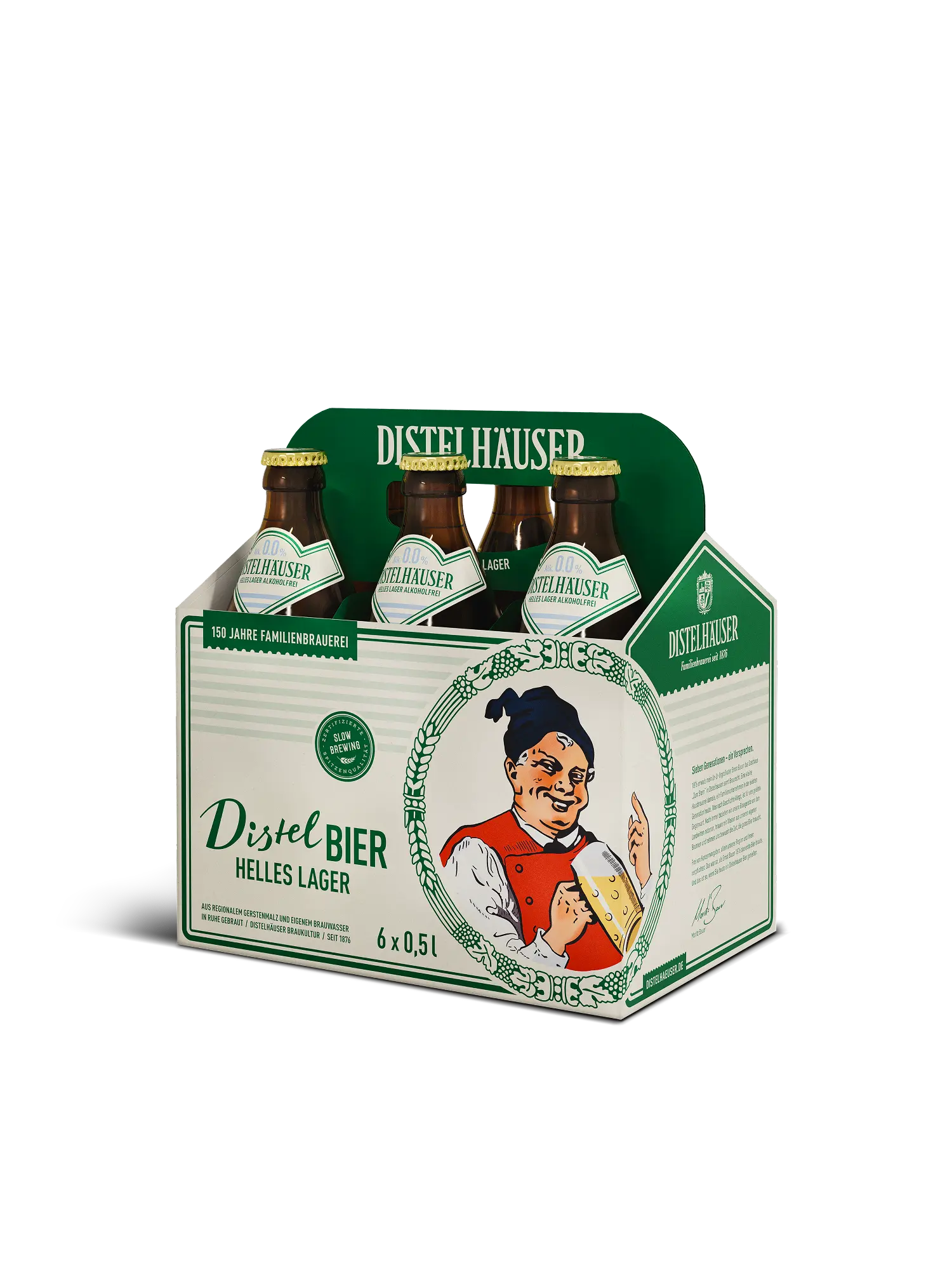
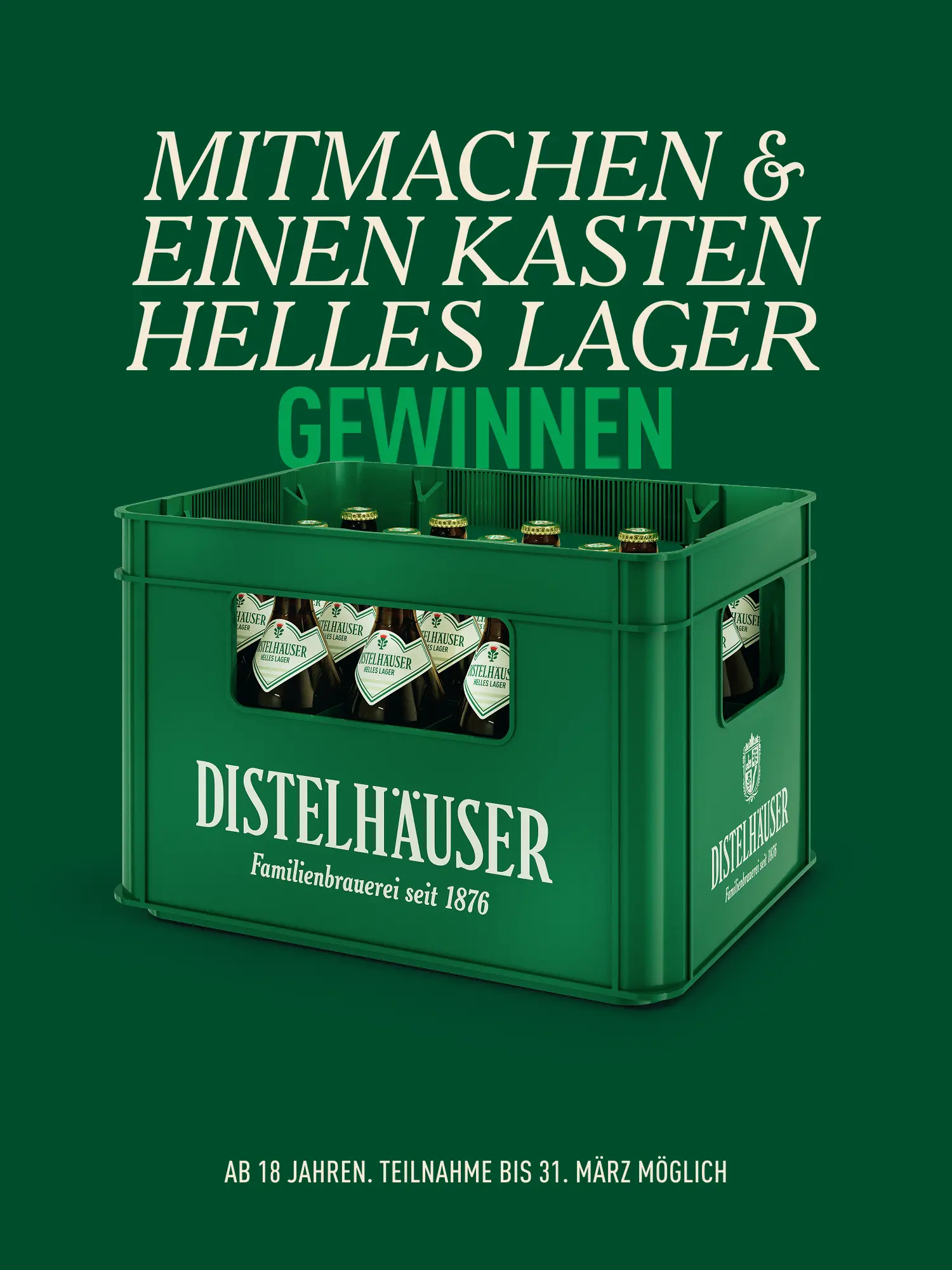
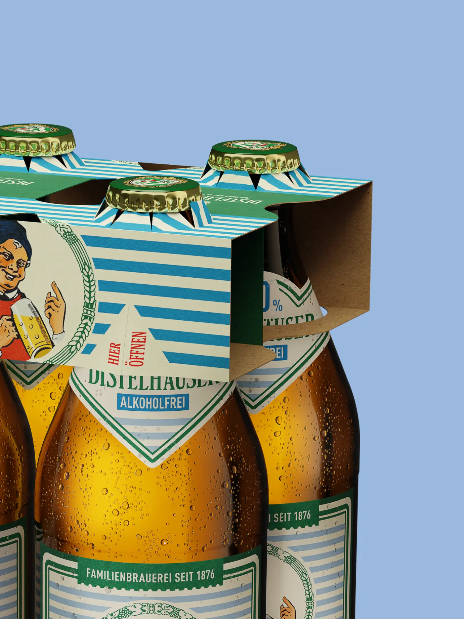
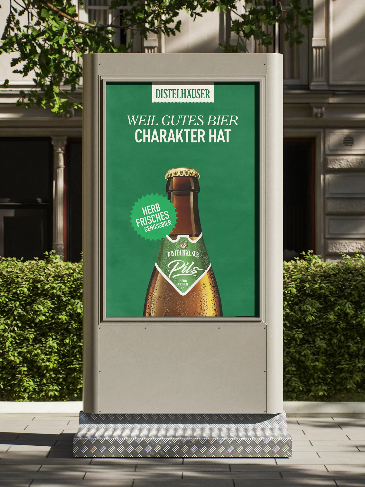
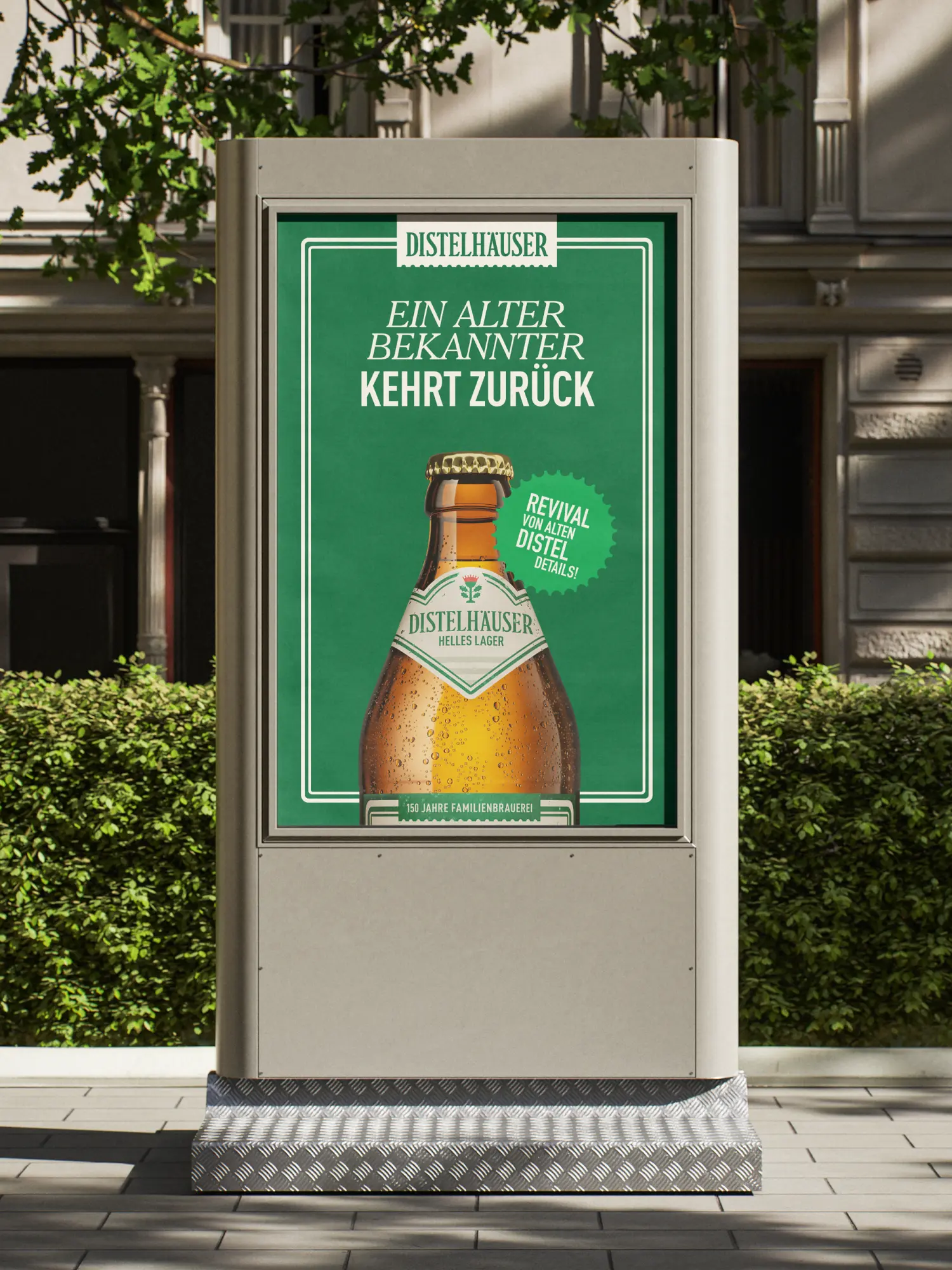
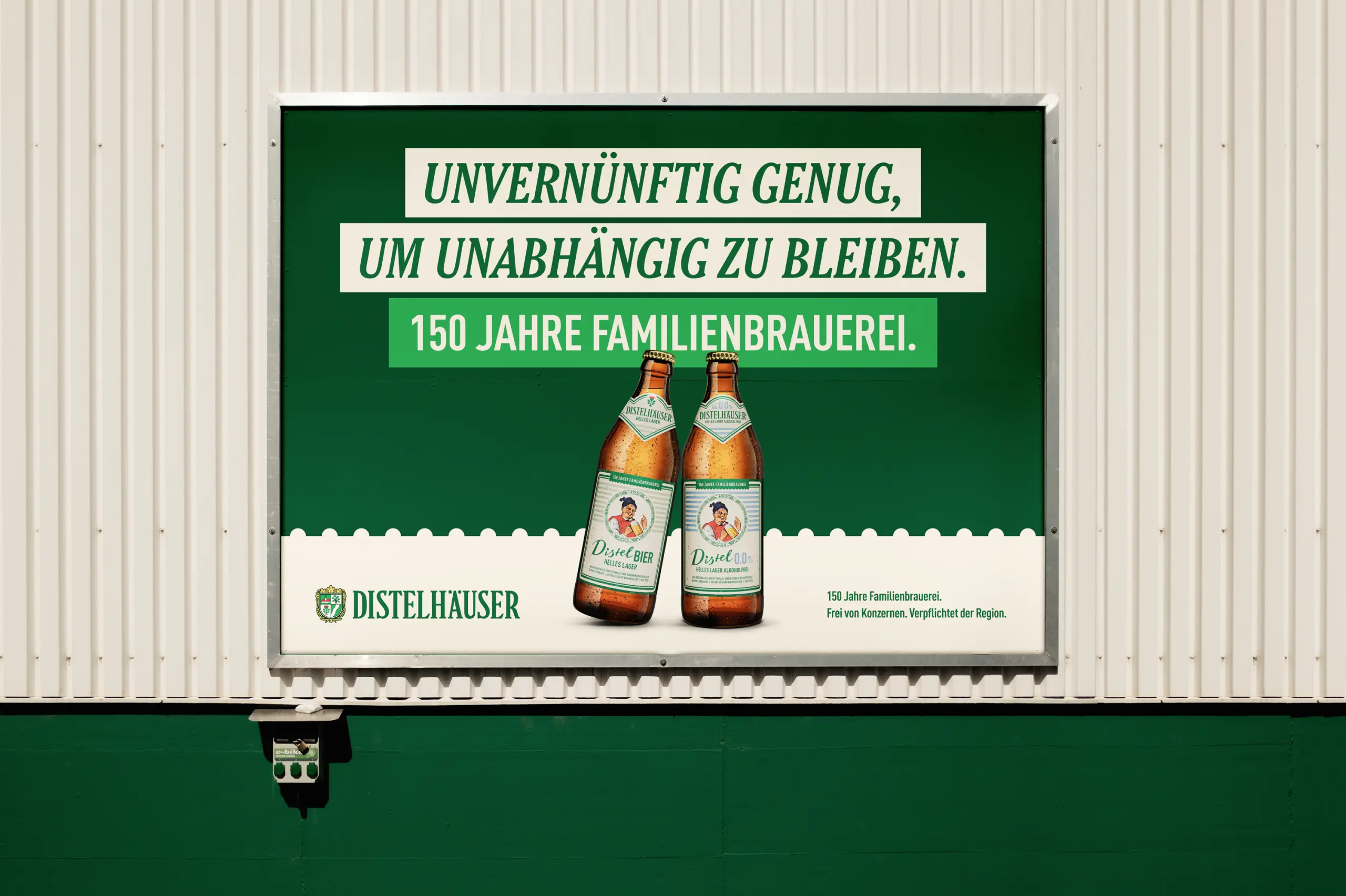
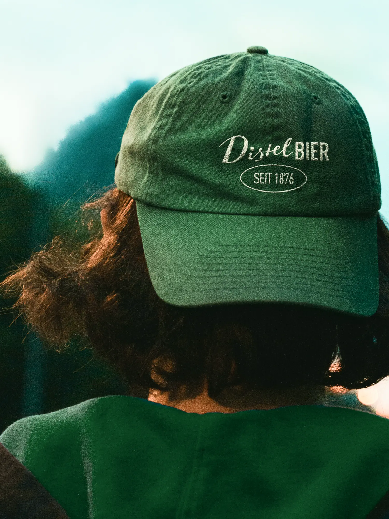
A corporate design manual makes the brand usable day to day. For Distelhäuser Brewery it sets logo, type and colour, and the elements the brand is recognised by: bursts, a torn edge, a grid. In a Figma workshop we trained the brewery team and left templates they can adapt themselves, from a product poster to a social post. So the design carries the brand consistently across every touchpoint. On the label. On the glass. On the truck. From that came applications for social, print and outdoor presence, through to refrigerated vans and parasols. 150 years as a foundation, not an obstacle. On that ground also sits the product design of Distel Bier, the brewery's new Helles lager.
Client
Distelhäuser
Industry
Release
– today
Team





Book a call
01 Context
Since 1876 Distelhäuser Brewery has been brewing in the Tauber valley, in family hands for seven generations. A brand with patina, grown over decades: several greens side by side, gradients in the logo roof, a coat of arms full of detail. From the outside it read cooler and more industrial than how the brewery actually works. And what still works on a beer crate falls apart in a social feed and on the smallest label. How do you sharpen an identity like that for today's channels and a younger audience, without betraying where it comes from? Neither a clean break through relaunch nor simply conserving what is there answers it.
02 Method
A brand can be brought into form without inventing it again. The harder decision is not what changes. It's what stays. Since early 2025, fjnland has been the lead agency for Distelhäuser Brewery. We cleaned the coat of arms carefully: fewer details, clearer proportions, clean contours. The symbols of brewing and origin remain, and now print cleanly down to the smallest label. In the colour system the gradients are gone. Several greens became one house green, warmer than before. A cool green reads as a corporation. A warm one as craft. And instead of pure white, beige now carries the surfaces: a small detail with a large effect on the character of a family brewery. We defined every tone across Pantone, RAL and CMYK and checked it in hard proof, because the same green comes out differently on paper, bottle and crate. We tightened the wordmark and moved the brand claim into the house typeface Cheltenham.
03 Result
A corporate design manual makes the brand usable day to day. For Distelhäuser Brewery it sets logo, type and colour, and the elements the brand is recognised by: bursts, a torn edge, a grid. In a Figma workshop we trained the brewery team and left templates they can adapt themselves, from a product poster to a social post. So the design carries the brand consistently across every touchpoint. On the label. On the glass. On the truck. From that came applications for social, print and outdoor presence, through to refrigerated vans and parasols. 150 years as a foundation, not an obstacle. On that ground also sits the product design of Distel Bier, the brewery's new Helles lager.
Client
Distelhäuser
Industry
Release
– today
Team
Book a call
Not enough? Ask your AI about us
Let's find out if we're a fit.
Let’s get to know each other and see whether we’re the right fit for your project. From there, we can shape a solution around what you actually need.
Thursday, September 24, 2026
1
2
3
4
5
6
7
8
9
10
11
12
13
14
15
16
17
18
19
20
21
22
23
24
25
26
27
28
29
30
31
10:30
11:30
14:30
15:30
16:30
17:30
Let's find out if we're a fit.
Let’s get to know each other and see whether we’re the right fit for your project. From there, we can shape a solution around what you actually need.
Thursday, September 24, 2026
1
2
3
4
5
6
7
8
9
10
11
12
13
14
15
16
17
18
19
20
21
22
23
24
25
26
27
28
29
30
31
10:30
11:30
14:30
15:30
16:30
17:30