Brand design for the organisation for cancer screening and education
Turning points in life
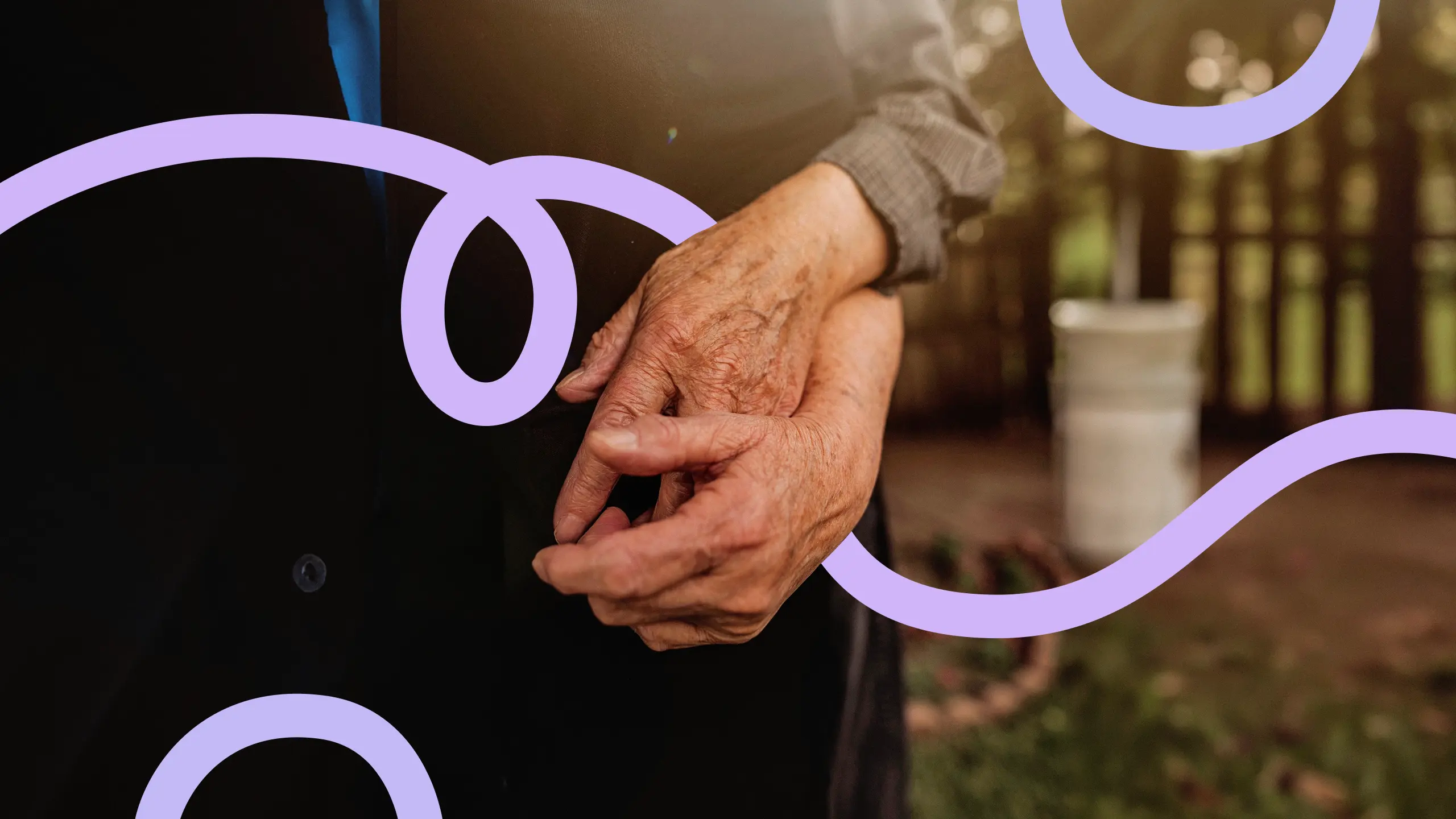
Turning points in life
01 Context
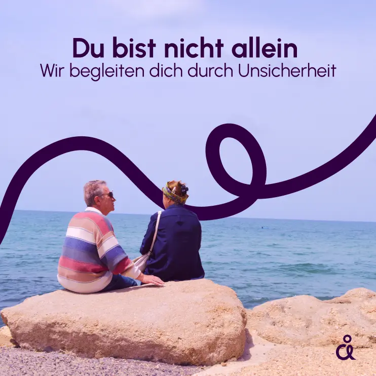
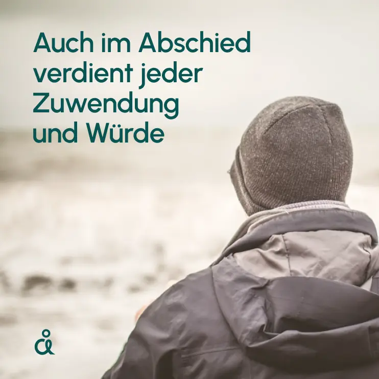
Nobody likes to think about illness and death. Sometimes there is no choice. To be an empathetic, trusted place in exactly those moments: that is what Awareness Deutschland is for. Several separate initiatives for cancer screening and education became one umbrella brand. What was missing was one face: a visual identity that builds trust, and reach for subjects that get brushed aside too easily. The right tone to carry that out: approachable and respectful, sensitive and precise.
02 Method
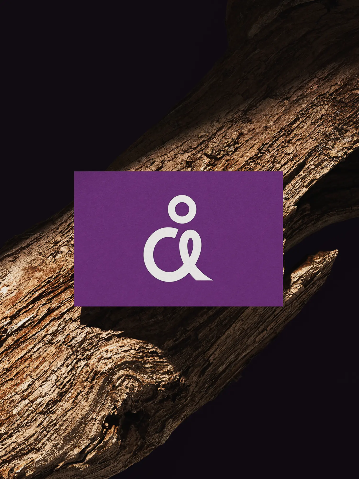
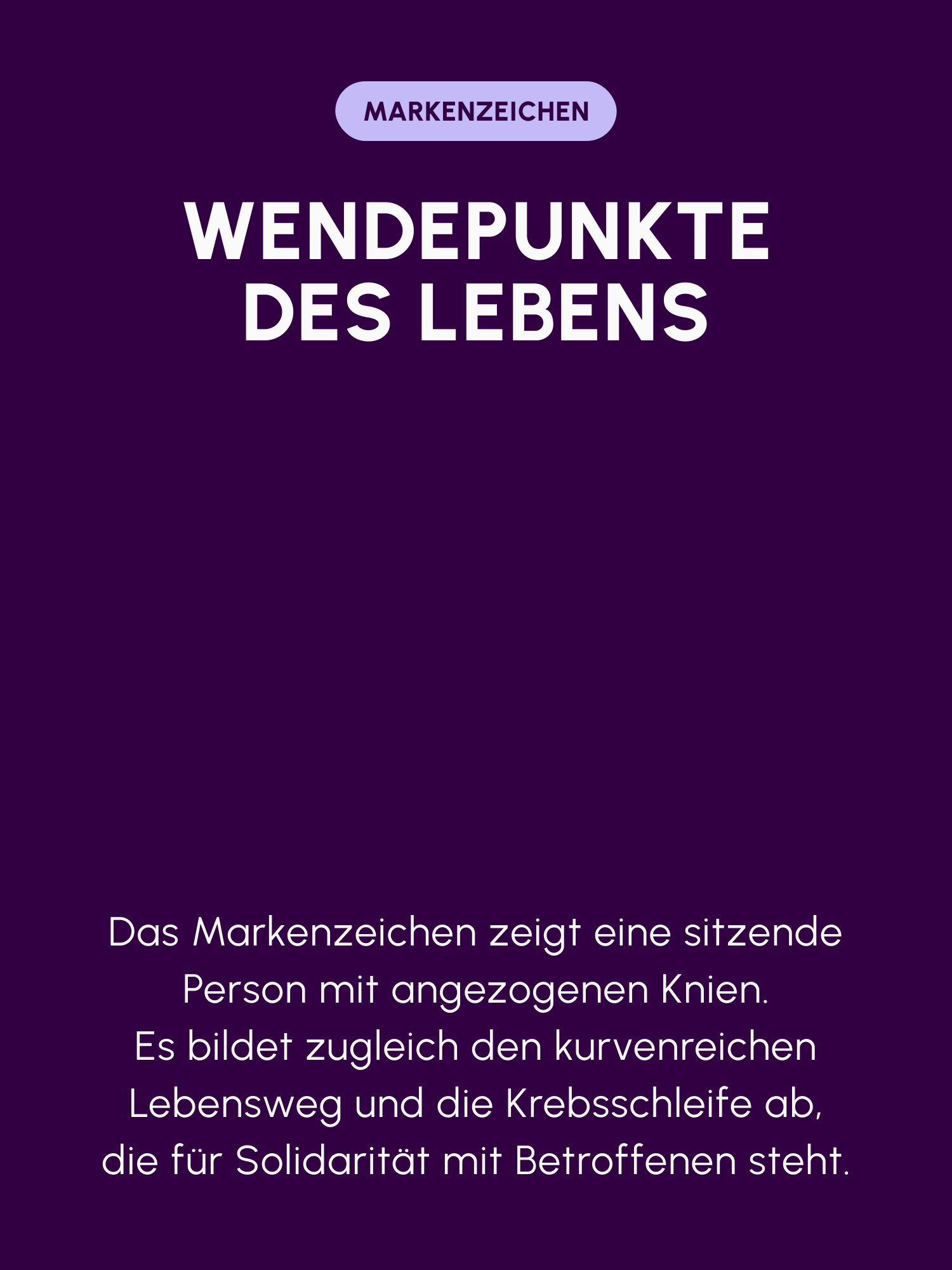
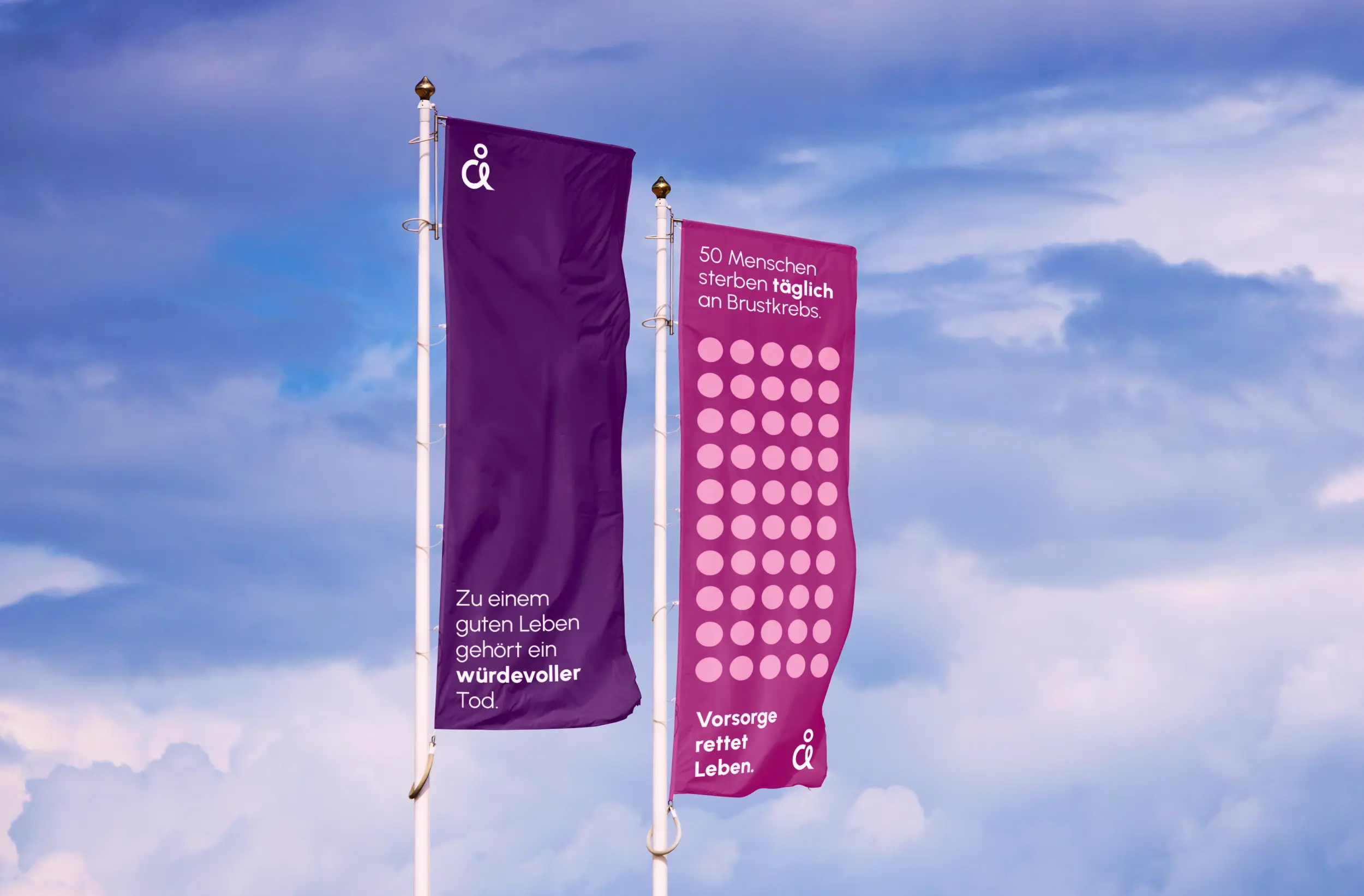
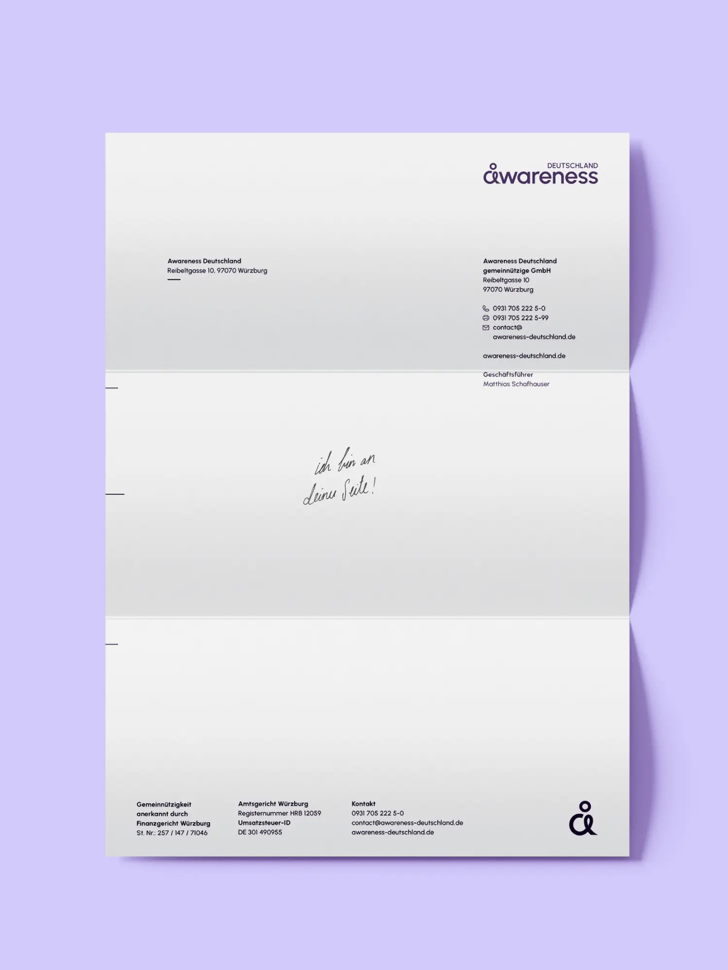
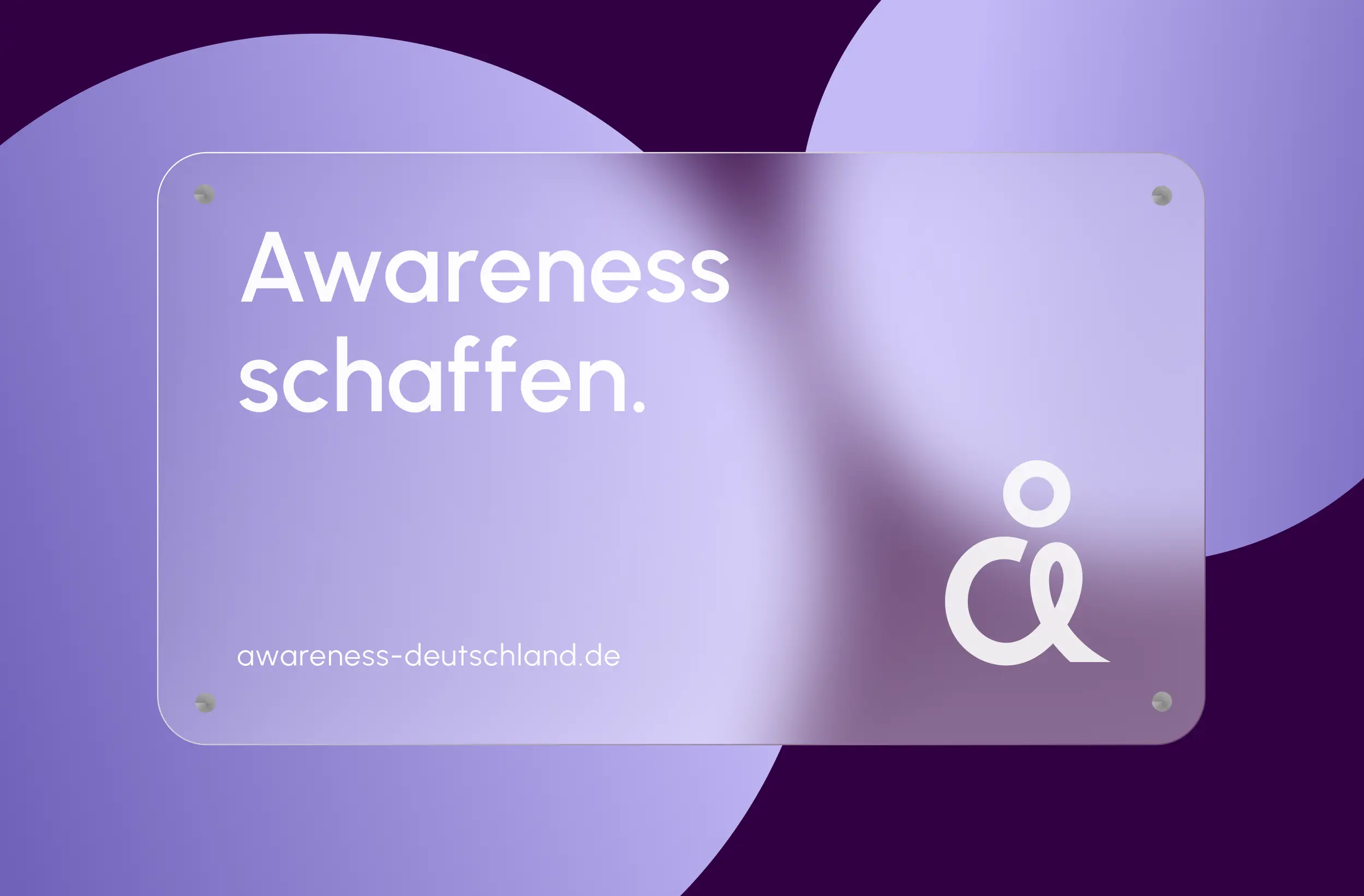
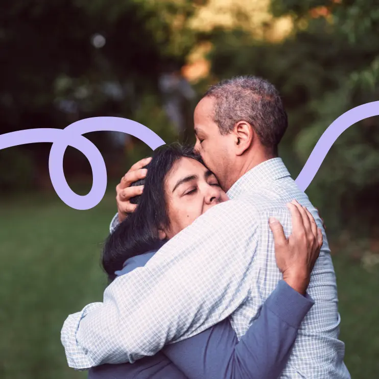
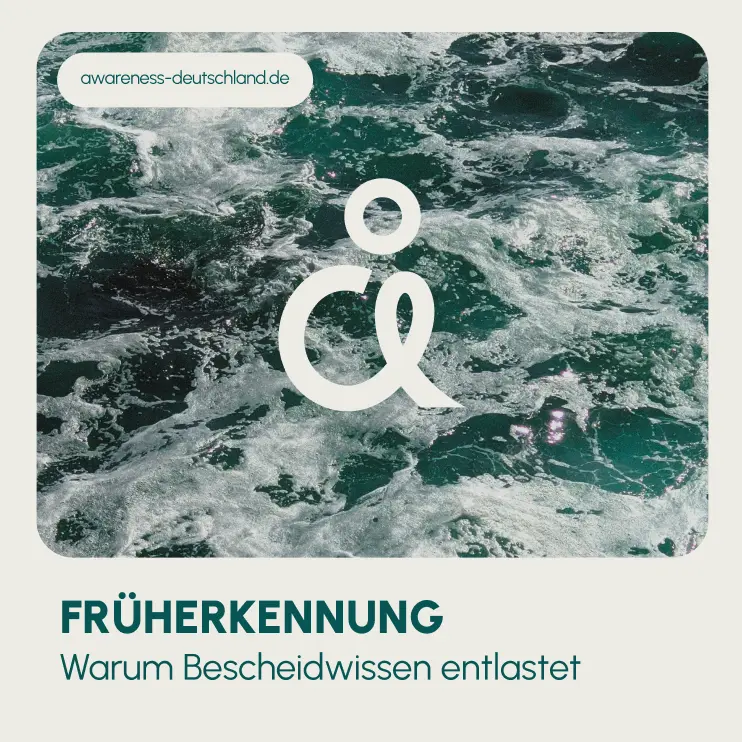
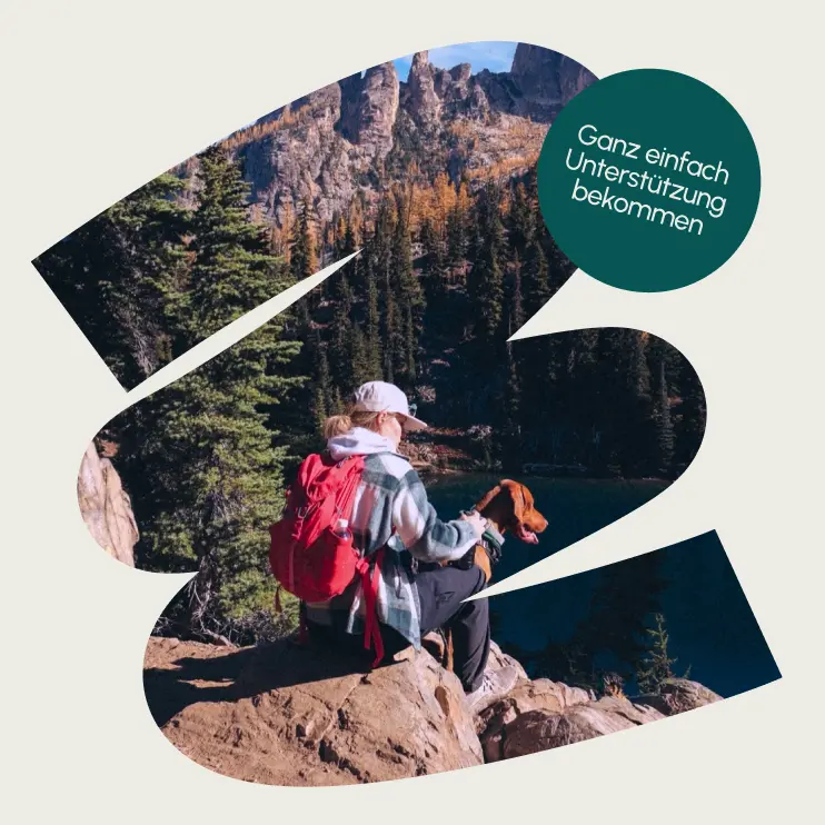
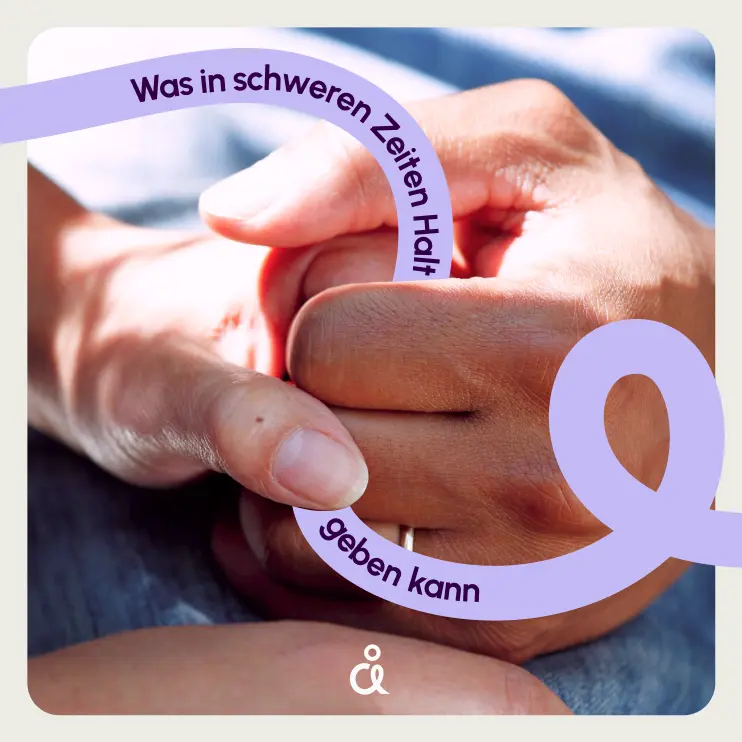
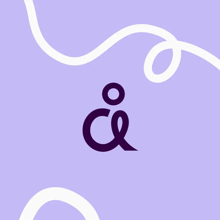
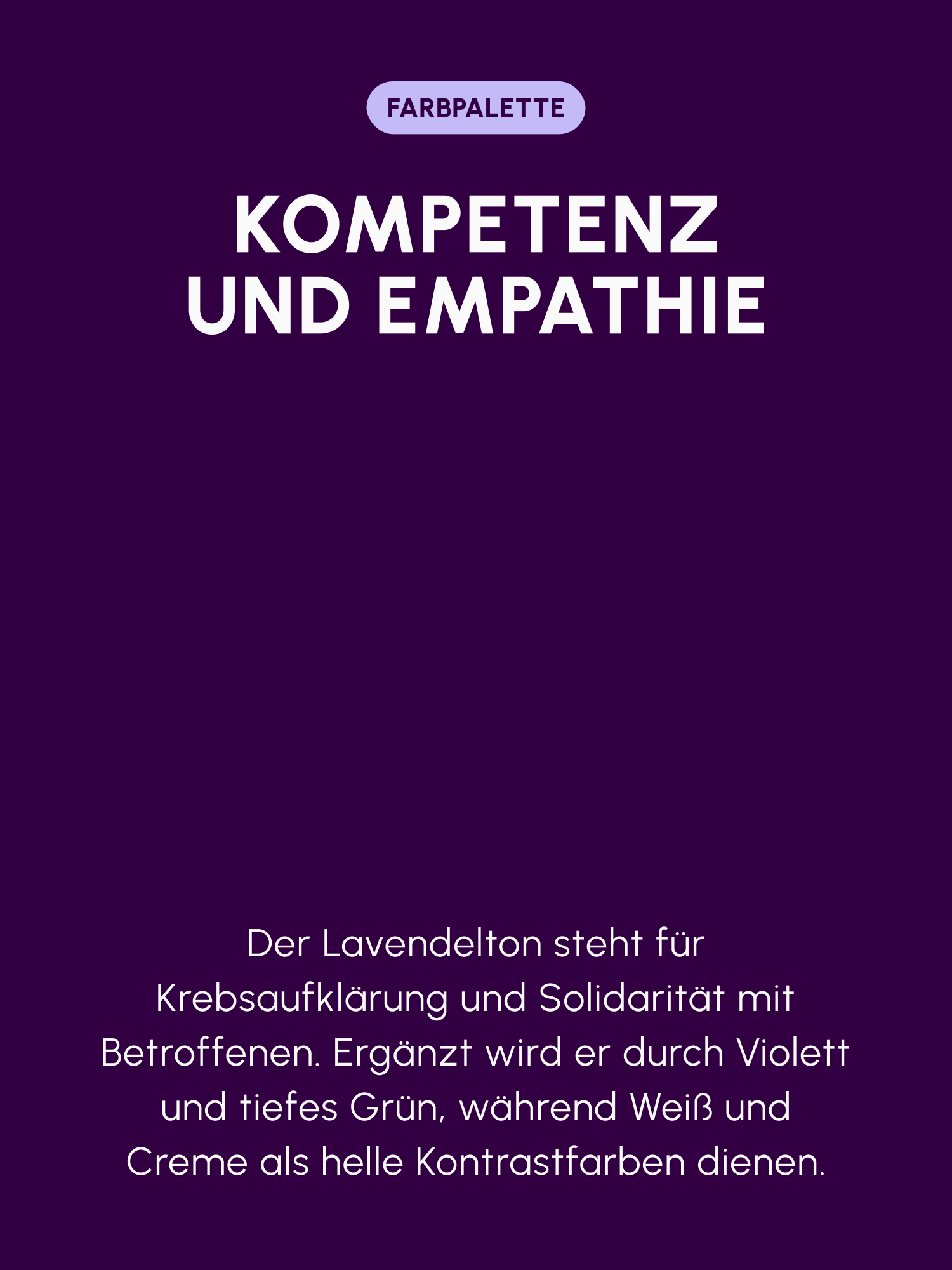
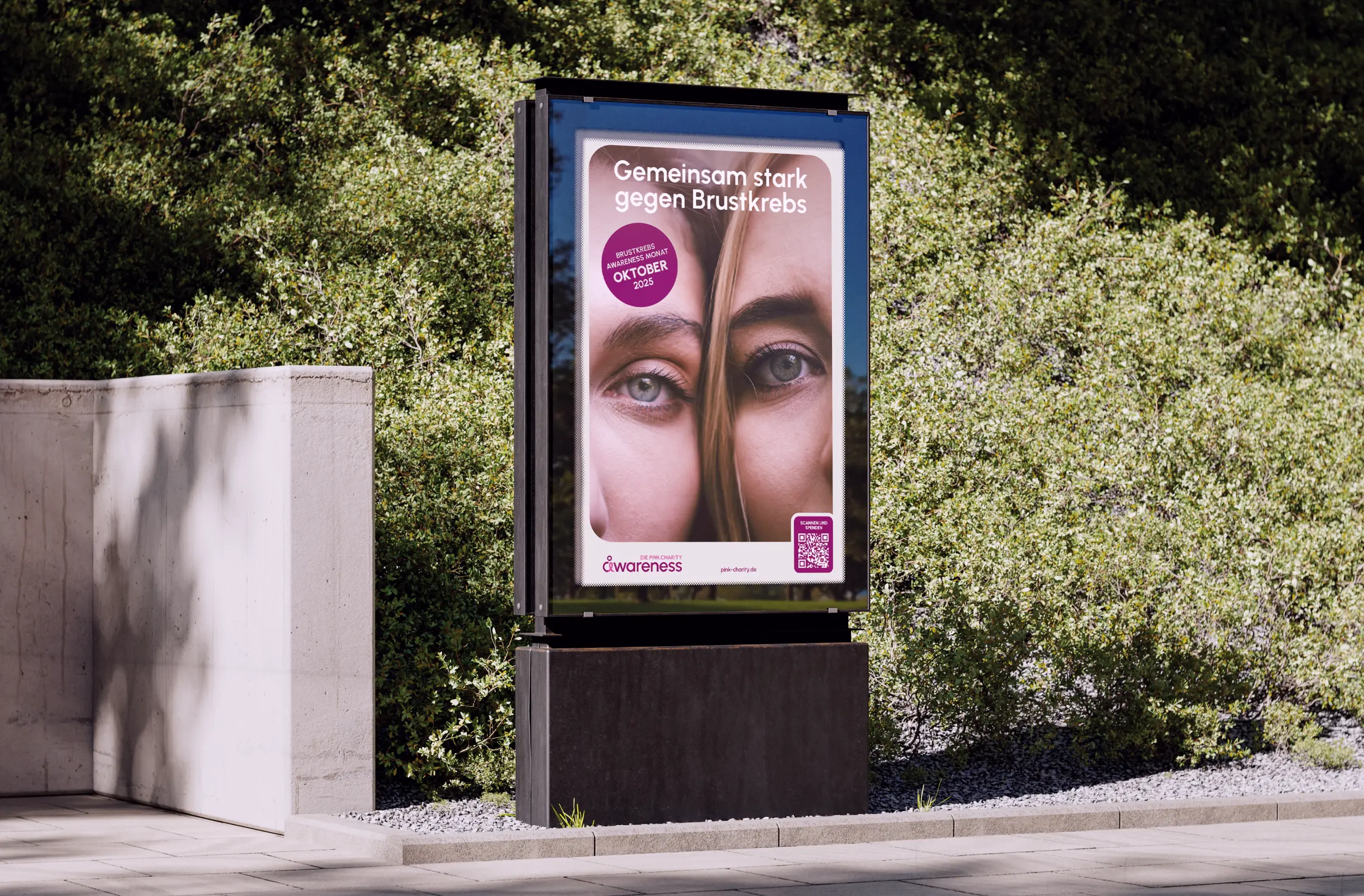
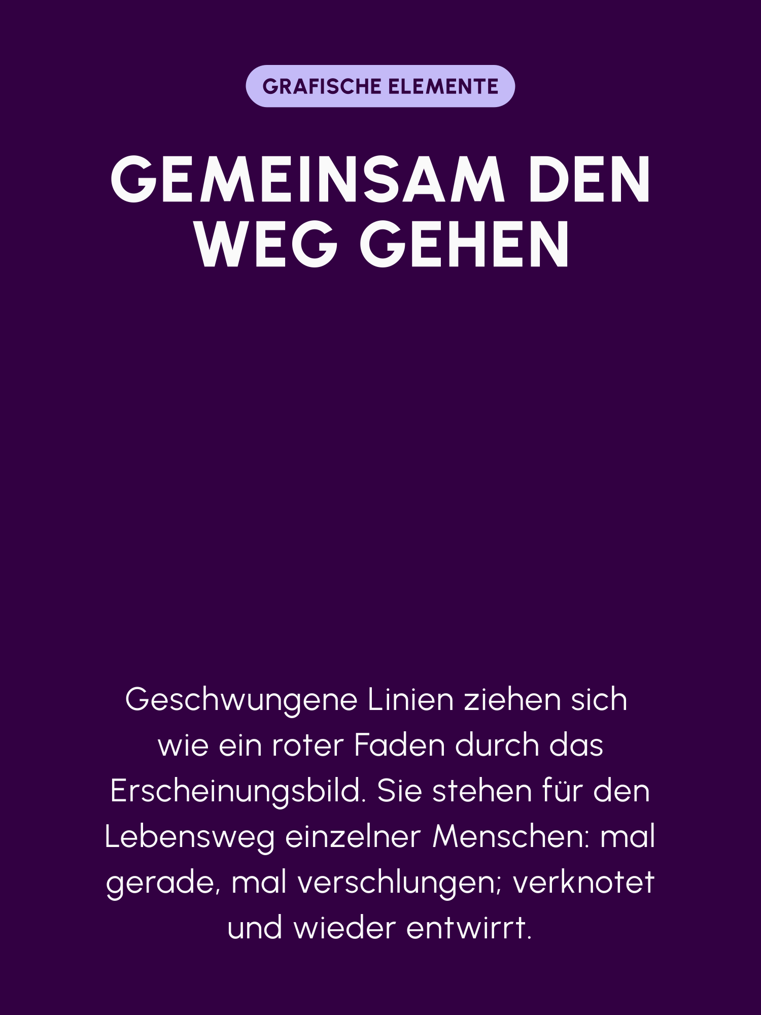
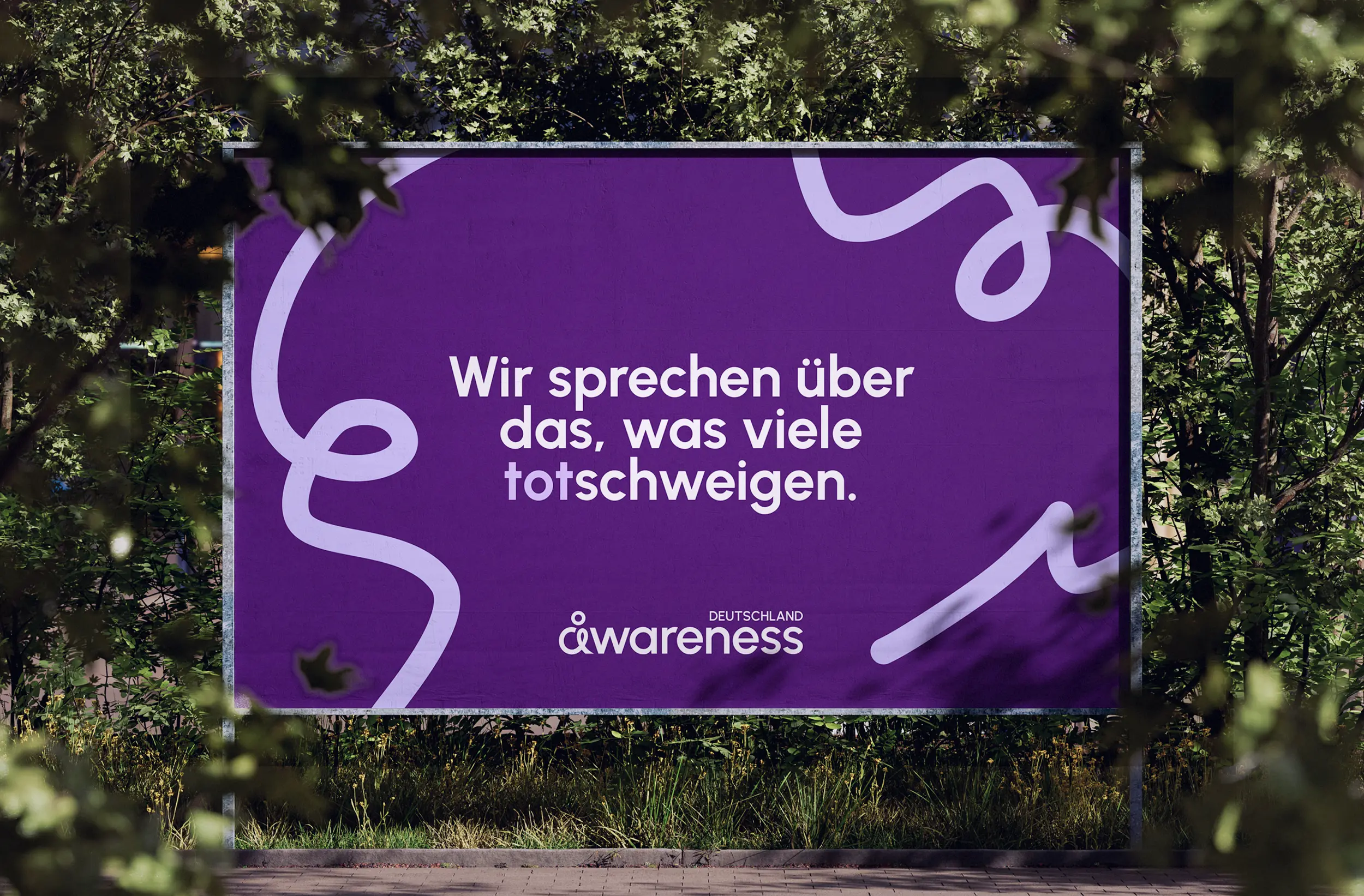
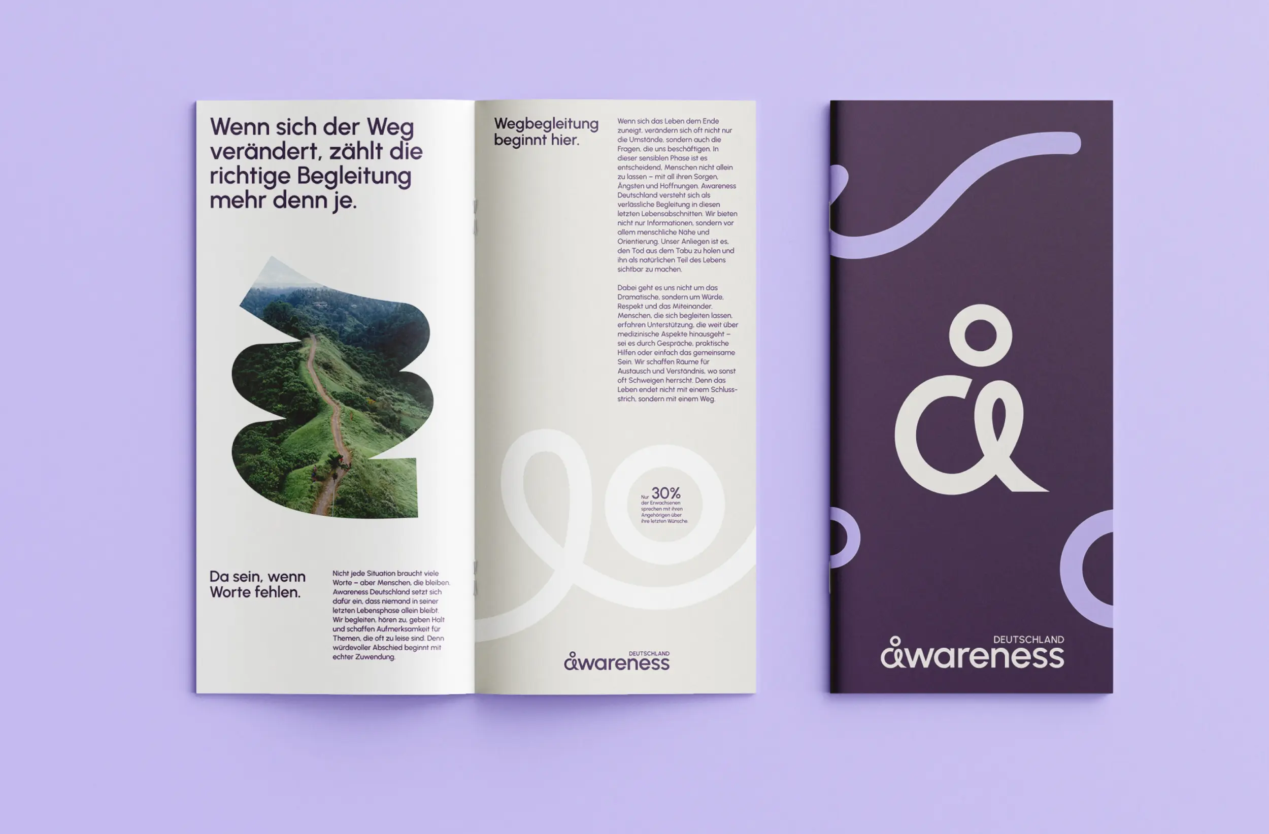
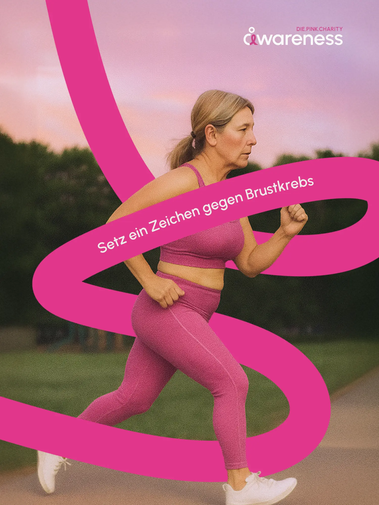
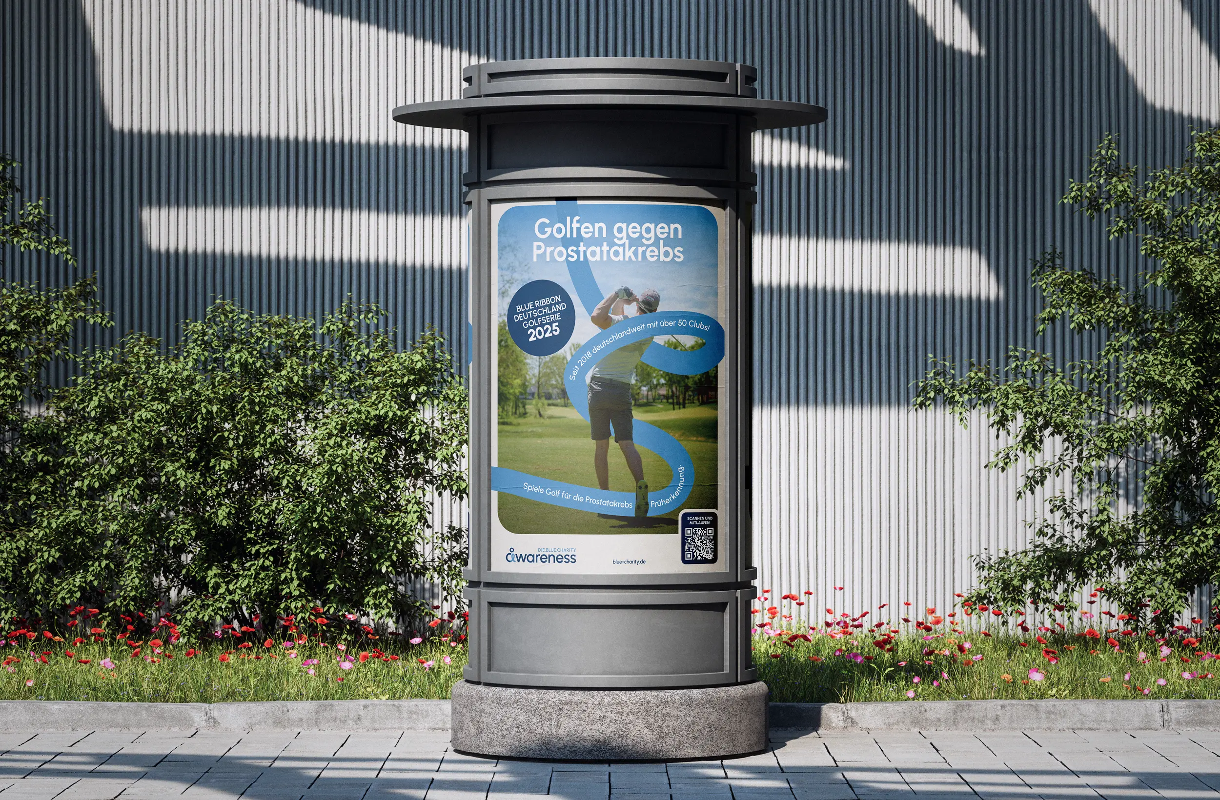
Subjects many people step back from need calm, clarity and a light touch. And above all, not hopelessness. We turned that into a visual language that stands on professionalism, and still leaves room for lightness. The thread is the lilac Awareness ribbon from cancer education. We extended it into curved lines that hold the brand together across every medium. The logo puts the individual at the centre, and at the same time traces the unpredictable path of a life, and the ribbon. The two sister brands "die.pink.charity" and "die.blue.charity" build on that handwriting, same visual language, each with its own namesake colour. A warm colour scheme carries the emotional depth and sets soft contrasts.
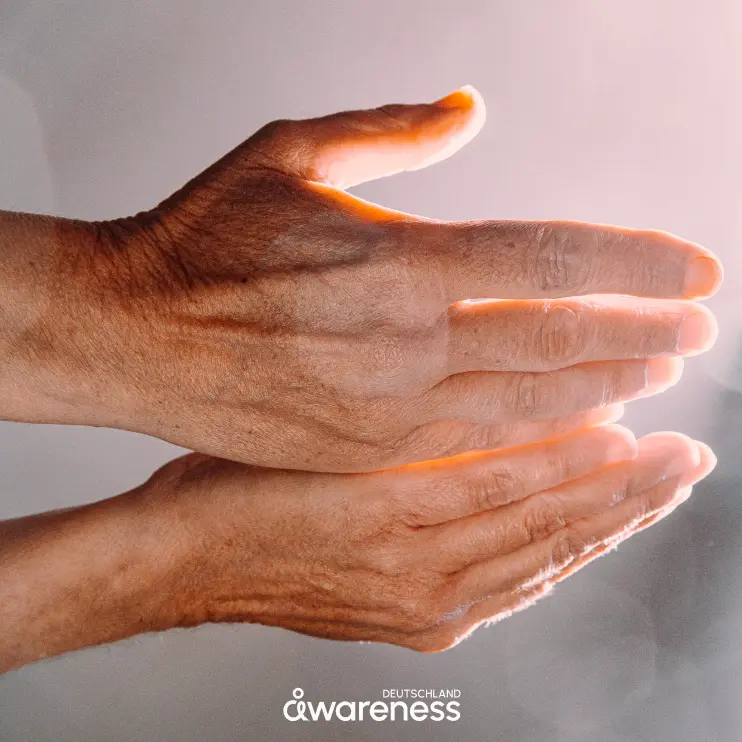
03 Result
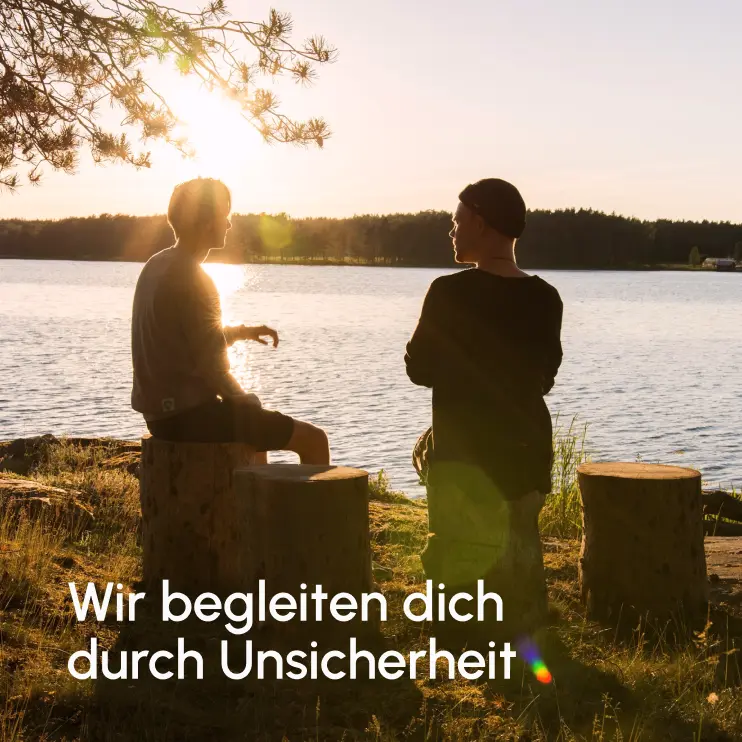
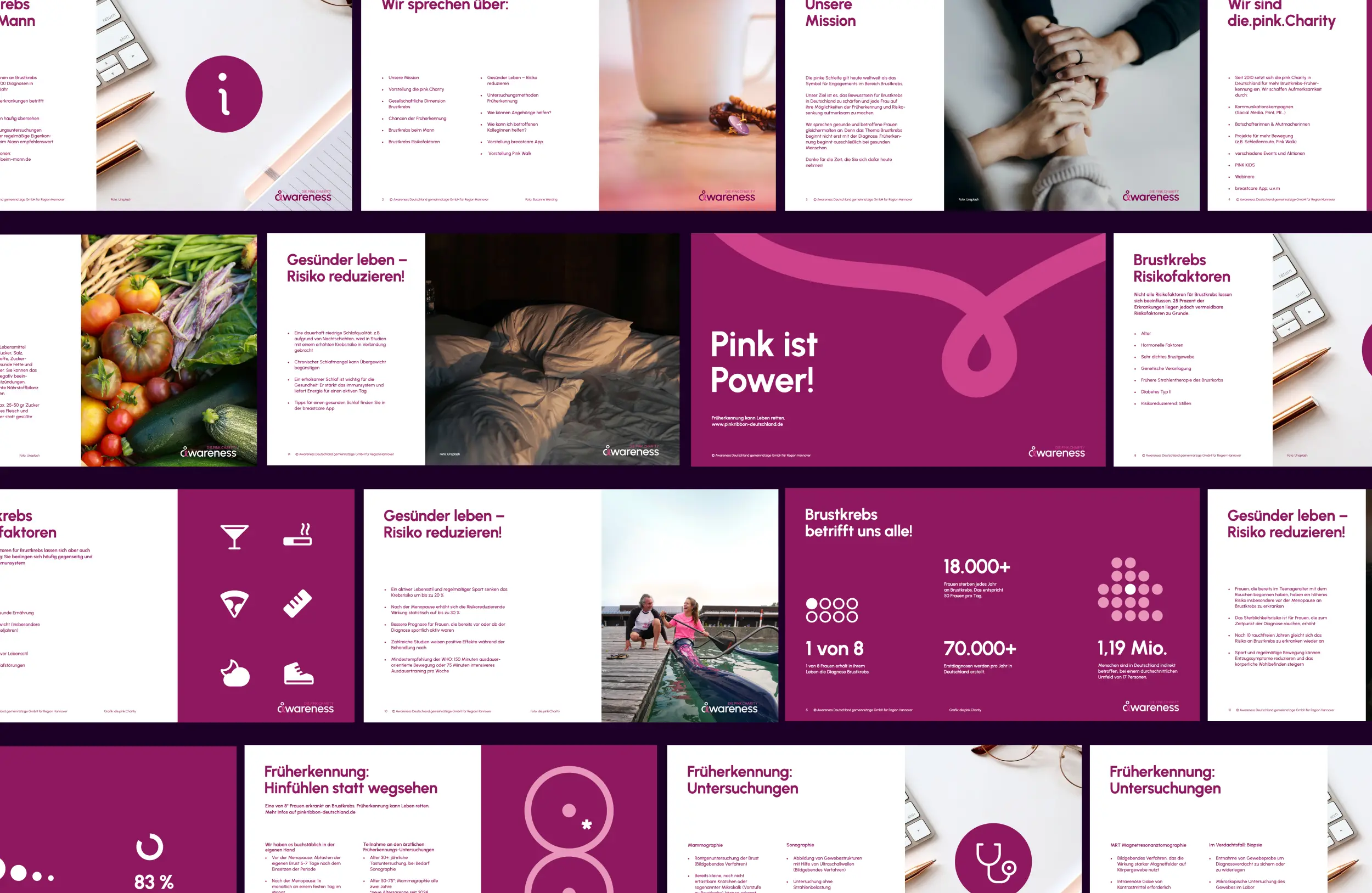
Whether a cancer patient, a relative, or not yet affected: at Awareness Deutschland the individual sits at the centre, and that's where they find themselves in the brand too. What we made is an umbrella system that goes beyond recognition. It gives cancer screening and education a clear, consistent voice. One that, in the hardest moments, offers what matters: support, companionship, and dignity. We delivered the full visual identity: logo, form language, colour, and the umbrella system with both sister brands "die.pink.charity" and "die.blue.charity".
Client
Awareness Deutschland
Services
Industry
Release
Team




Book a call
01 Context
Nobody likes to think about illness and death. Sometimes there is no choice. To be an empathetic, trusted place in exactly those moments: that is what Awareness Deutschland is for. Several separate initiatives for cancer screening and education became one umbrella brand. What was missing was one face: a visual identity that builds trust, and reach for subjects that get brushed aside too easily. The right tone to carry that out: approachable and respectful, sensitive and precise.
02 Method
Subjects many people step back from need calm, clarity and a light touch. And above all, not hopelessness. We turned that into a visual language that stands on professionalism, and still leaves room for lightness. The thread is the lilac Awareness ribbon from cancer education. We extended it into curved lines that hold the brand together across every medium. The logo puts the individual at the centre, and at the same time traces the unpredictable path of a life, and the ribbon. The two sister brands "die.pink.charity" and "die.blue.charity" build on that handwriting, same visual language, each with its own namesake colour. A warm colour scheme carries the emotional depth and sets soft contrasts.
03 Result
Whether a cancer patient, a relative, or not yet affected: at Awareness Deutschland the individual sits at the centre, and that's where they find themselves in the brand too. What we made is an umbrella system that goes beyond recognition. It gives cancer screening and education a clear, consistent voice. One that, in the hardest moments, offers what matters: support, companionship, and dignity. We delivered the full visual identity: logo, form language, colour, and the umbrella system with both sister brands "die.pink.charity" and "die.blue.charity".
Client
Awareness Deutschland
Services
Industry
Release
Team
Book a call
Not enough? Ask your AI about us
Let's find out if we're a fit.
Let’s get to know each other and see whether we’re the right fit for your project. From there, we can shape a solution around what you actually need.
Saturday, October 10, 2026
1
2
3
4
5
6
7
8
9
10
11
12
13
14
15
16
17
18
19
20
21
22
23
24
25
26
27
28
29
30
31
10:30
11:30
14:30
15:30
16:30
17:30
Let's find out if we're a fit.
Let’s get to know each other and see whether we’re the right fit for your project. From there, we can shape a solution around what you actually need.
Saturday, October 10, 2026
1
2
3
4
5
6
7
8
9
10
11
12
13
14
15
16
17
18
19
20
21
22
23
24
25
26
27
28
29
30
31
10:30
11:30
14:30
15:30
16:30
17:30