Corporate design, stationery and website for the bathroom specialists from Mainfranken
Bathroom as living space, from one hand
Bathroom as living space, from one hand
01 Context
For over 20 years Rügamer & Haas has been building bathrooms in Mainfranken as part of the Creativraum team. Over the years their own brand had aged: solid in the craft, but fuzzy in how it showed up. The two managing directors wanted to change that, and faced a double challenge. The link to the Creativraum team should stay visible, but their own identity should finally stand on its own. Plus a regular clientele grown over two decades: a cut too radical would have risked exactly the trust the business stands on. The brand should become more modern and still stay familiar. That fine line was the job.
02 Method
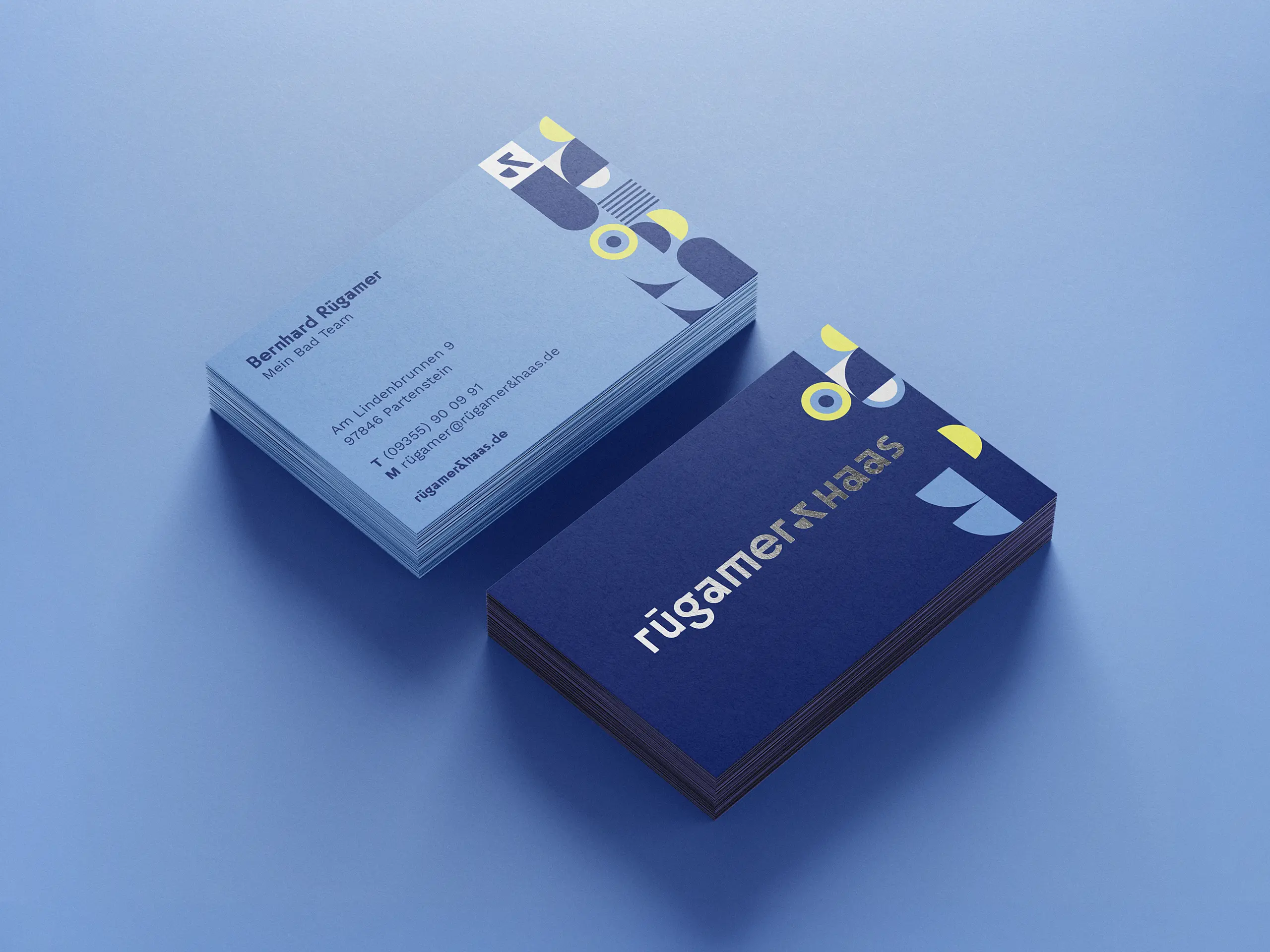
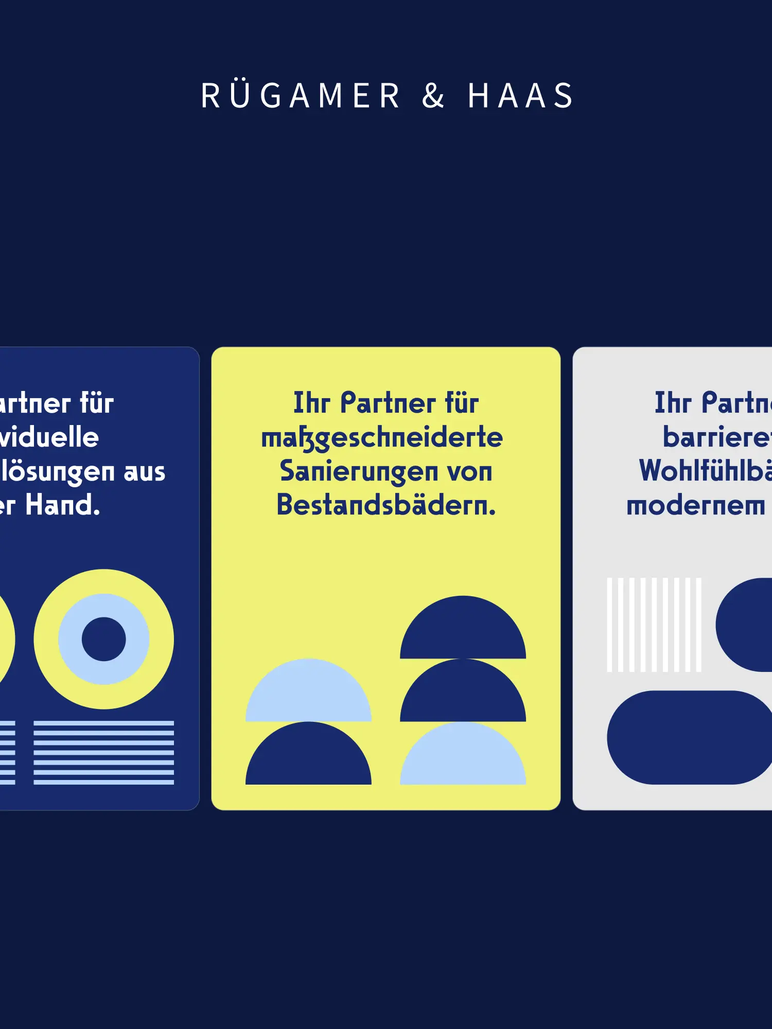
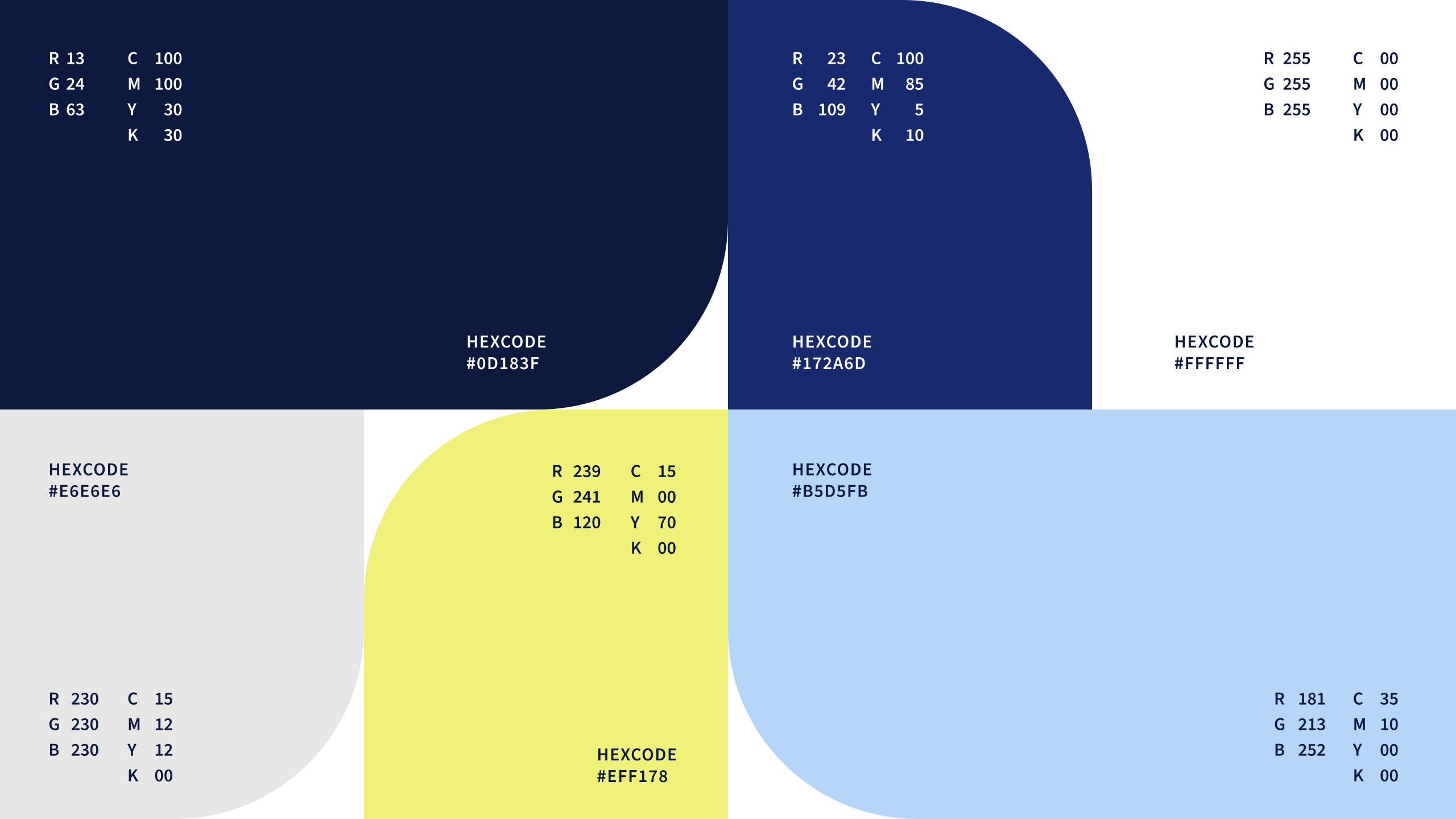
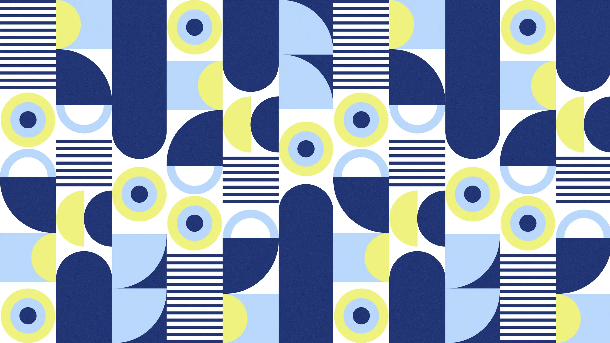
Modernising a brand that is meant to stay means: understand what's there before you touch it. We put the identity on a Bauhaus-inspired word-and-image mark. Straight type that shows the pragmatic craft character without a detour. At the heart is the signet: an "&" that joins the names of the two managing directors and at the same time takes up the tile from the Creativraum team logo. One sign, two messages. Independence and belonging in one form. Plus a tone that stays matter-of-fact and attentive, instead of showing off. So the rebranding isn't a break. It's a sharpening. The brand sounds like itself, only clearer.
03 Result
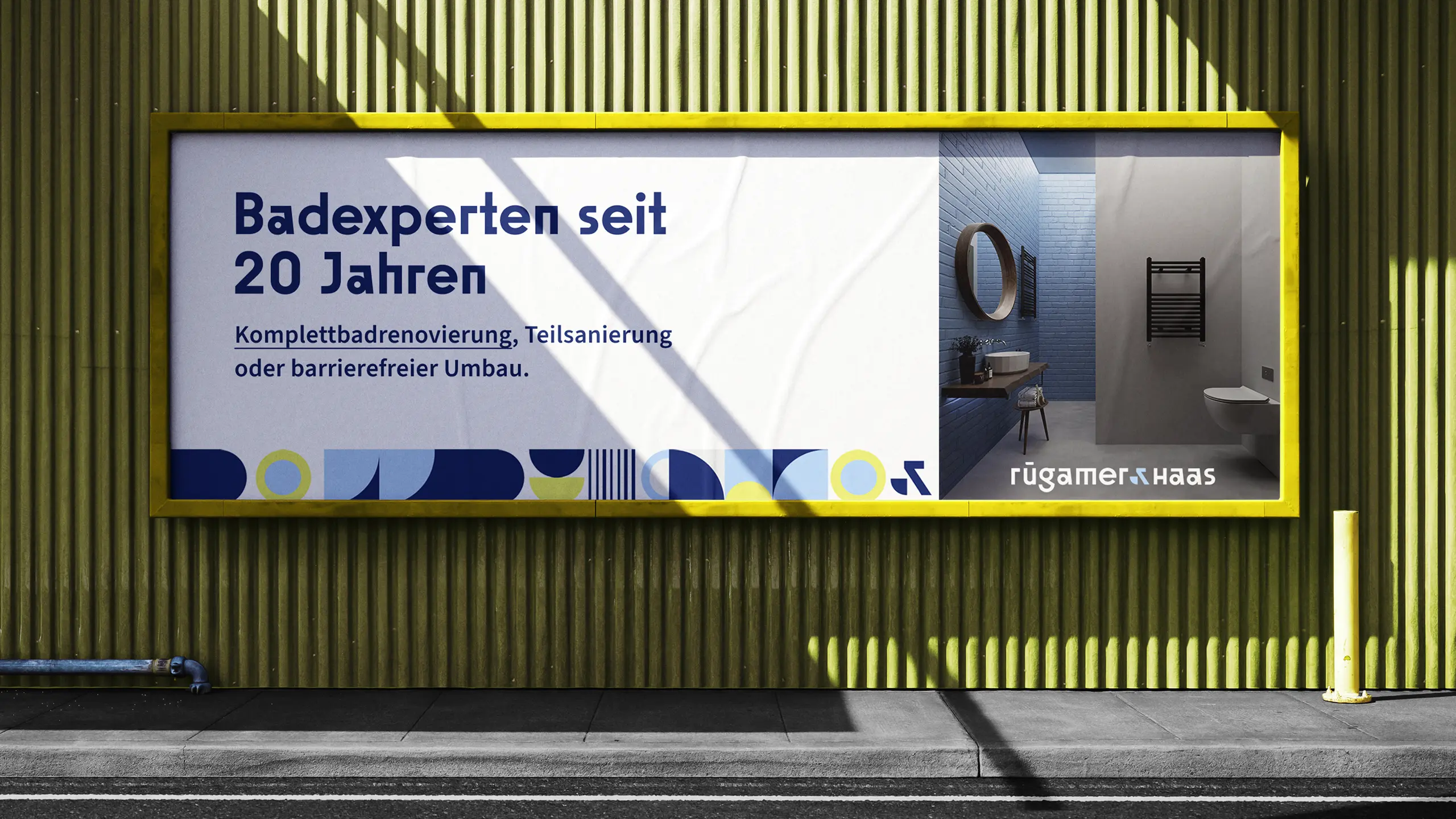
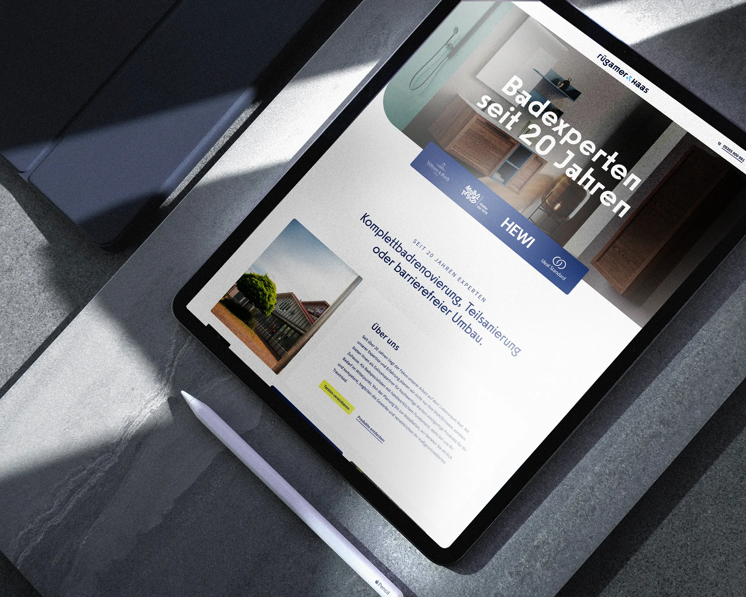
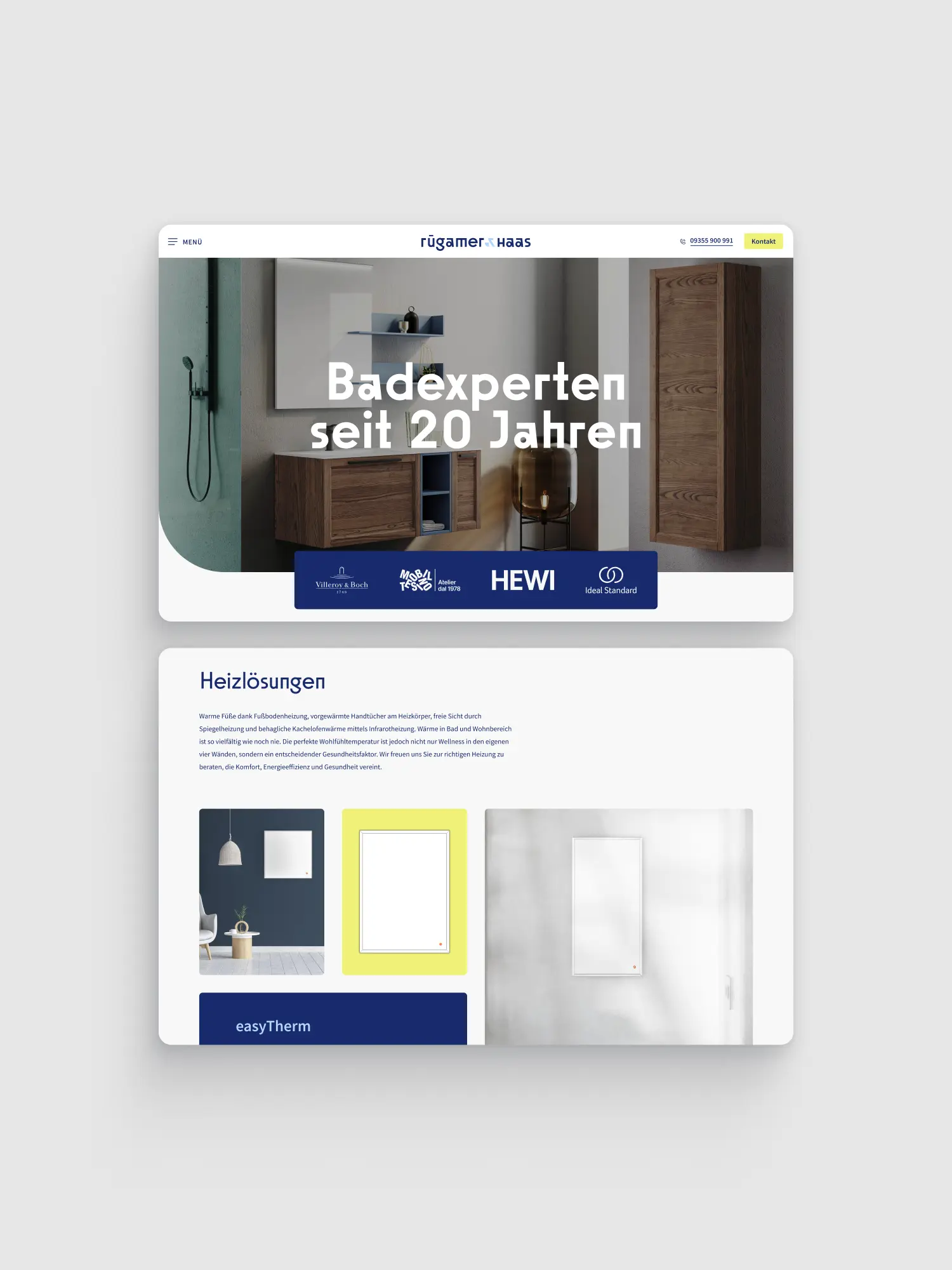
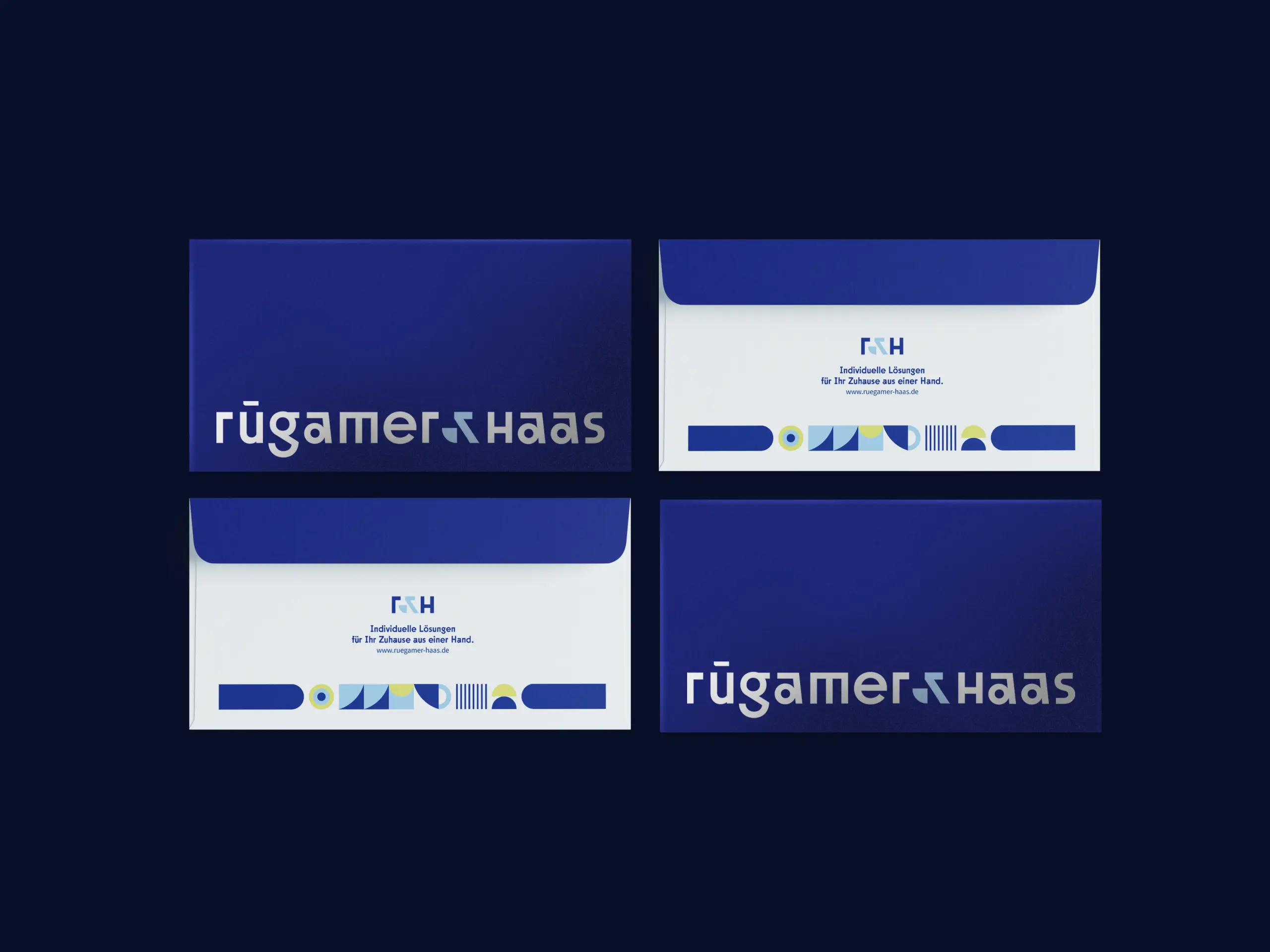
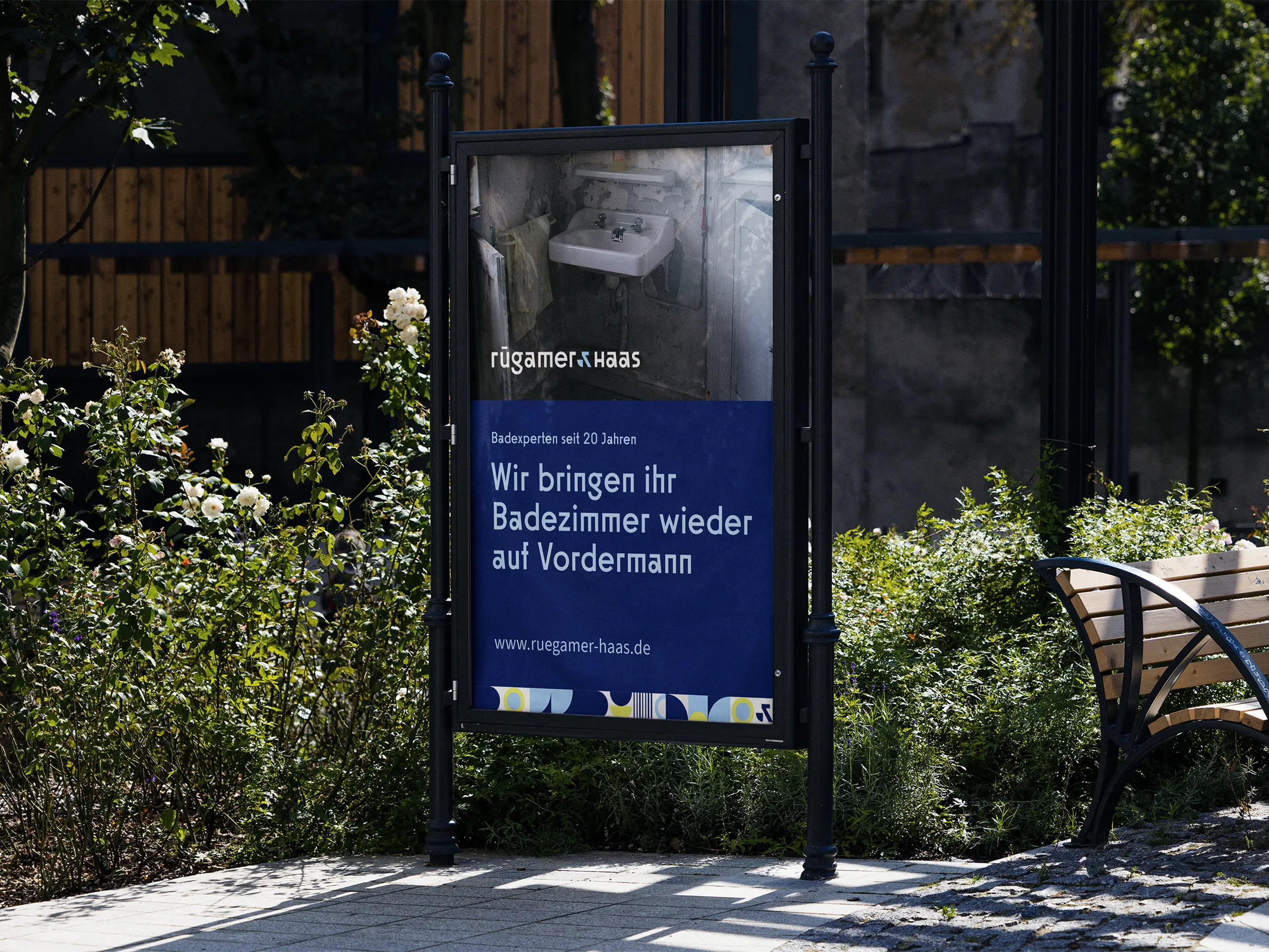
Today Rügamer & Haas appears as one brand that holds together, from the first impression to the finished bathroom renovation. The tile signet visibly ties to the known umbrella, and spares regulars the worry of something unfamiliar. We drew the new picture through every point of contact: business cards, letterhead, vehicle livery, signage and ads lock into each other. Plus a multi-page website with dedicated landing pages for the four fields of work: full bathroom renovation, partial renovation, accessible bathroom, and products. If you're looking, you find the right answer directly, instead of clicking through. What remains is an identity that shows the whole capability of this business at a glance: clear, grounded, from one hand.



Book a call
01 Context
For over 20 years Rügamer & Haas has been building bathrooms in Mainfranken as part of the Creativraum team. Over the years their own brand had aged: solid in the craft, but fuzzy in how it showed up. The two managing directors wanted to change that, and faced a double challenge. The link to the Creativraum team should stay visible, but their own identity should finally stand on its own. Plus a regular clientele grown over two decades: a cut too radical would have risked exactly the trust the business stands on. The brand should become more modern and still stay familiar. That fine line was the job.
02 Method
Modernising a brand that is meant to stay means: understand what's there before you touch it. We put the identity on a Bauhaus-inspired word-and-image mark. Straight type that shows the pragmatic craft character without a detour. At the heart is the signet: an "&" that joins the names of the two managing directors and at the same time takes up the tile from the Creativraum team logo. One sign, two messages. Independence and belonging in one form. Plus a tone that stays matter-of-fact and attentive, instead of showing off. So the rebranding isn't a break. It's a sharpening. The brand sounds like itself, only clearer.
03 Result
Today Rügamer & Haas appears as one brand that holds together, from the first impression to the finished bathroom renovation. The tile signet visibly ties to the known umbrella, and spares regulars the worry of something unfamiliar. We drew the new picture through every point of contact: business cards, letterhead, vehicle livery, signage and ads lock into each other. Plus a multi-page website with dedicated landing pages for the four fields of work: full bathroom renovation, partial renovation, accessible bathroom, and products. If you're looking, you find the right answer directly, instead of clicking through. What remains is an identity that shows the whole capability of this business at a glance: clear, grounded, from one hand.
Book a call
Not enough? Ask your AI about us
Let's find out if we're a fit.
Let’s get to know each other and see whether we’re the right fit for your project. From there, we can shape a solution around what you actually need.
Saturday, October 10, 2026
1
2
3
4
5
6
7
8
9
10
11
12
13
14
15
16
17
18
19
20
21
22
23
24
25
26
27
28
29
30
31
10:30
11:30
14:30
15:30
16:30
17:30
Let's find out if we're a fit.
Let’s get to know each other and see whether we’re the right fit for your project. From there, we can shape a solution around what you actually need.
Saturday, October 10, 2026
1
2
3
4
5
6
7
8
9
10
11
12
13
14
15
16
17
18
19
20
21
22
23
24
25
26
27
28
29
30
31
10:30
11:30
14:30
15:30
16:30
17:30