Corporate design, web development and brand assets for the lighting studio from Franconia
Light in every facet
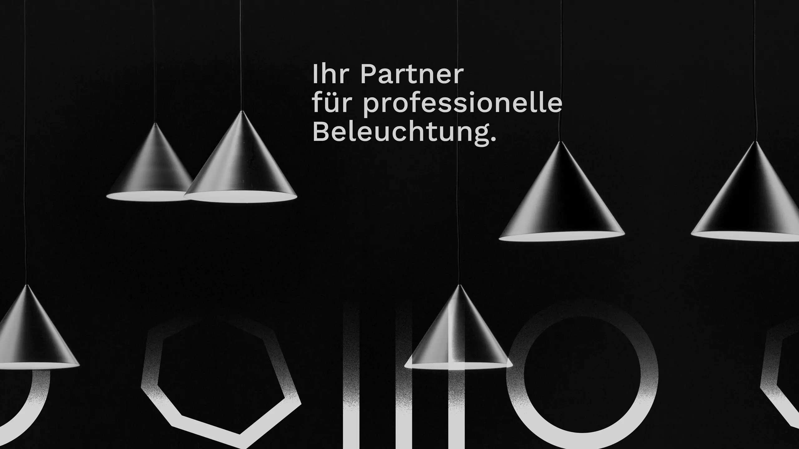
Light in every facet



01 Context
Three sites, three audiences, no shared identity. Lichtagentur has been bringing light into its clients' projects for years, in Würzburg, Nuremberg and Bamberg. Its own brand stayed in the shadow: grown, but uneven, read differently from site to site. Plus an audience that could hardly be more mixed, from a building contractor to a private customer. What was missing was an identity that holds all three sites together and speaks to both worlds, without losing one to the other.
02 Method
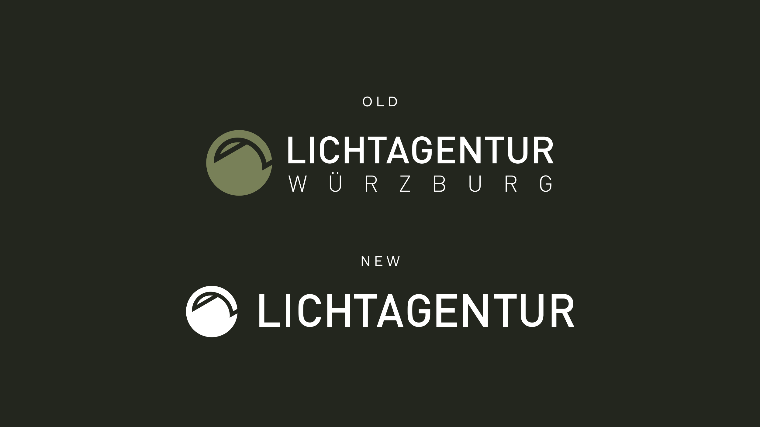
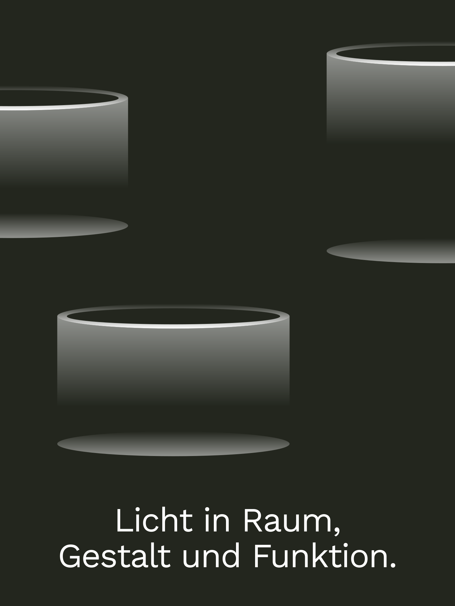
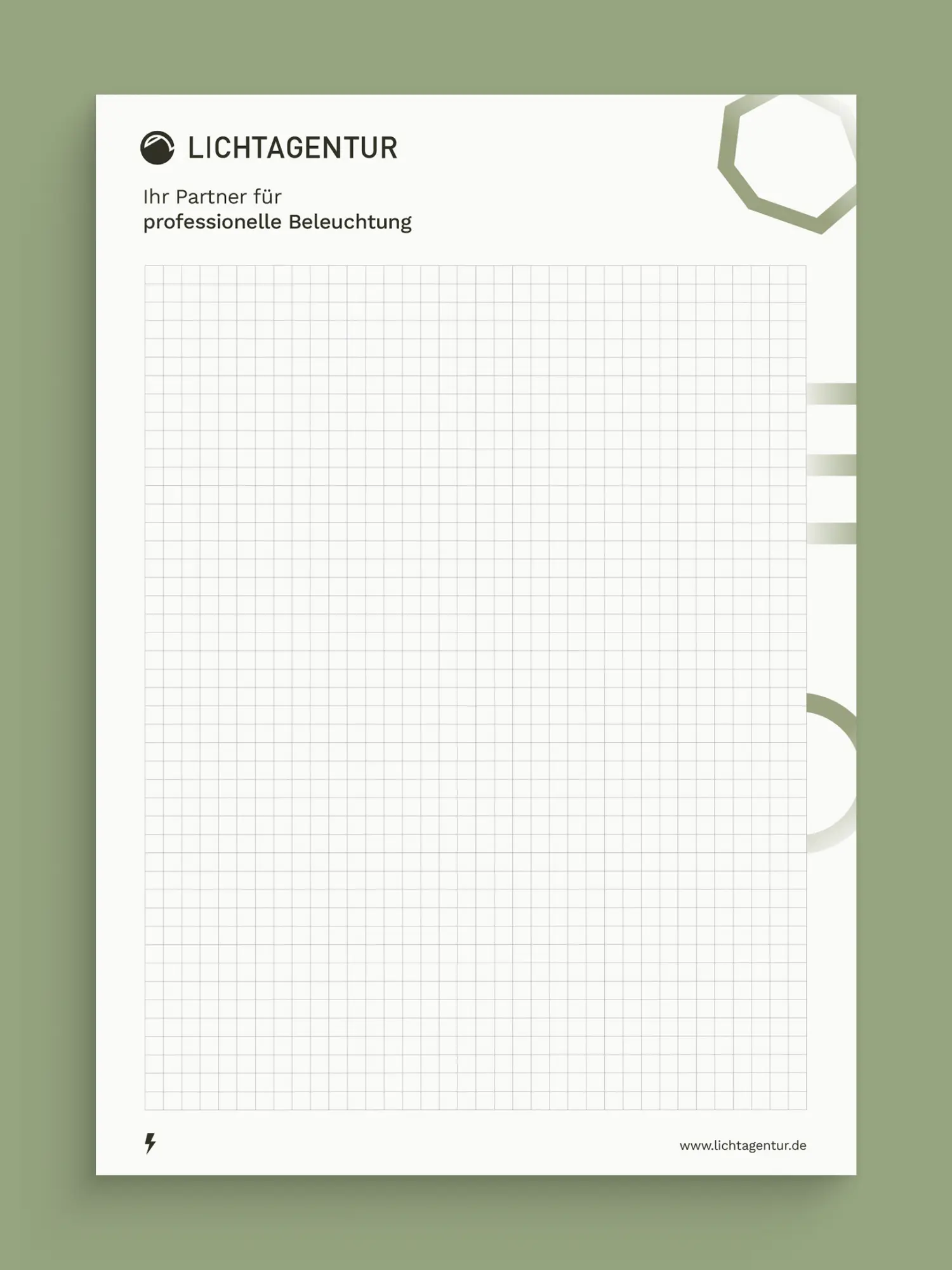
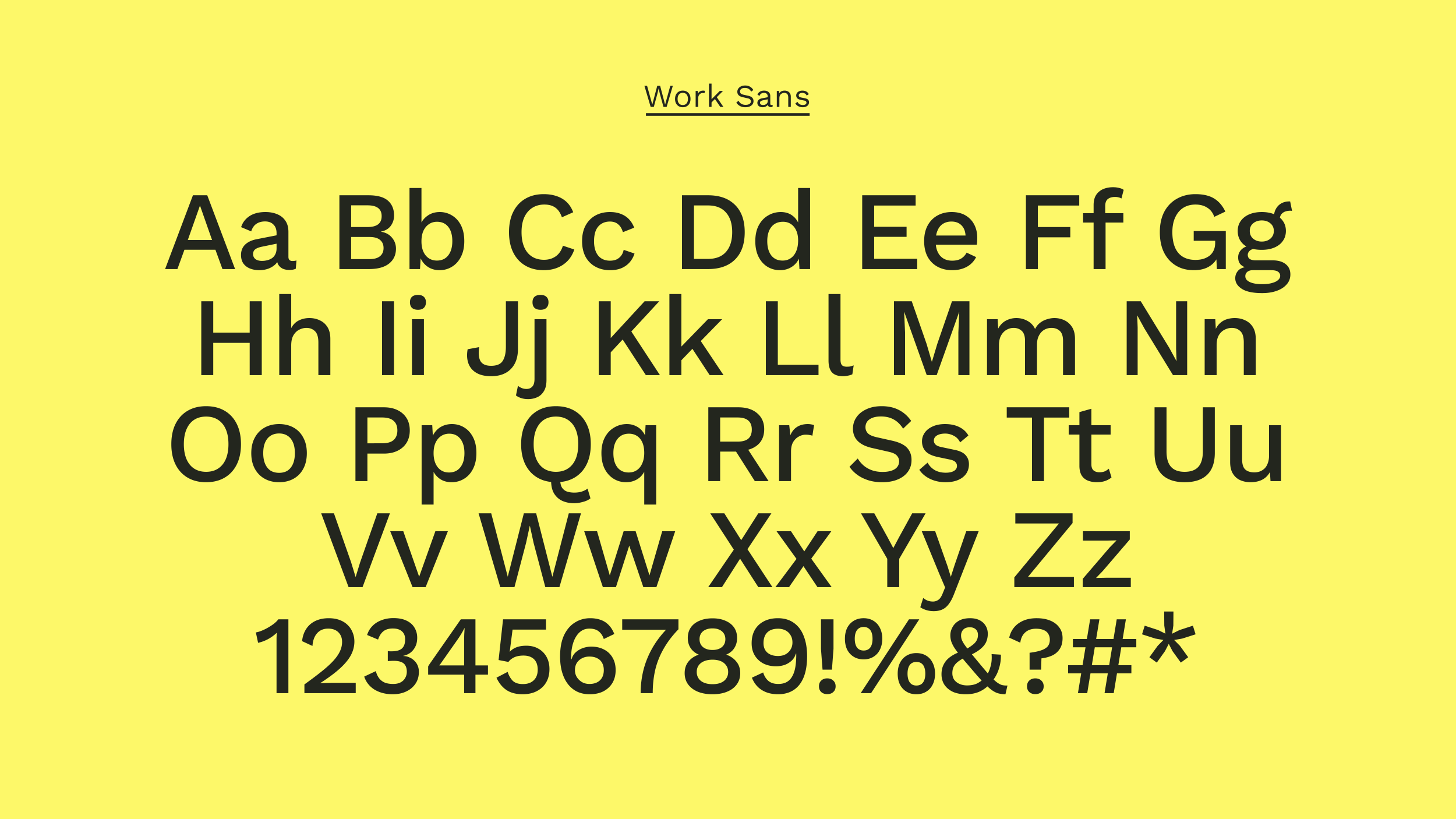
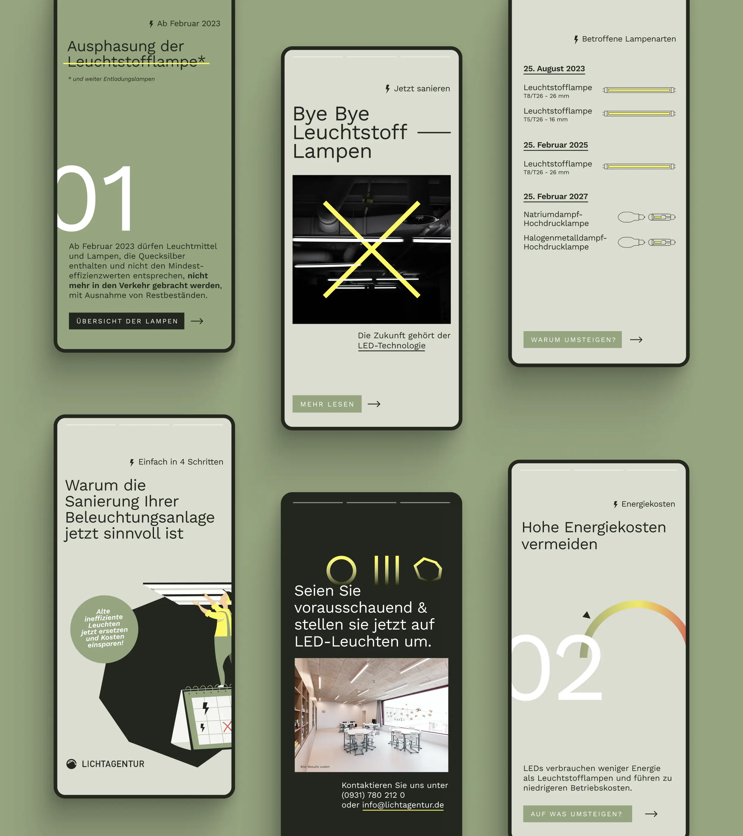
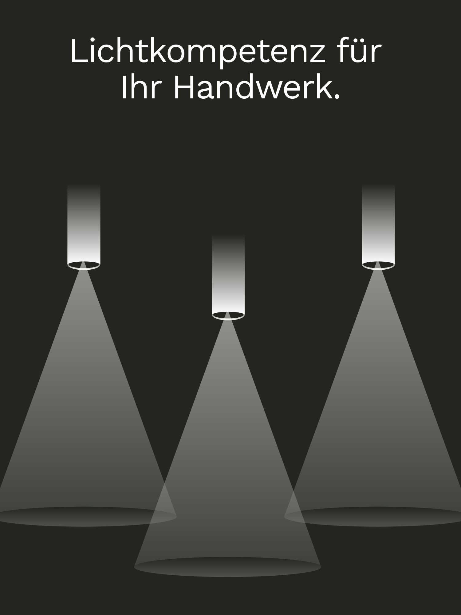
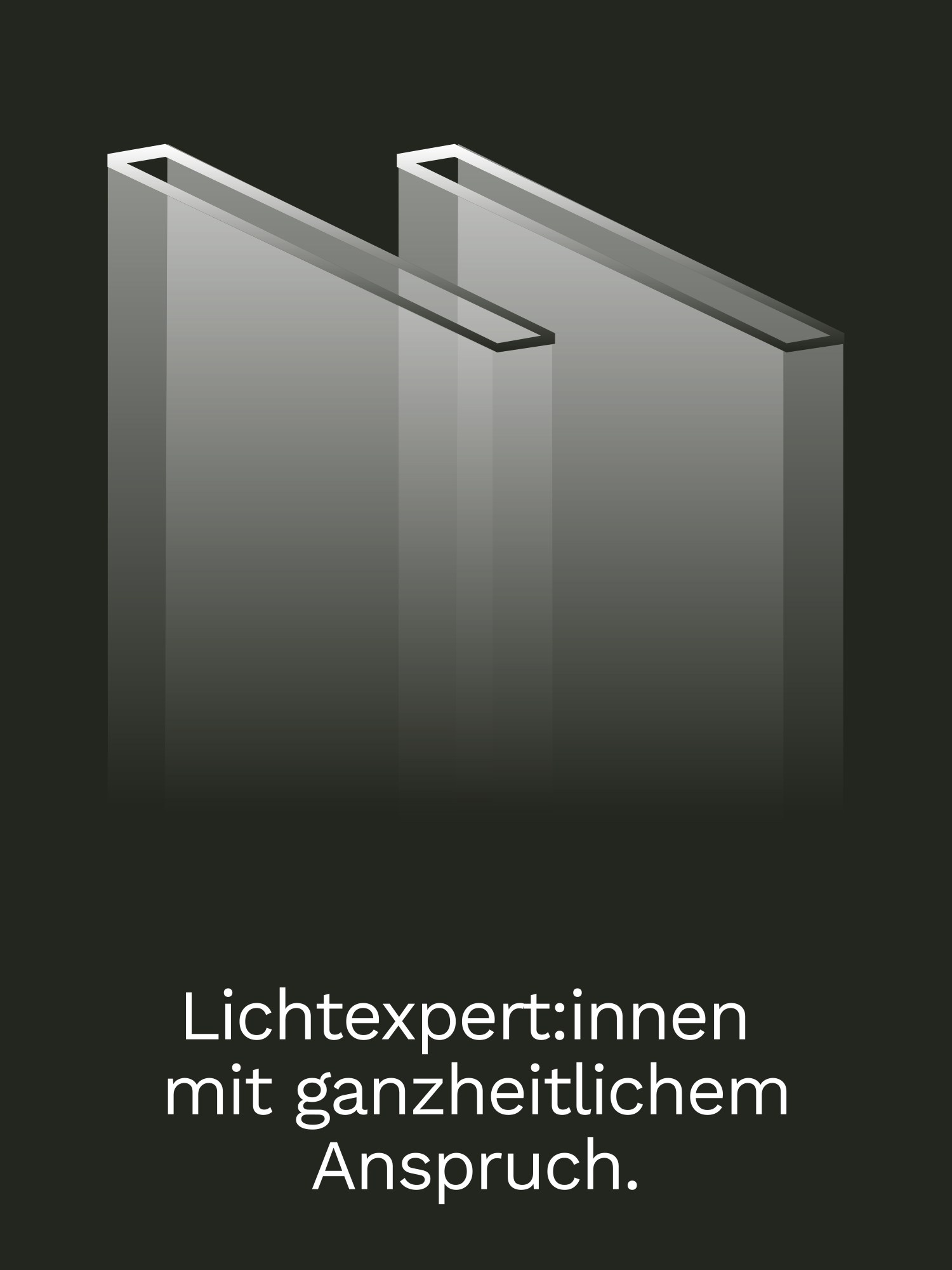
Building up, not tearing down, was the right path for us. No break with what was there. The characteristic logo and the deep green stayed, because they worked and were recognisable. We added a strong yellow as a complementary colour and a modernised form language that brings order to the three sites. Instead of dressing up a single medium, we thought the identity across media from the start: a system that works across analogue and digital, and guides a mixed audience instead of sorting it. So what Lichtagentur got was not a new face. It was a sharpened one.
03 Result
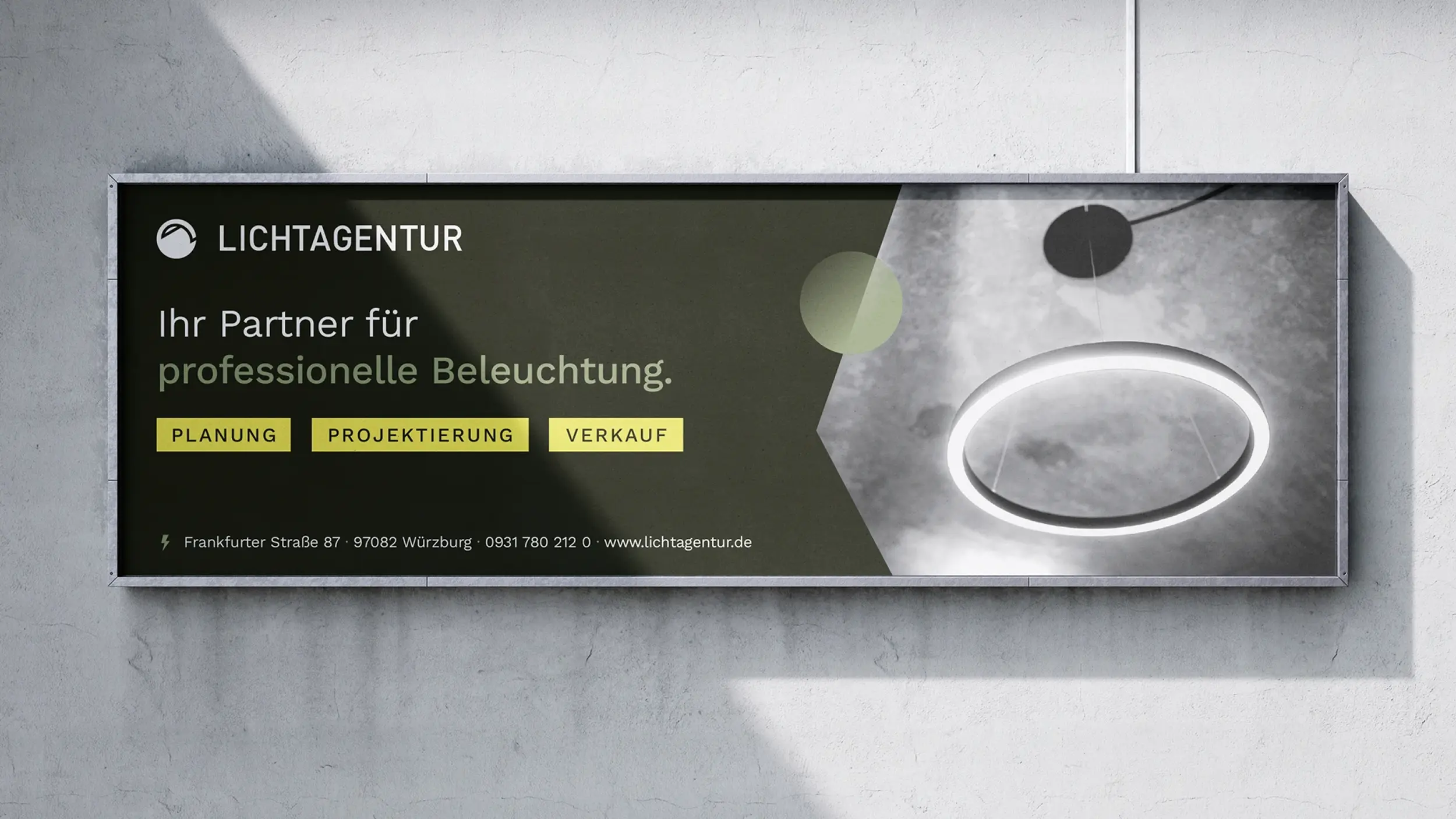
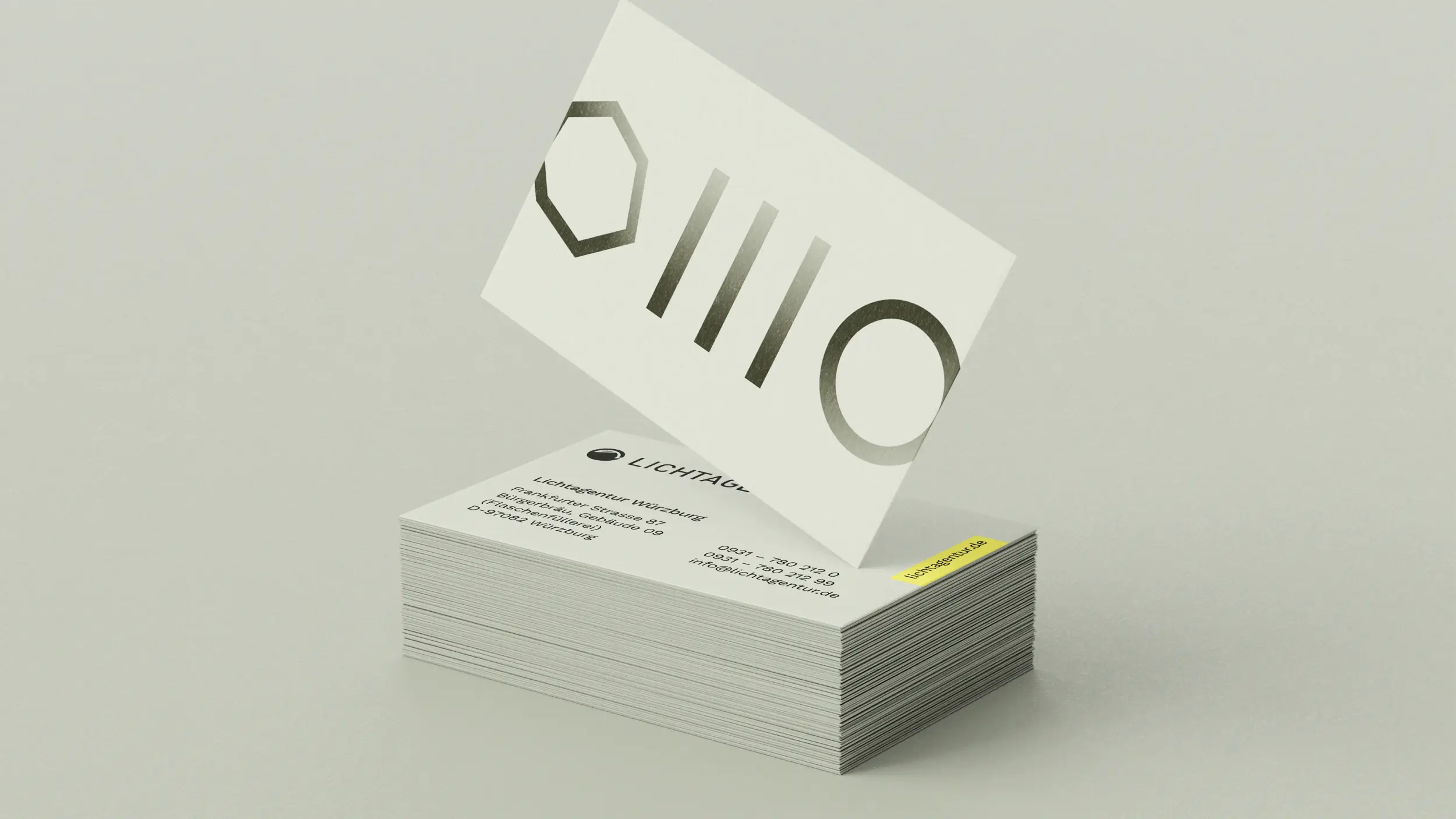
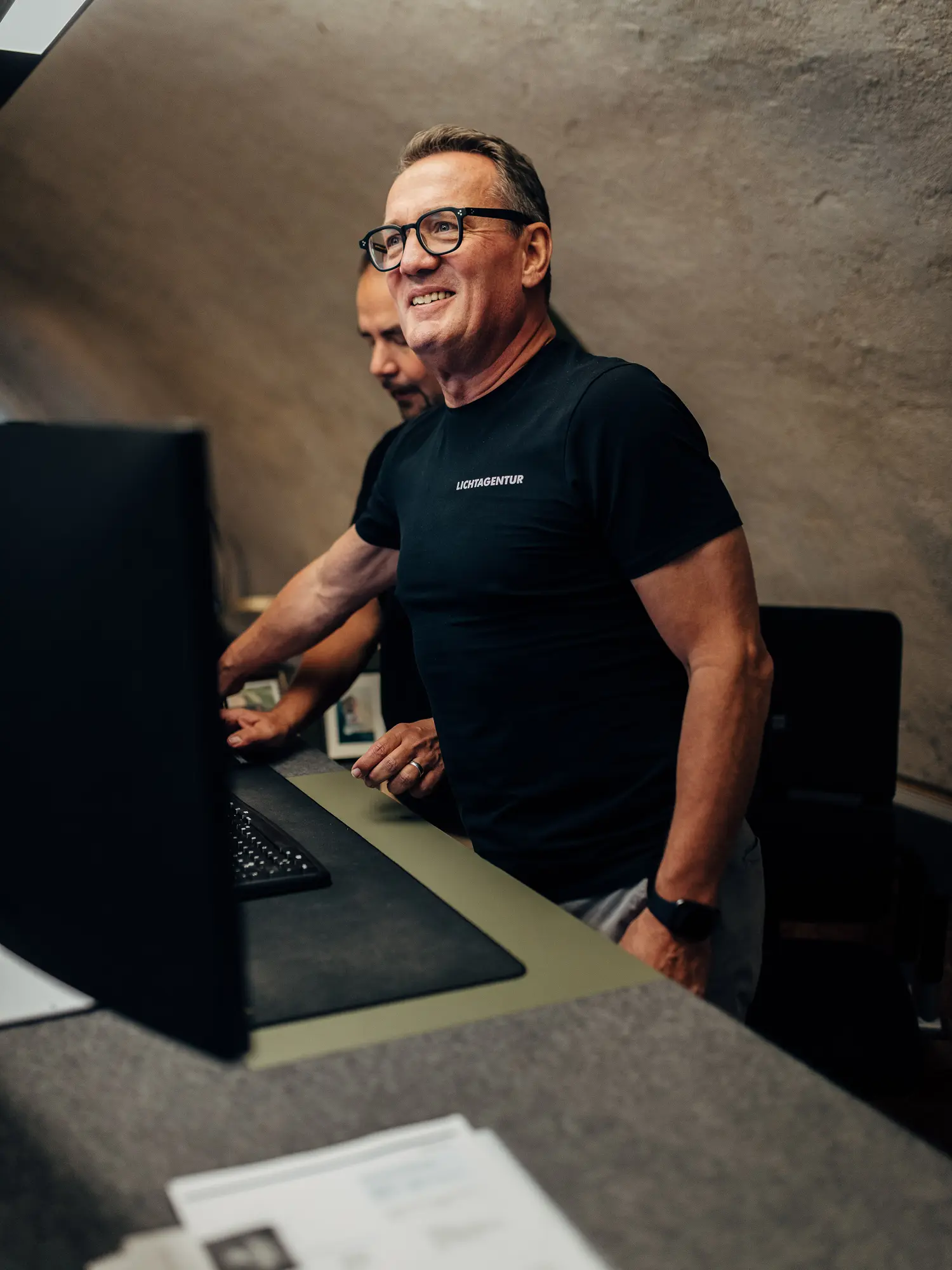
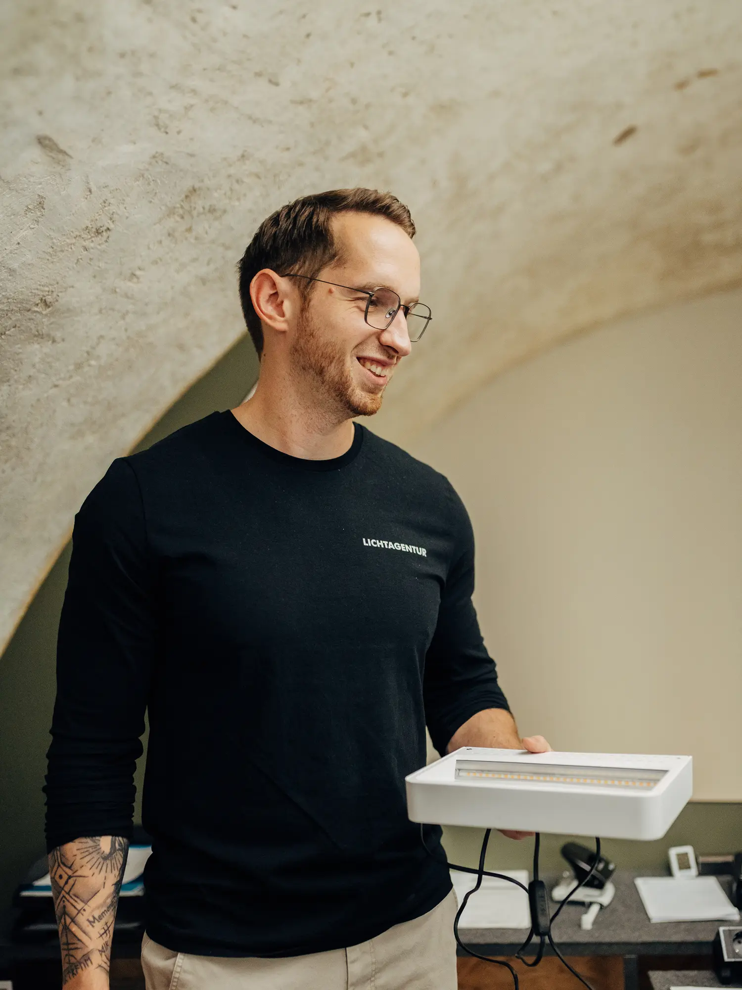
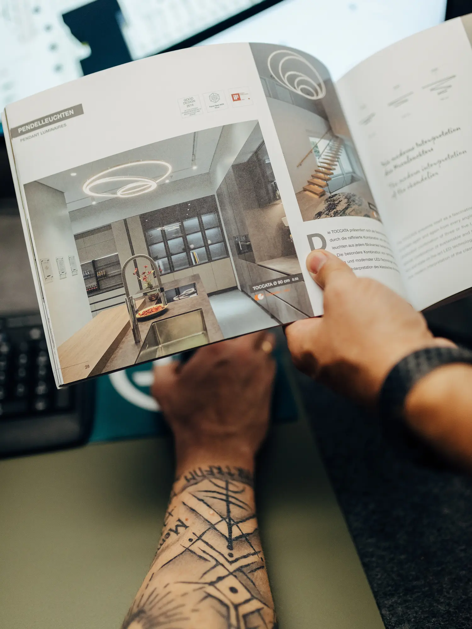
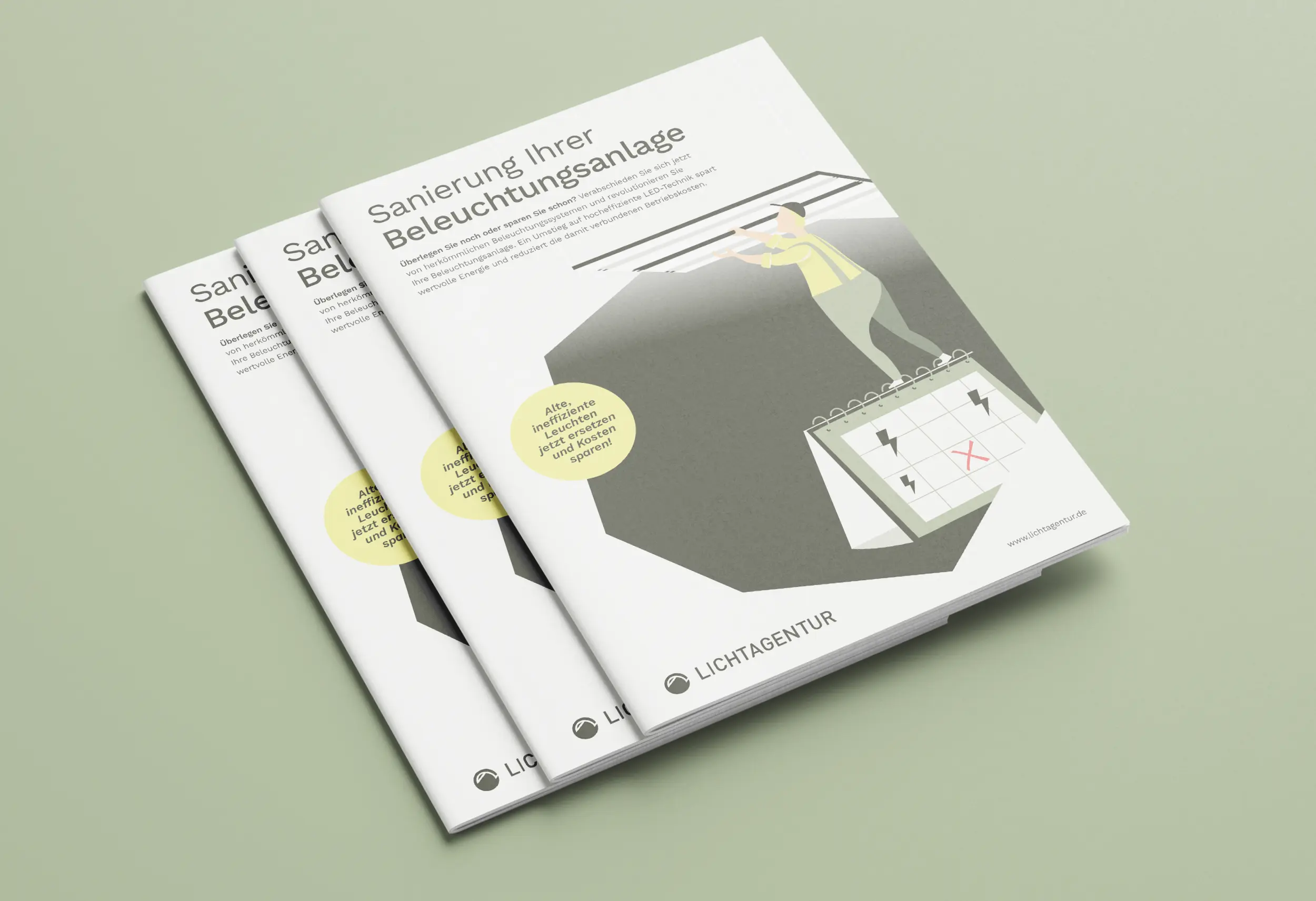
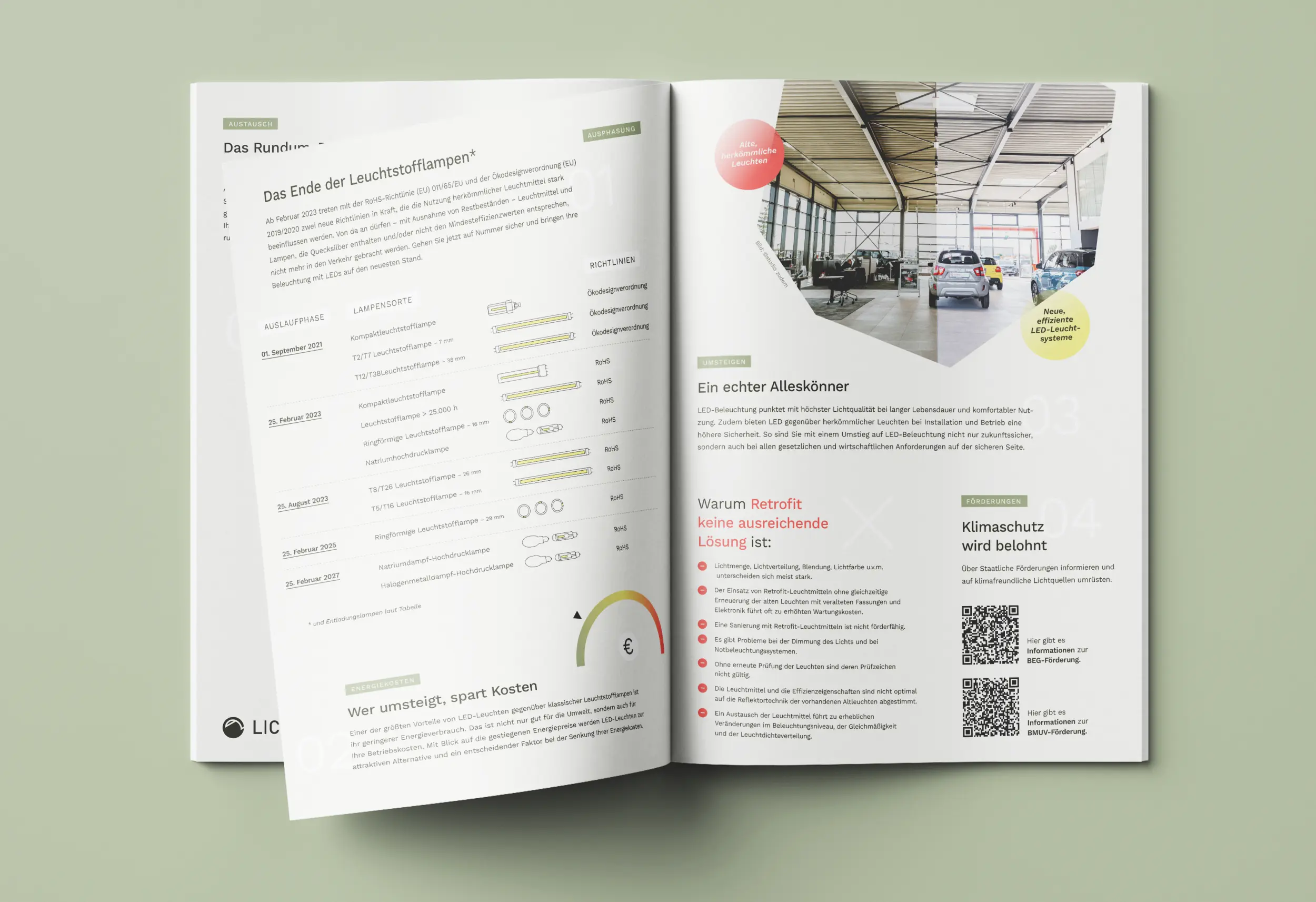
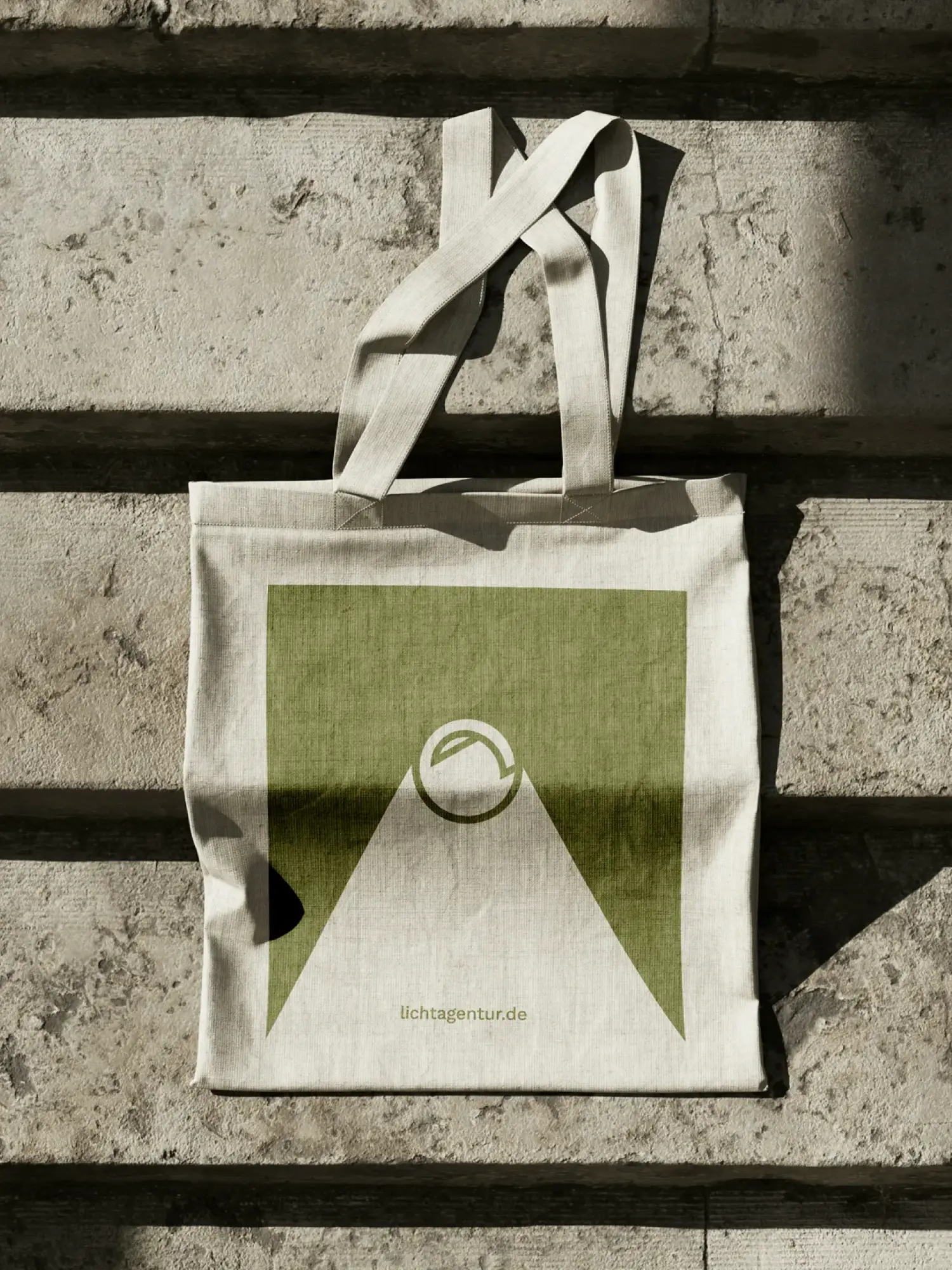
From that ground, over years, came a joined-up identity that we have been supporting since 2021, and extending piece by piece. We built the website as the central point of contact, with dedicated landing pages for specific audiences and dedicated industry pages. Over time came a wide range from one system: print ads and job ads, flyers for fairs and openings, brochures, business cards, and merchandise from tote bag to folding rule. Every format speaks the same language, from the first contact to the detail in the hand. What started as a corporate design revision today carries an identity that grows with them, instead of starting over at every occasion.
Client
Lichtagentur
Industry
Release
– today
Team


Book a call
01 Context
Three sites, three audiences, no shared identity. Lichtagentur has been bringing light into its clients' projects for years, in Würzburg, Nuremberg and Bamberg. Its own brand stayed in the shadow: grown, but uneven, read differently from site to site. Plus an audience that could hardly be more mixed, from a building contractor to a private customer. What was missing was an identity that holds all three sites together and speaks to both worlds, without losing one to the other.
02 Method
Building up, not tearing down, was the right path for us. No break with what was there. The characteristic logo and the deep green stayed, because they worked and were recognisable. We added a strong yellow as a complementary colour and a modernised form language that brings order to the three sites. Instead of dressing up a single medium, we thought the identity across media from the start: a system that works across analogue and digital, and guides a mixed audience instead of sorting it. So what Lichtagentur got was not a new face. It was a sharpened one.
03 Result
From that ground, over years, came a joined-up identity that we have been supporting since 2021, and extending piece by piece. We built the website as the central point of contact, with dedicated landing pages for specific audiences and dedicated industry pages. Over time came a wide range from one system: print ads and job ads, flyers for fairs and openings, brochures, business cards, and merchandise from tote bag to folding rule. Every format speaks the same language, from the first contact to the detail in the hand. What started as a corporate design revision today carries an identity that grows with them, instead of starting over at every occasion.
Client
Lichtagentur
Industry
Release
– today
Team
Book a call
Not enough? Ask your AI about us
Let's find out if we're a fit.
Let’s get to know each other and see whether we’re the right fit for your project. From there, we can shape a solution around what you actually need.
Friday, October 9, 2026
1
2
3
4
5
6
7
8
9
10
11
12
13
14
15
16
17
18
19
20
21
22
23
24
25
26
27
28
29
30
31
10:30
11:30
14:30
15:30
16:30
17:30
Let's find out if we're a fit.
Let’s get to know each other and see whether we’re the right fit for your project. From there, we can shape a solution around what you actually need.
Friday, October 9, 2026
1
2
3
4
5
6
7
8
9
10
11
12
13
14
15
16
17
18
19
20
21
22
23
24
25
26
27
28
29
30
31
10:30
11:30
14:30
15:30
16:30
17:30