Rebranding and corporate design for Würzburg's oldest herb shop
More than a herb shop
More than a herb shop
01 Context
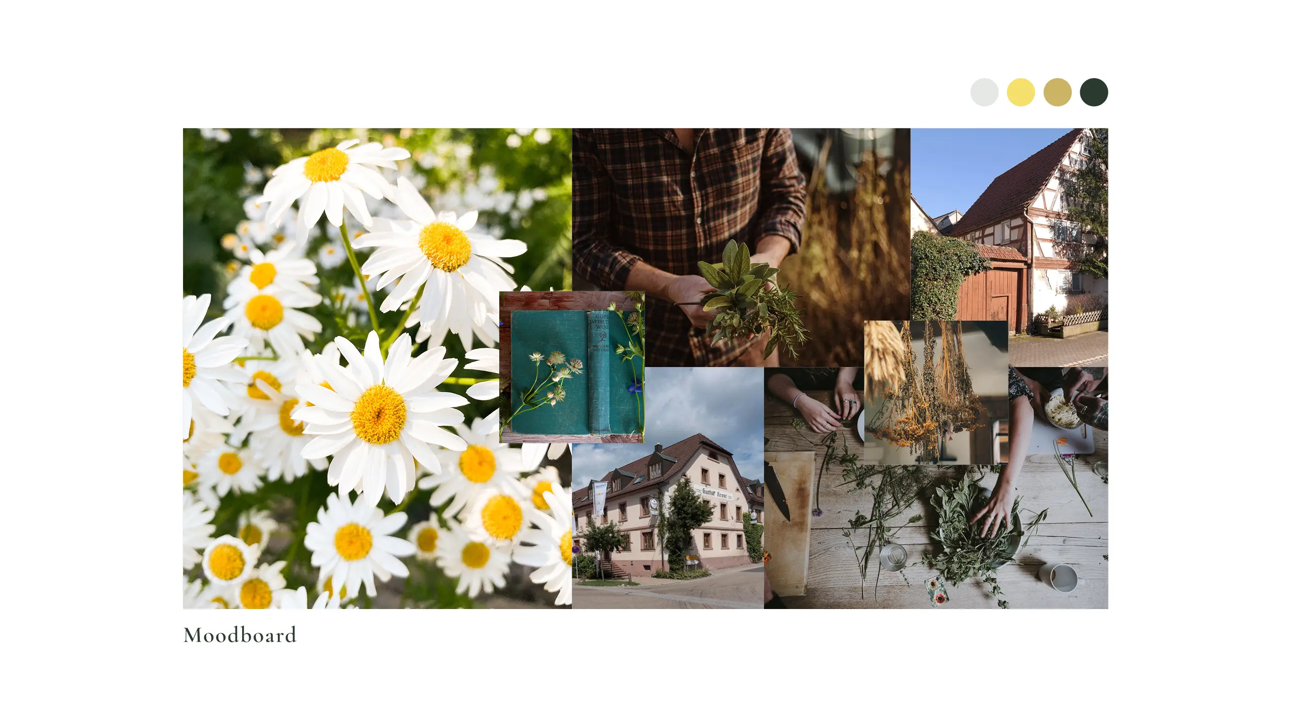
Kräutersepp. The herb shop. Rosa Kräuter. Over almost a hundred years a Würzburg herb business has seen new owners, new names, new faces again and again. But never a continuous brand. The tradition sat in the place and in the craft, not in an identity you recognise. When two new owners took over the shop, the question many owner-run traditional businesses face came up: how do you draw a line under a patchwork of names, without denying the history regulars are attached to? A relaunch that cut the roots would have wiped away what was familiar. Simply carrying on would have left the shop in yesterday, especially now, when natural is in demand again.
02 Method
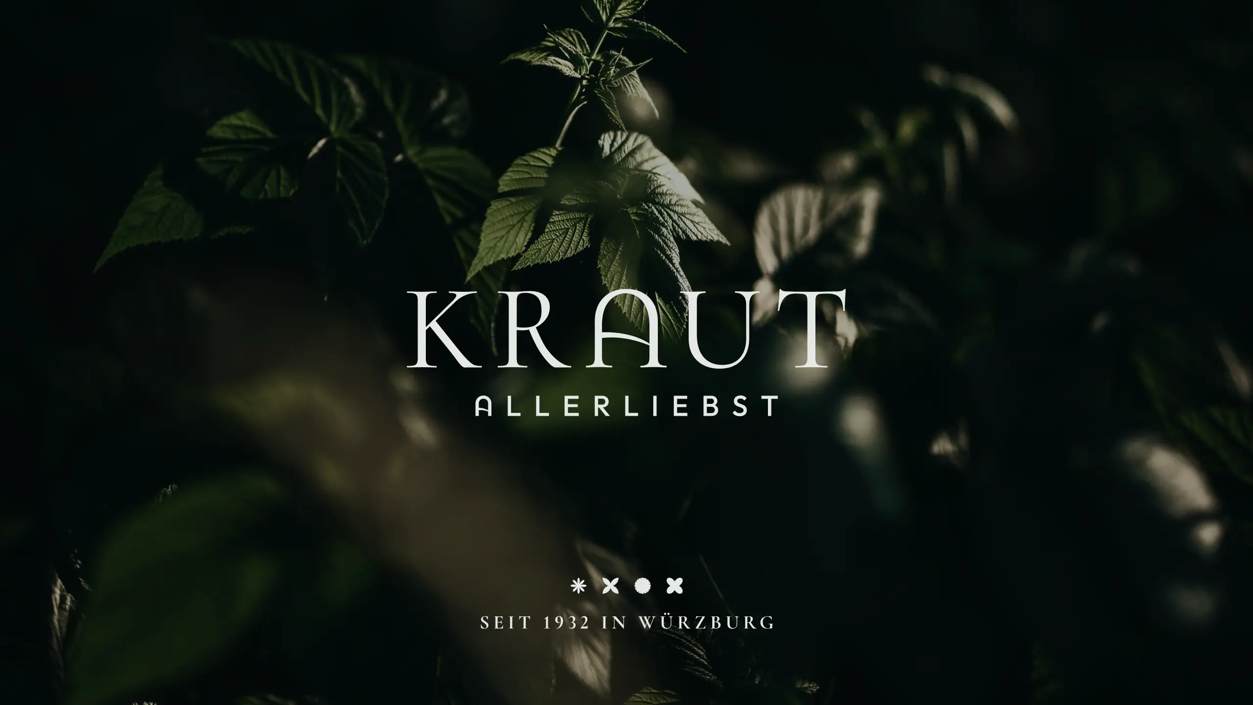
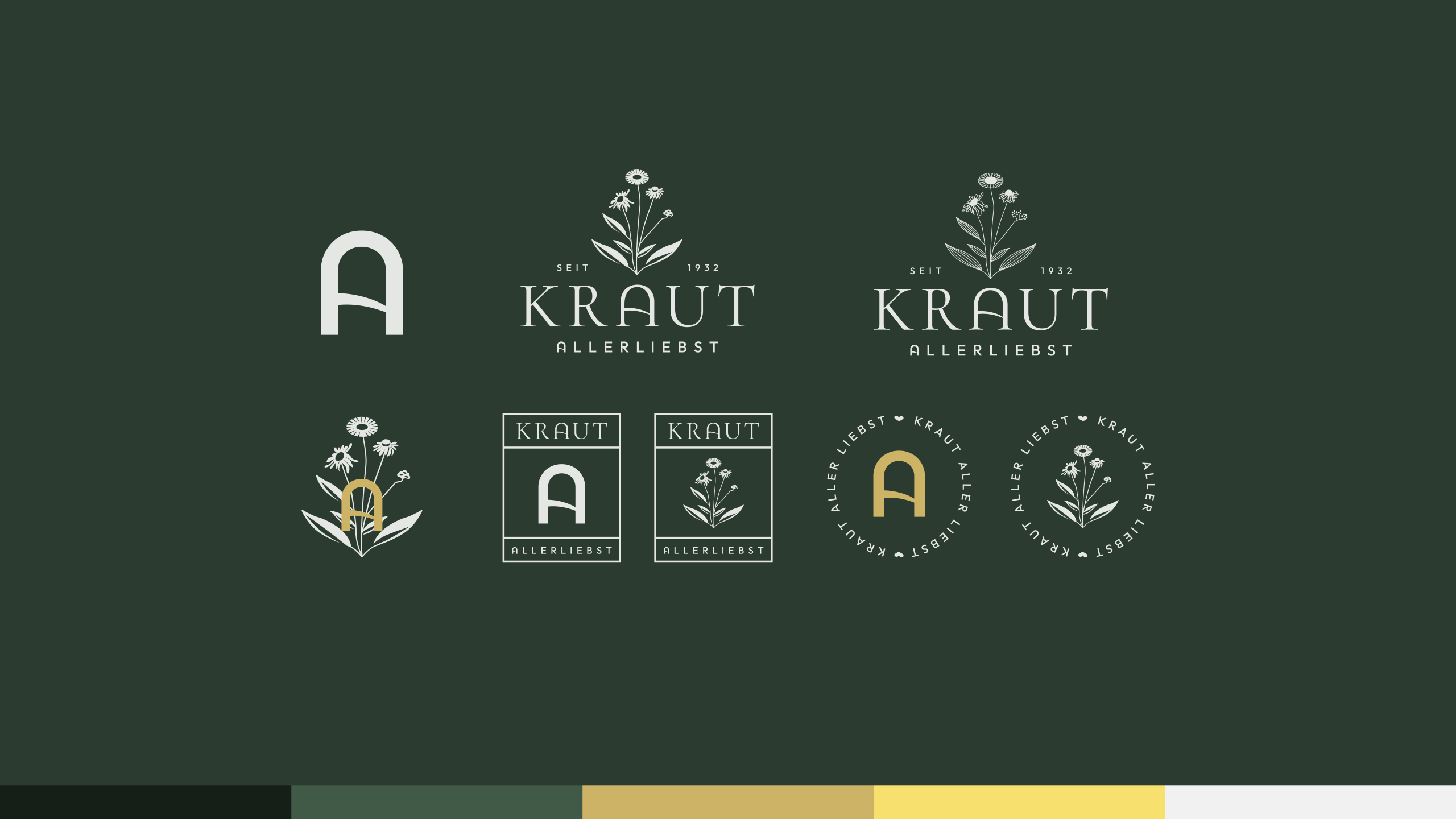
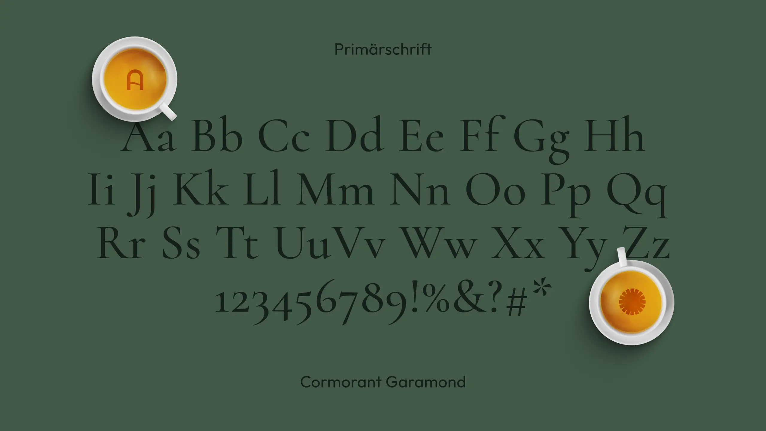
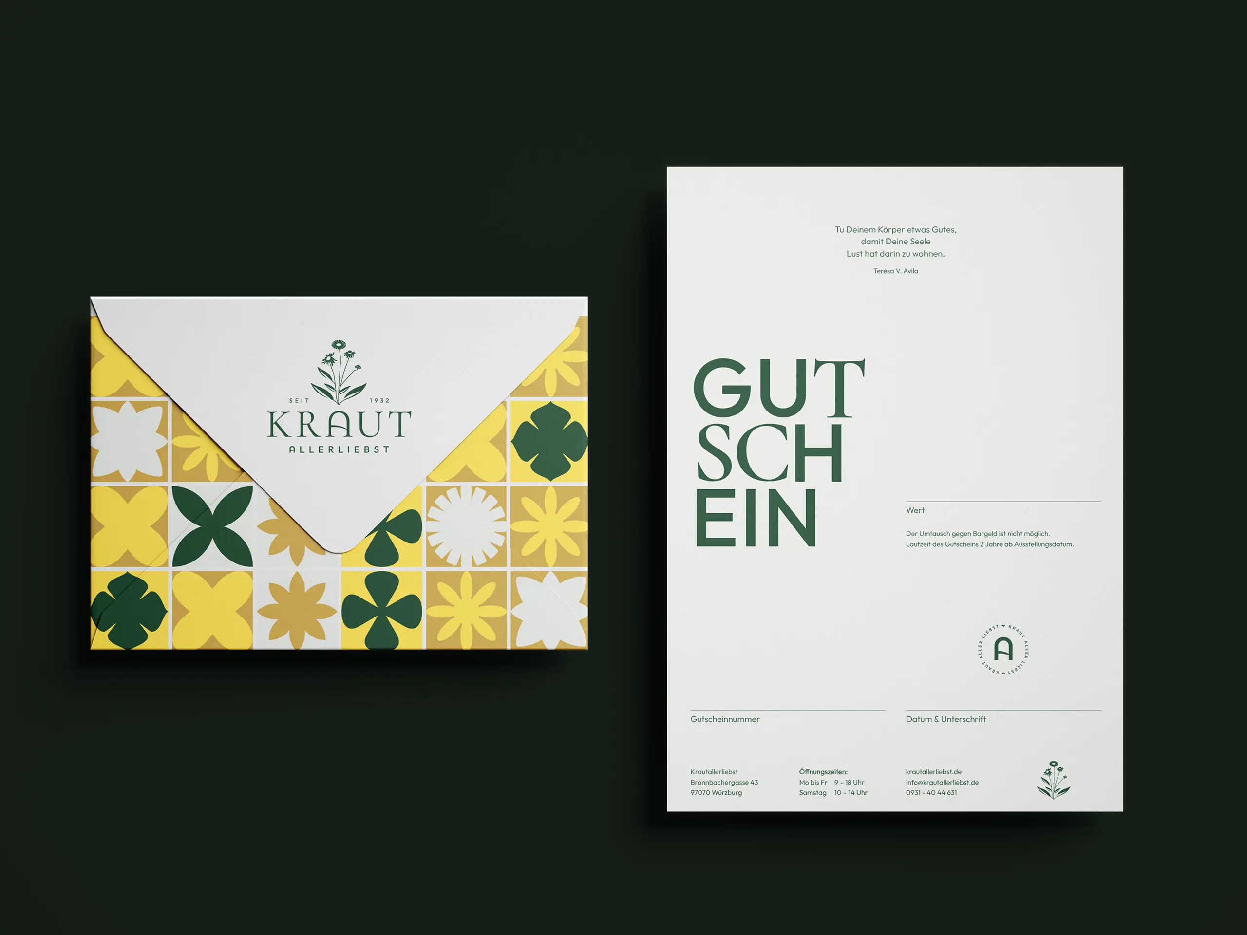
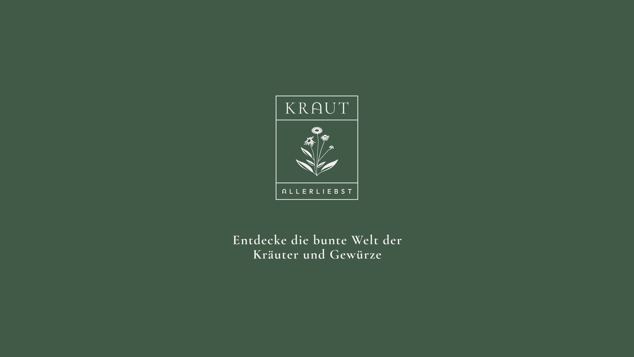
High-quality tradition meets playful modernity. We didn't resolve that tension. We made it the principle. Instead of continuing one of the old identities, we developed with Krautallerliebst a new name and a design system that holds origin and departure together. At the core is a high-contrast wordmark. The herbs set in the middle tie the brand directly to the range. The "A" we drew is more than a letter: it stands as a monogram for "Allerliebst", its curve also sketches a herb field sloping to the horizon, and it sits in the bowl of a spice scoop. One sign, three meanings. That gives the brand a firm anchor, and a recognition that carries across generations of customers.
03 Result
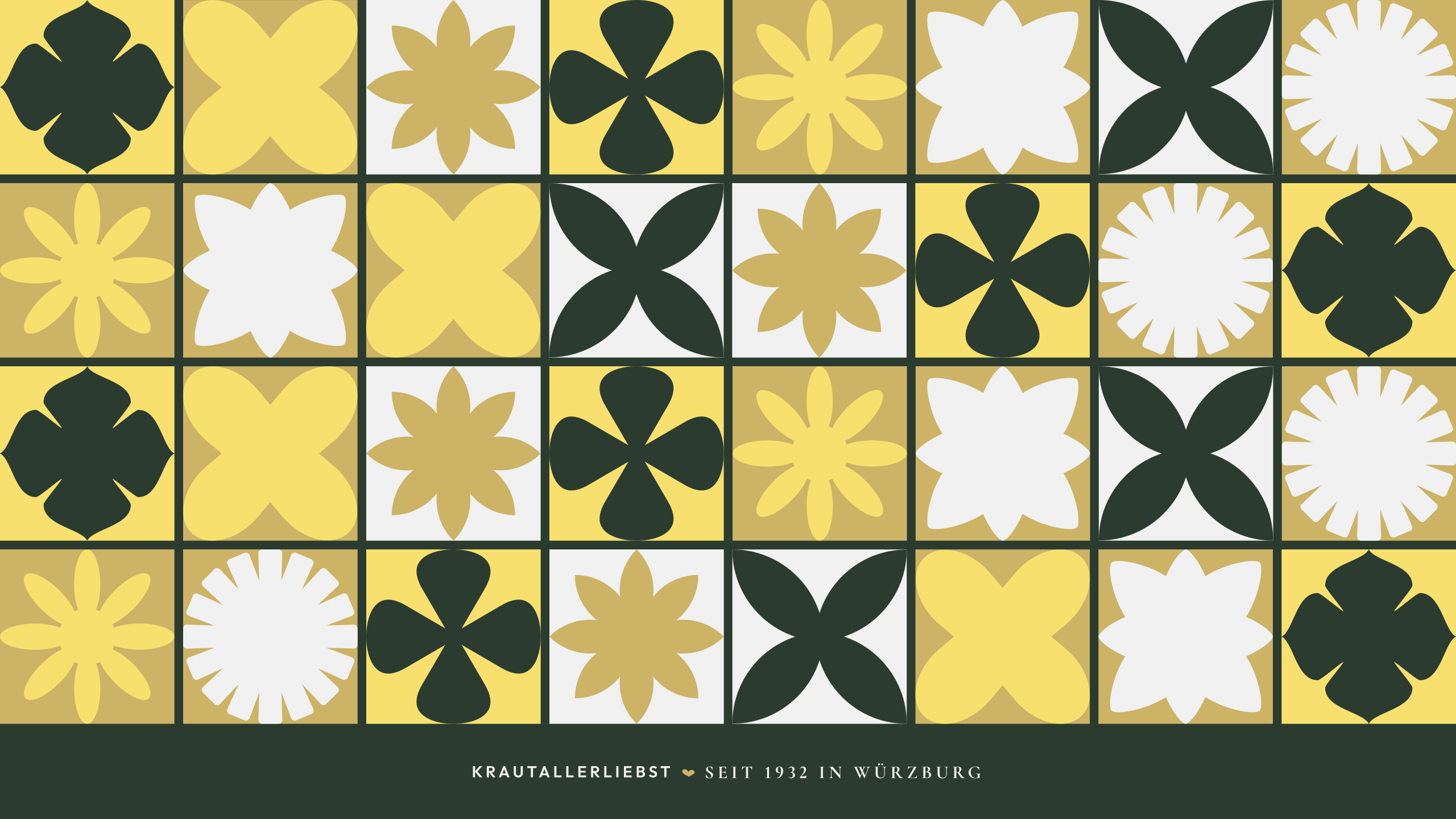
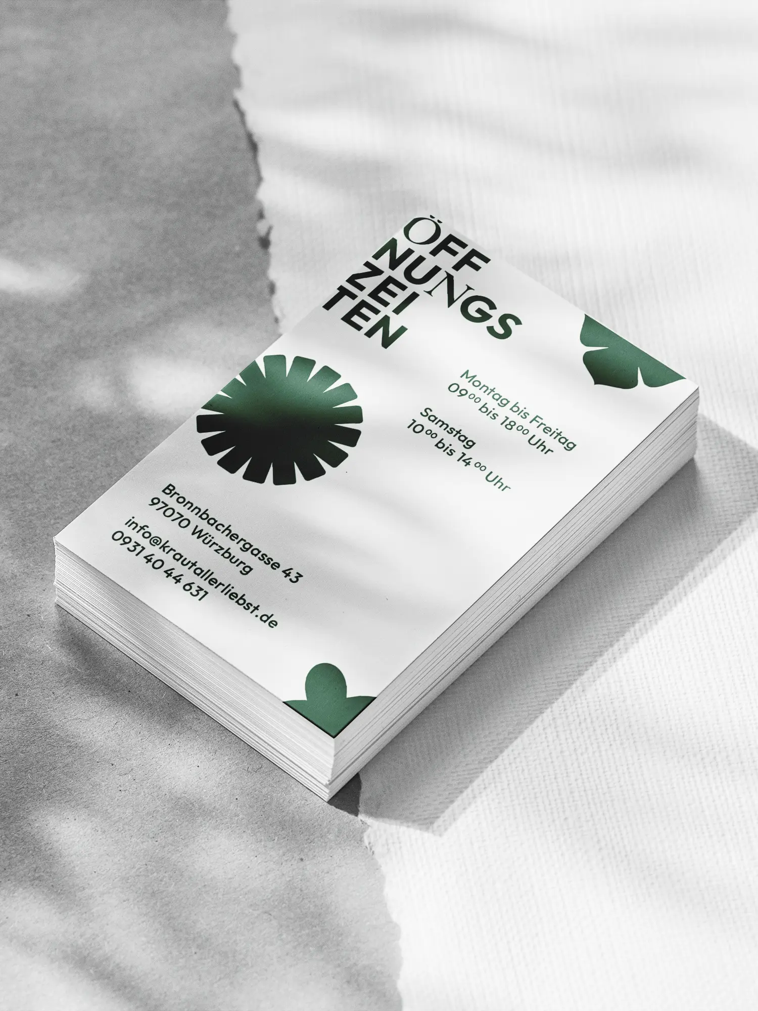
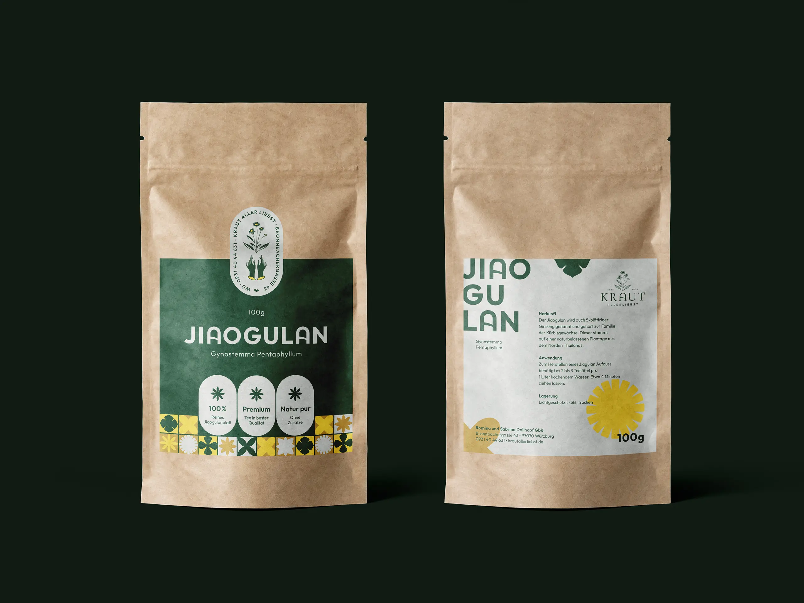
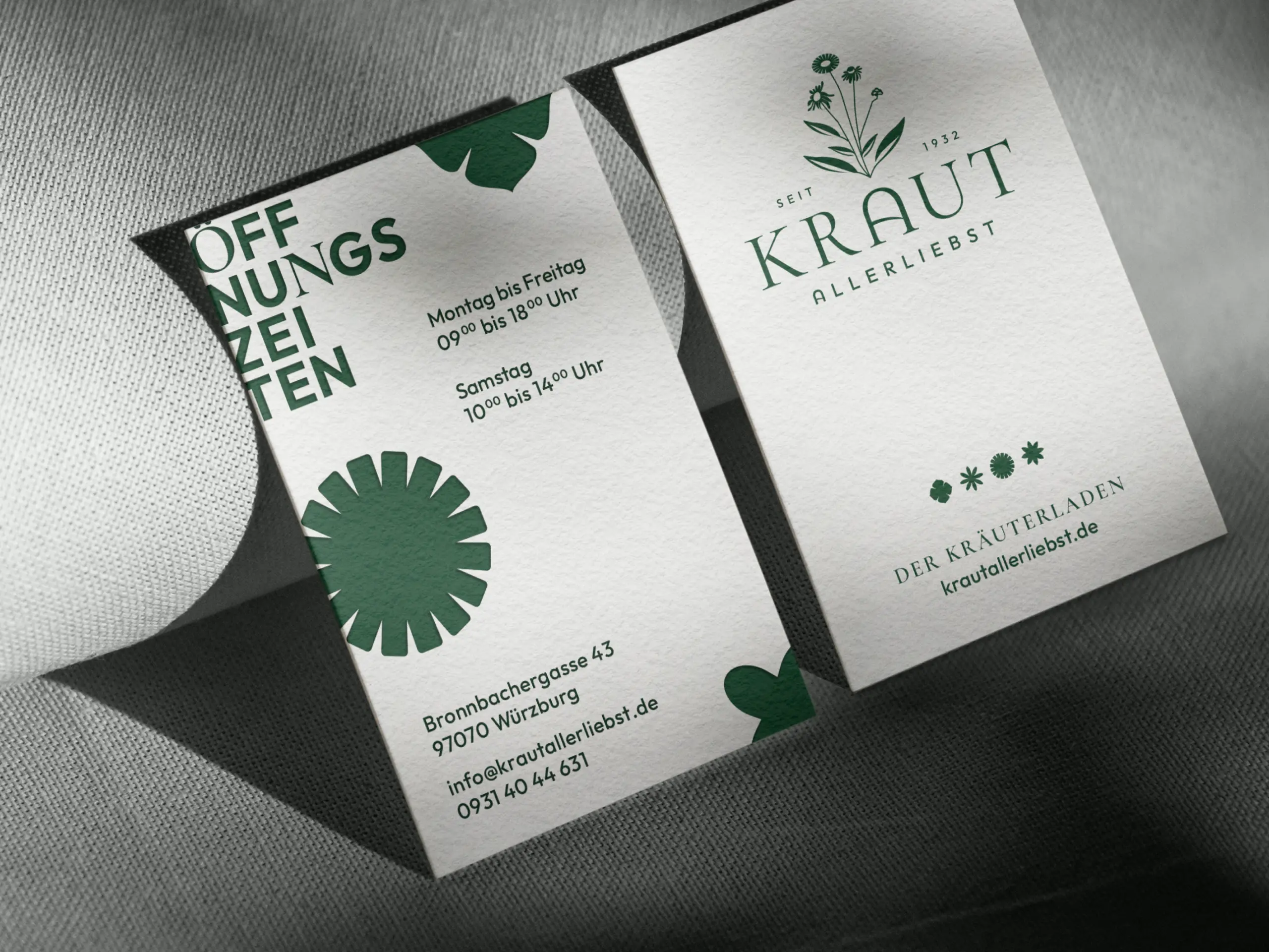
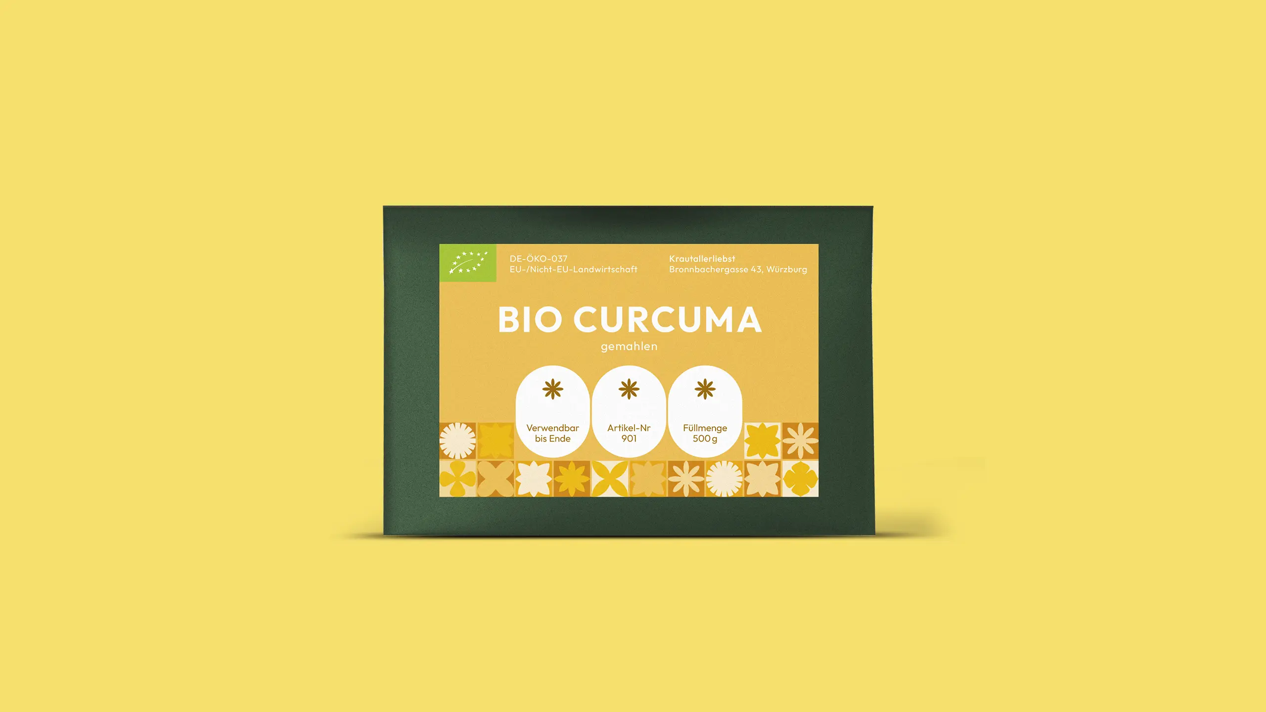
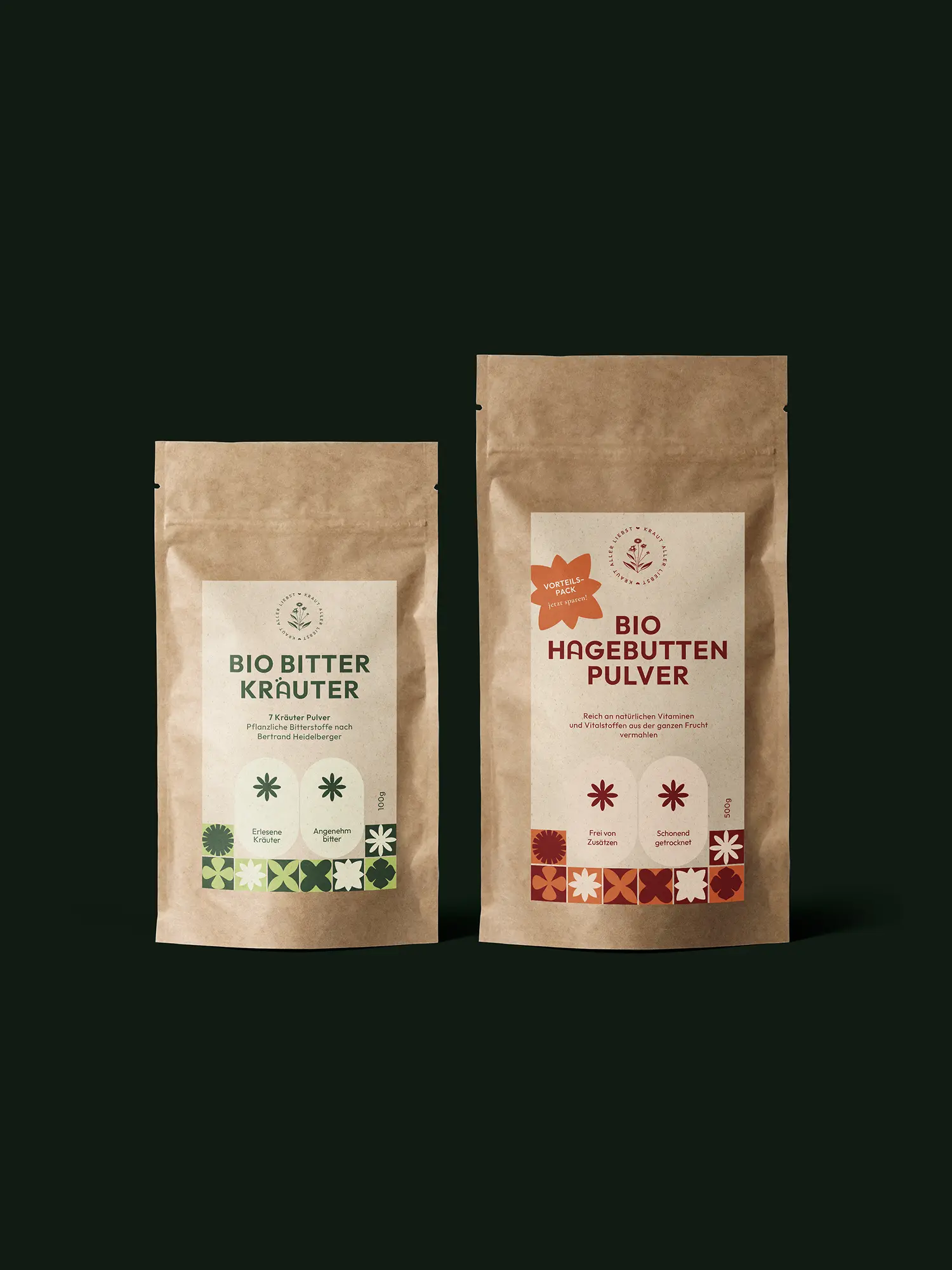
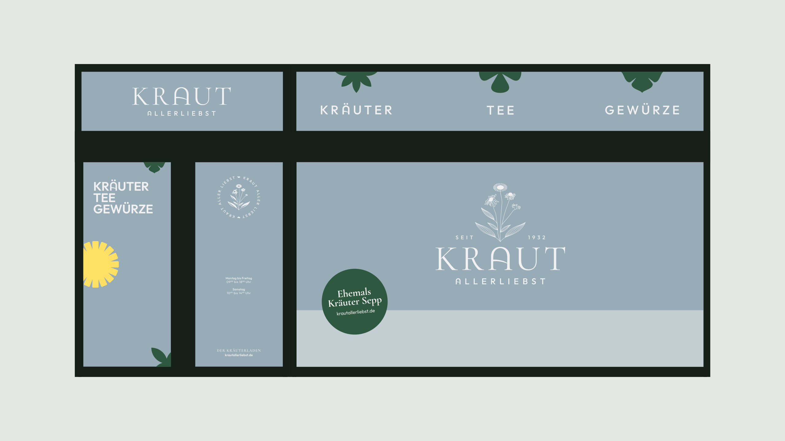
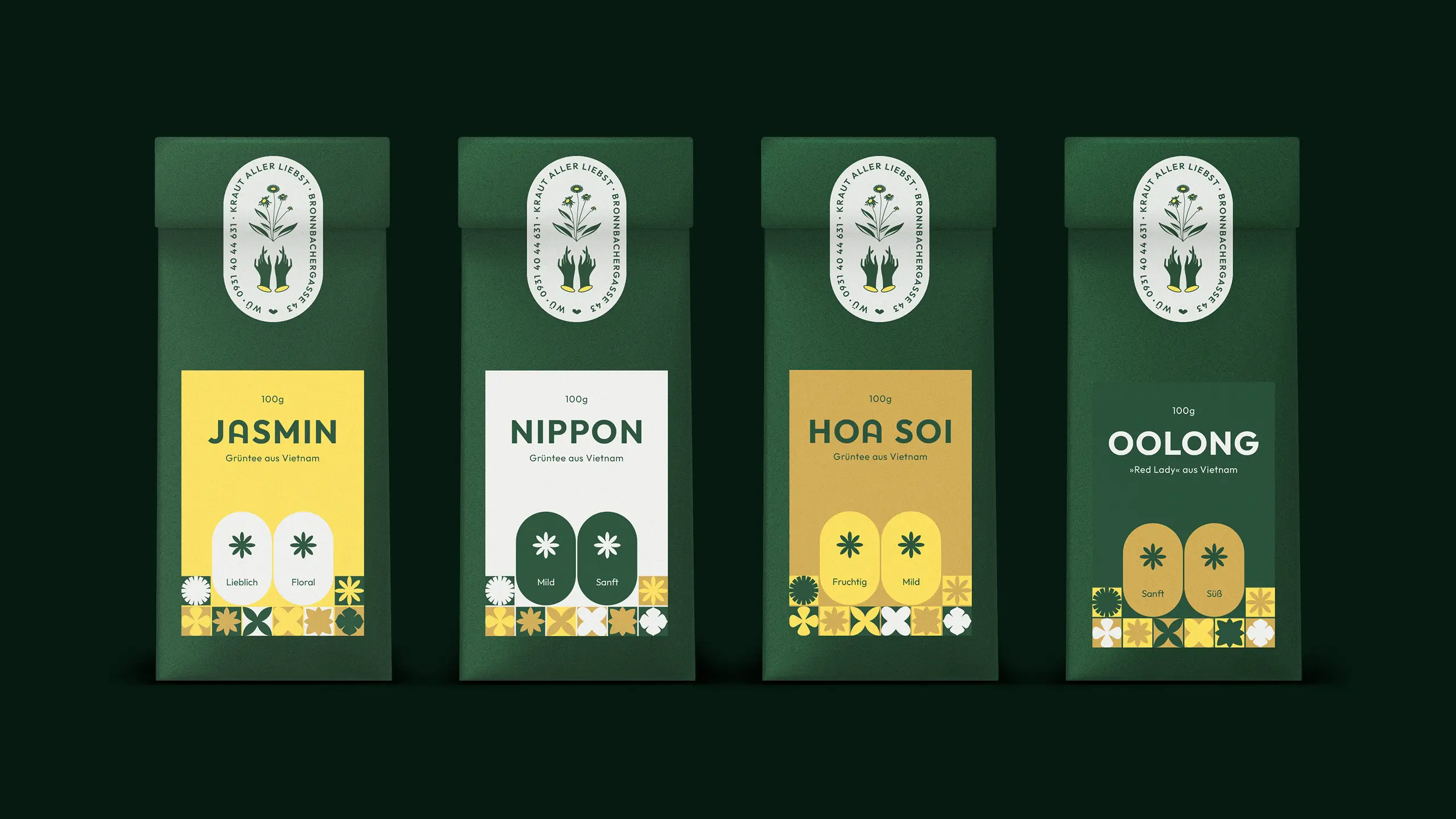
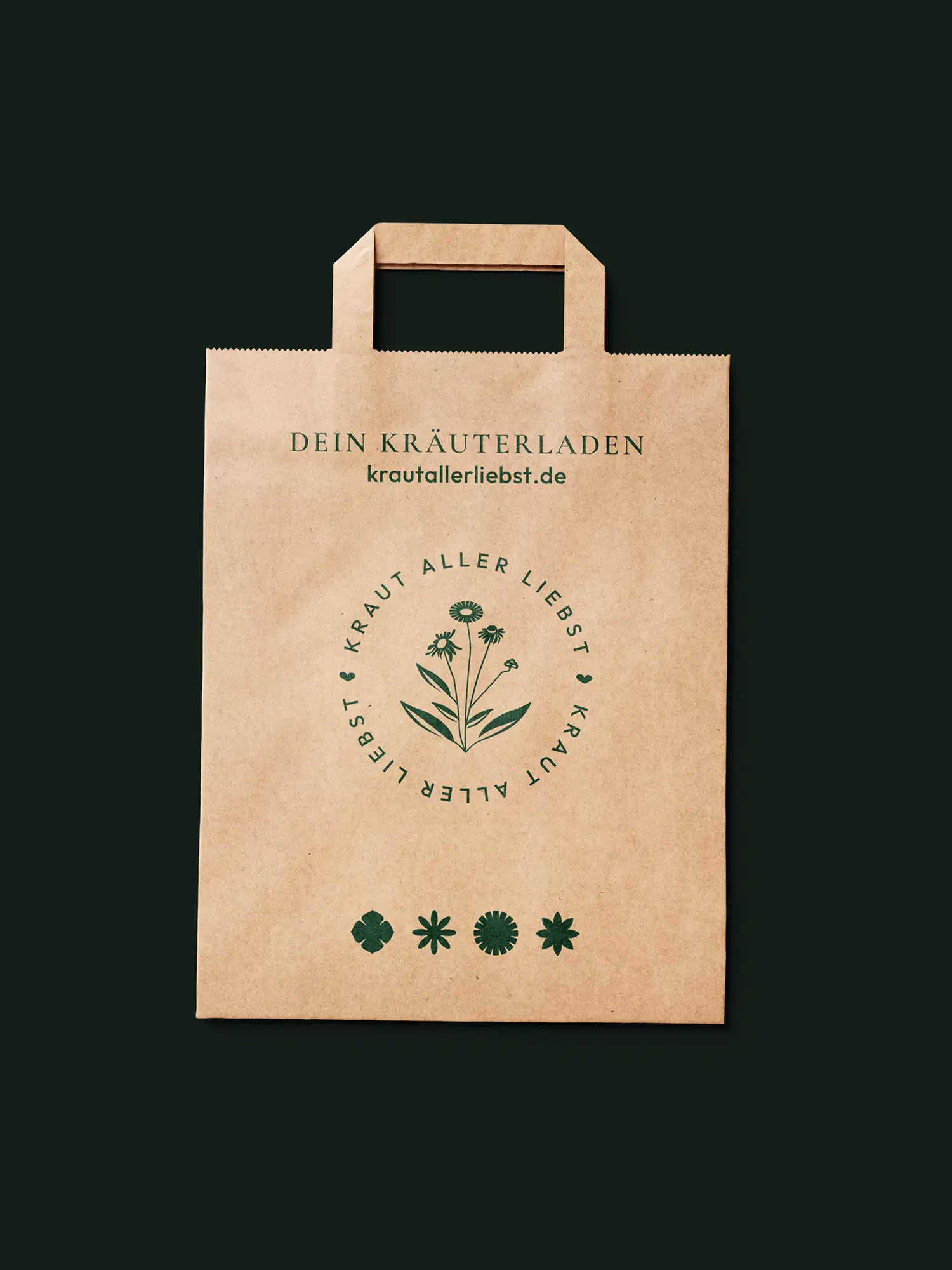
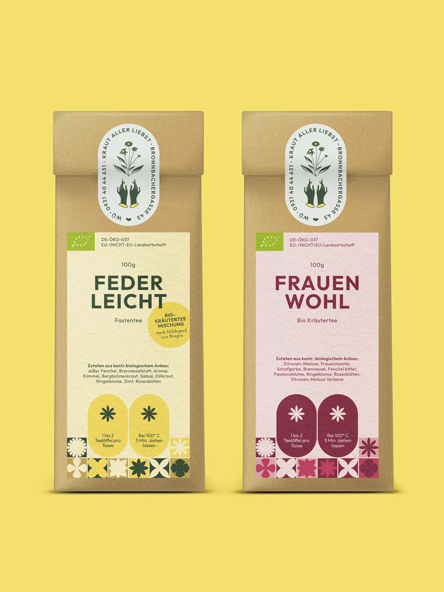
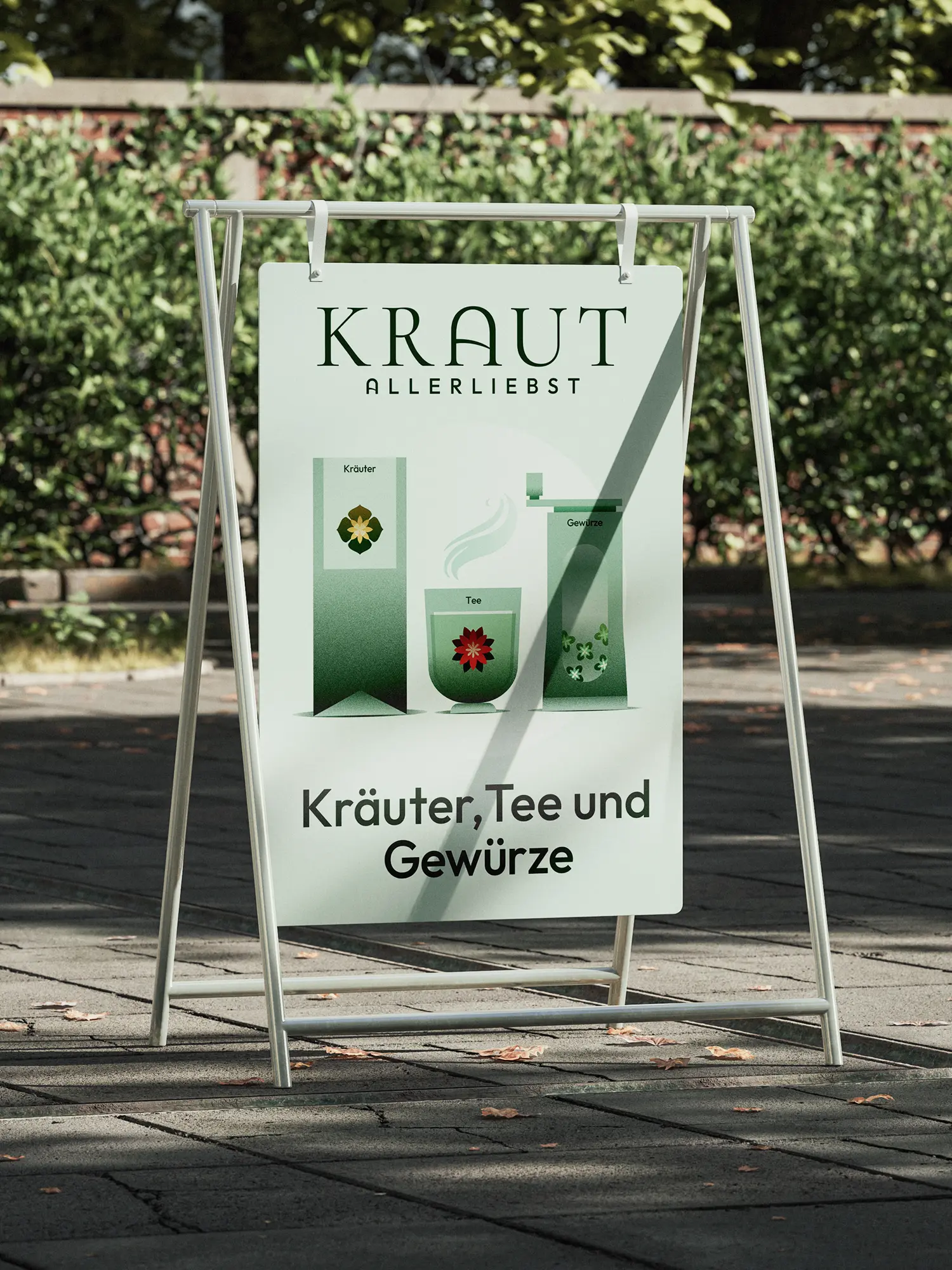
From a shop with many names came a brand that holds to its tradition without closing itself to change. Krautallerliebst today appears as a companion and adviser around naturopathy, not only as retail space, with an identity that runs through from the shop to the shelf. We designed the full corporate design and the stationery: business cards, flyers, letterhead and vouchers, plus the shop lettering and a packaging system for more than 60 of their own tea and herb varieties. That system is what makes the difference: it doesn't only work in their own shop. It also holds up on someone else's shelf. So the products now sit beyond Würzburg in regional retail at Edeka and Rewe. The brand reaches further than the shop it comes from.
Client
Kraut Allerliebst
Industry
Release
– today
Team




Book a call
01 Context
Kräutersepp. The herb shop. Rosa Kräuter. Over almost a hundred years a Würzburg herb business has seen new owners, new names, new faces again and again. But never a continuous brand. The tradition sat in the place and in the craft, not in an identity you recognise. When two new owners took over the shop, the question many owner-run traditional businesses face came up: how do you draw a line under a patchwork of names, without denying the history regulars are attached to? A relaunch that cut the roots would have wiped away what was familiar. Simply carrying on would have left the shop in yesterday, especially now, when natural is in demand again.
02 Method
High-quality tradition meets playful modernity. We didn't resolve that tension. We made it the principle. Instead of continuing one of the old identities, we developed with Krautallerliebst a new name and a design system that holds origin and departure together. At the core is a high-contrast wordmark. The herbs set in the middle tie the brand directly to the range. The "A" we drew is more than a letter: it stands as a monogram for "Allerliebst", its curve also sketches a herb field sloping to the horizon, and it sits in the bowl of a spice scoop. One sign, three meanings. That gives the brand a firm anchor, and a recognition that carries across generations of customers.
03 Result
From a shop with many names came a brand that holds to its tradition without closing itself to change. Krautallerliebst today appears as a companion and adviser around naturopathy, not only as retail space, with an identity that runs through from the shop to the shelf. We designed the full corporate design and the stationery: business cards, flyers, letterhead and vouchers, plus the shop lettering and a packaging system for more than 60 of their own tea and herb varieties. That system is what makes the difference: it doesn't only work in their own shop. It also holds up on someone else's shelf. So the products now sit beyond Würzburg in regional retail at Edeka and Rewe. The brand reaches further than the shop it comes from.
Client
Kraut Allerliebst
Industry
Release
– today
Team
Book a call
Not enough? Ask your AI about us
Let's find out if we're a fit.
Let’s get to know each other and see whether we’re the right fit for your project. From there, we can shape a solution around what you actually need.
Friday, October 9, 2026
1
2
3
4
5
6
7
8
9
10
11
12
13
14
15
16
17
18
19
20
21
22
23
24
25
26
27
28
29
30
31
10:30
11:30
14:30
15:30
16:30
17:30
Let's find out if we're a fit.
Let’s get to know each other and see whether we’re the right fit for your project. From there, we can shape a solution around what you actually need.
Friday, October 9, 2026
1
2
3
4
5
6
7
8
9
10
11
12
13
14
15
16
17
18
19
20
21
22
23
24
25
26
27
28
29
30
31
10:30
11:30
14:30
15:30
16:30
17:30