Brand strategy and corporate design for the social agriculture project SAM
Garden and landscape. Fair and social.
Garden and landscape. Fair and social.
01 Context
Social work has many faces. One organisation, three fields of work, different audiences, and the aim to meet all of them with the same warmth and professionalism. That's where SAM stood, a meeting place for young people with special needs, and a project of KEEP Jugendhilfe in Schwarzach am Main. Three offers under one roof, each with its own job: ARCHE SAM, an educational retreat, GARTEN SAM, the garden and landscape work, and SAM as the bracket over them. The brief: a brand that holds all of that together, without the single fields losing their own face. A brand with room to grow. And with a point of view that's the same inside and out: every person is special, and SAM has a place for each of them.
02 Method
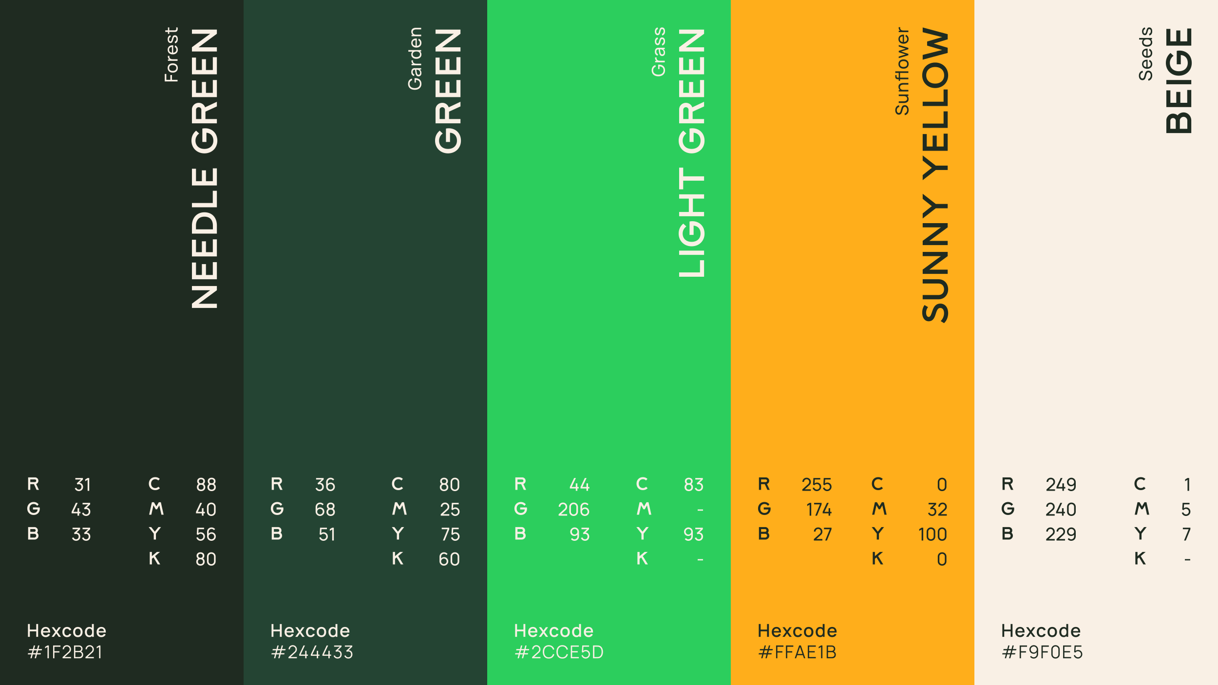
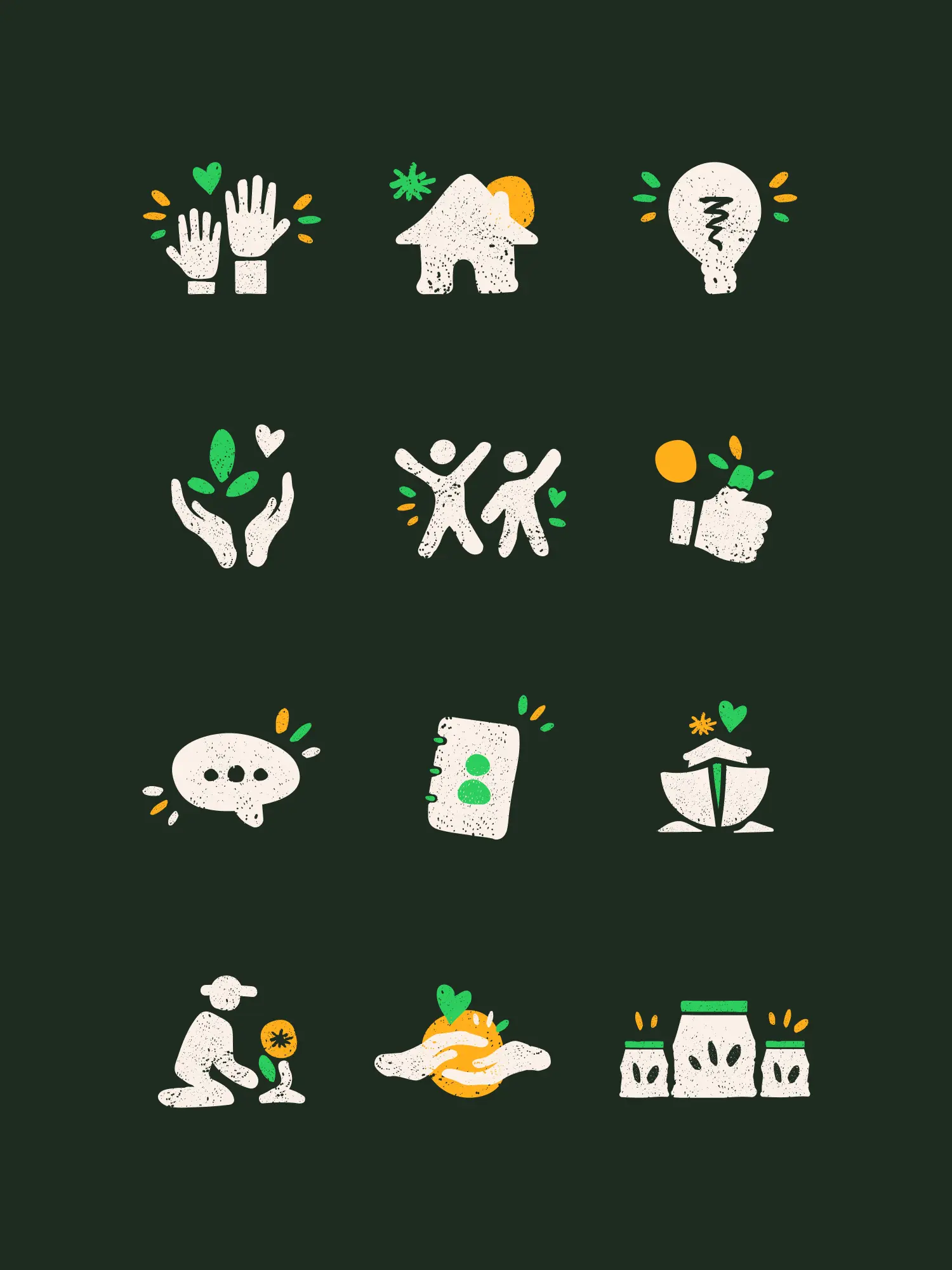
The strategic fork was the brand architecture. Instead of three loose offers side by side, we built SAM as an umbrella with independent sub-brands. ARCHE SAM and GARTEN SAM stand on their own, but belong together visibly. The connecting element we developed from the brand itself: a shared "A" and a stylised sun in the logo, which every single brand carries. So each field stays recognisable as its own brand, and still sits in the whole. In the design we translated the organisation's point of view directly: a slightly playful type that picks up the educational and social brief, own colour worlds per sub-brand, and a world of symbols for web and print. Light, warm, and as professional as it is kind. So the helping work meets a training that is practical, and close to nature.
03 Result
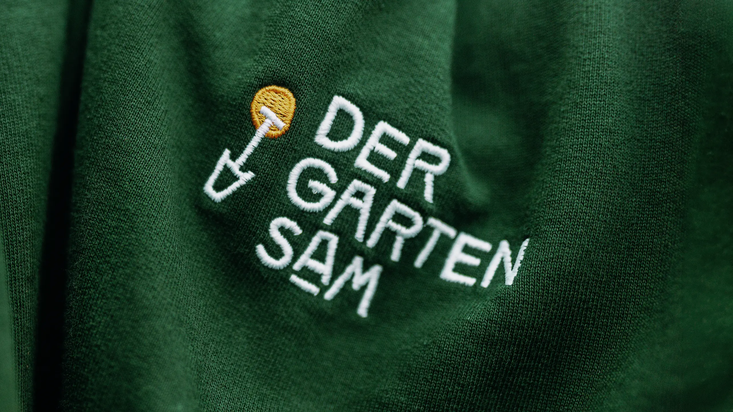
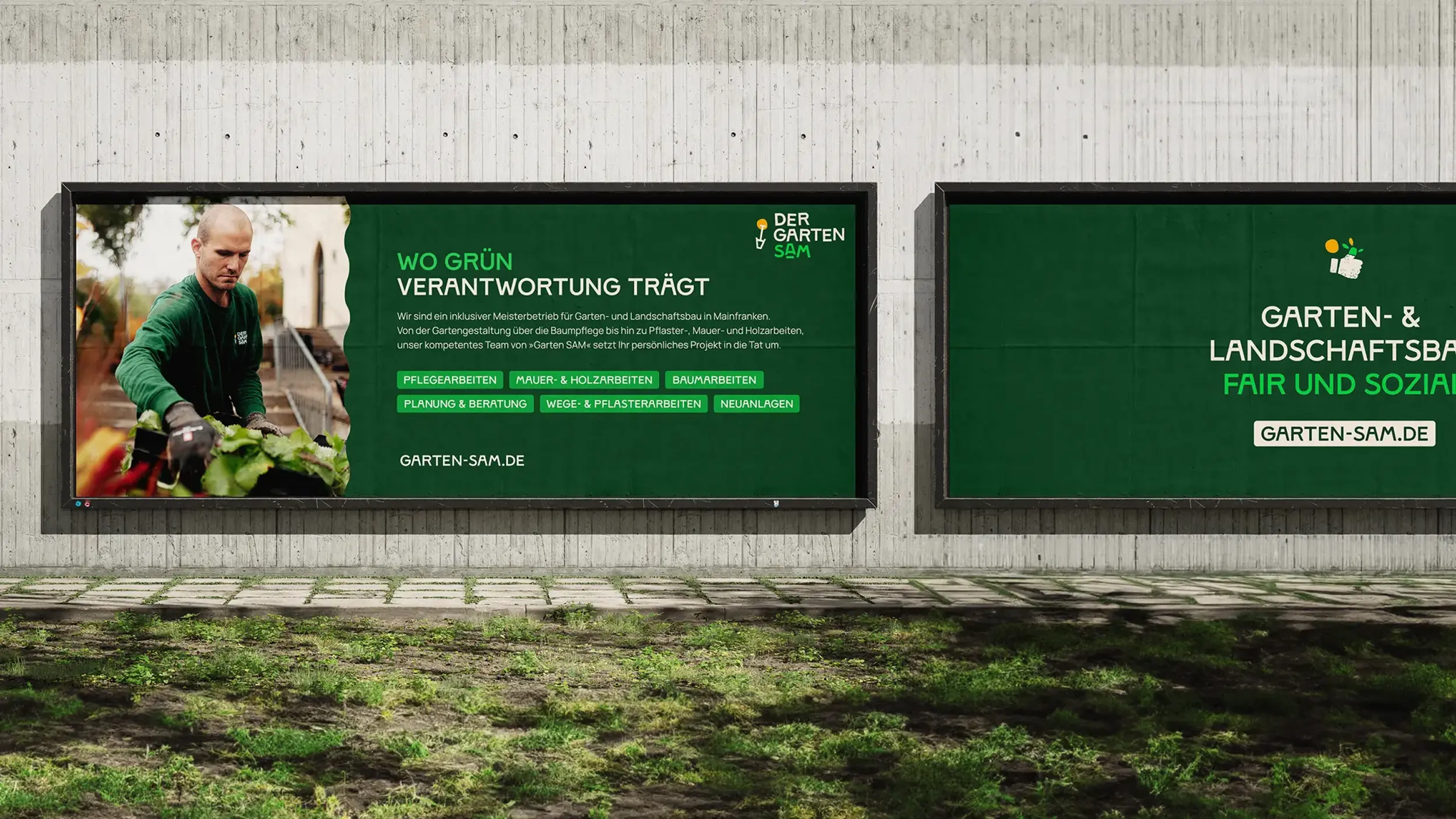
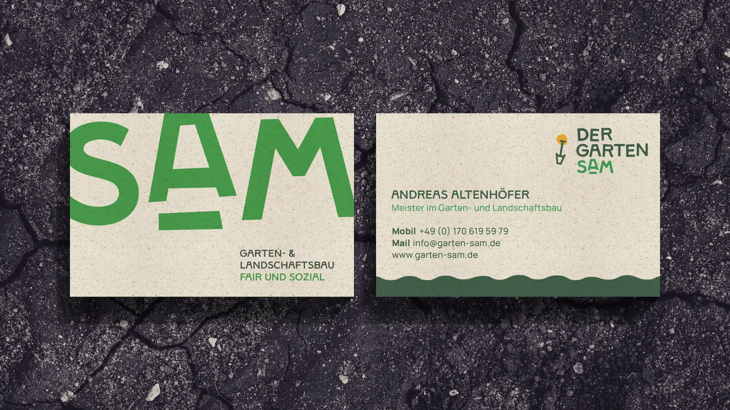
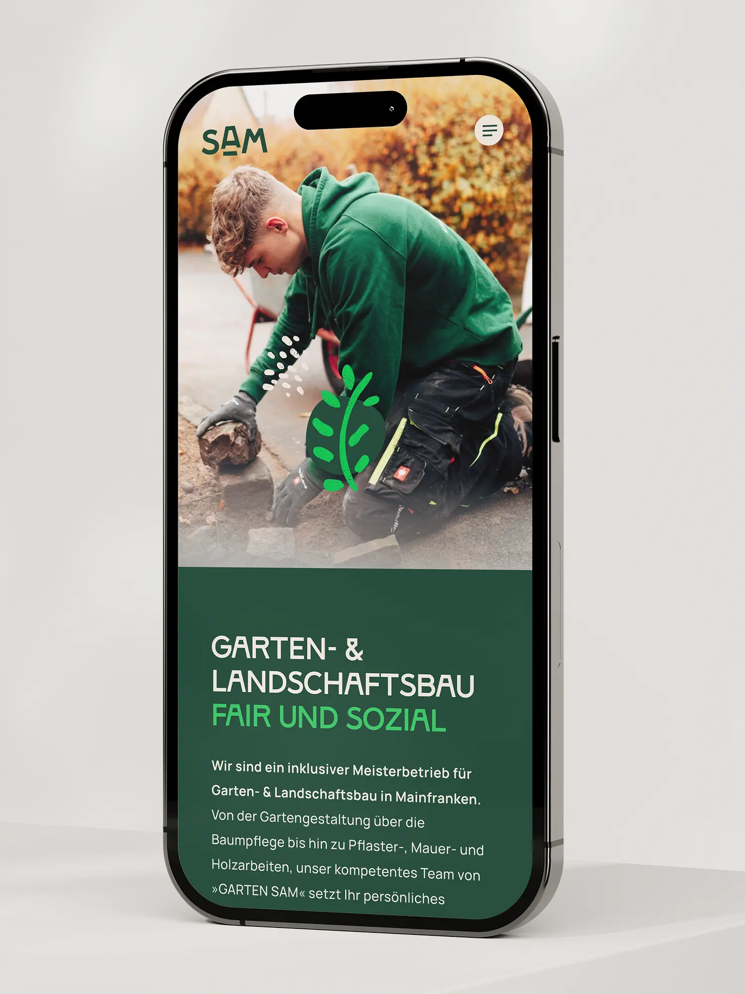
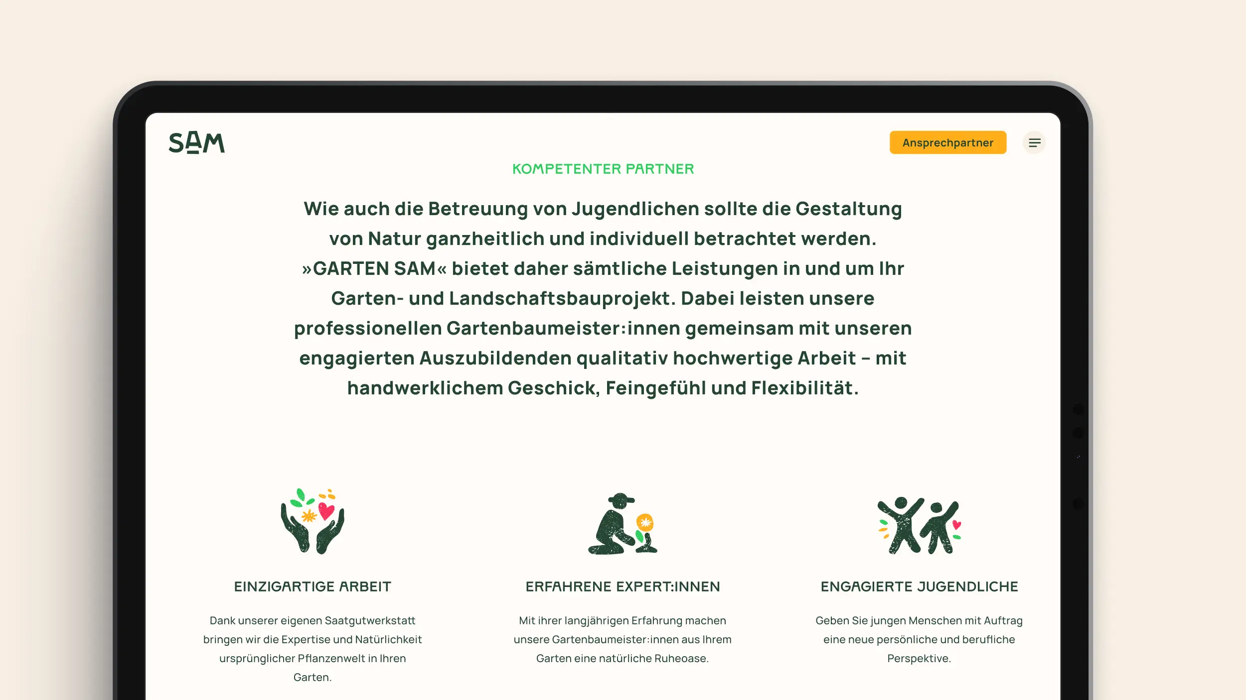
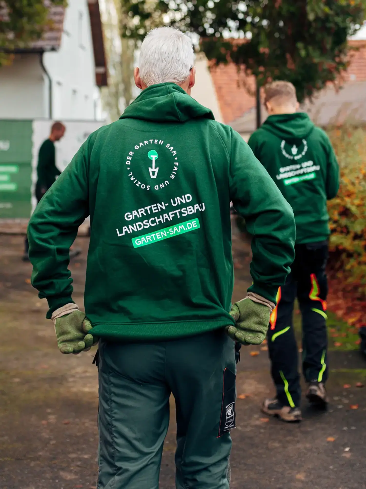
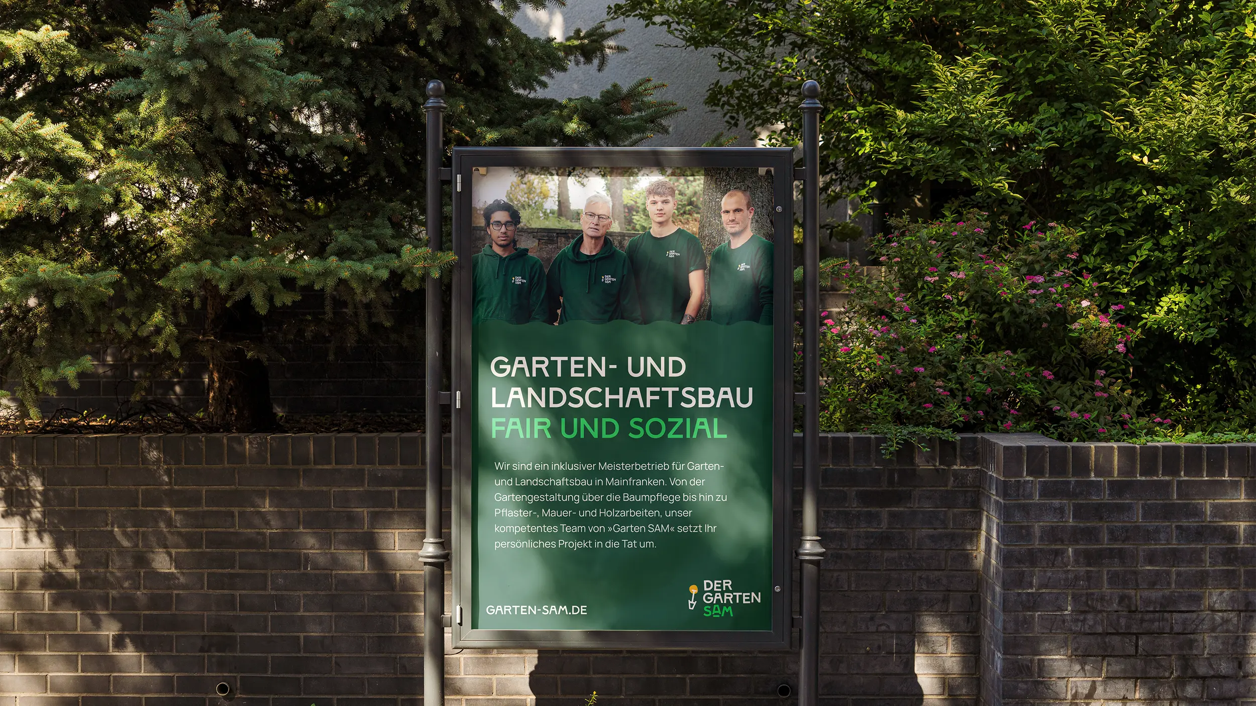
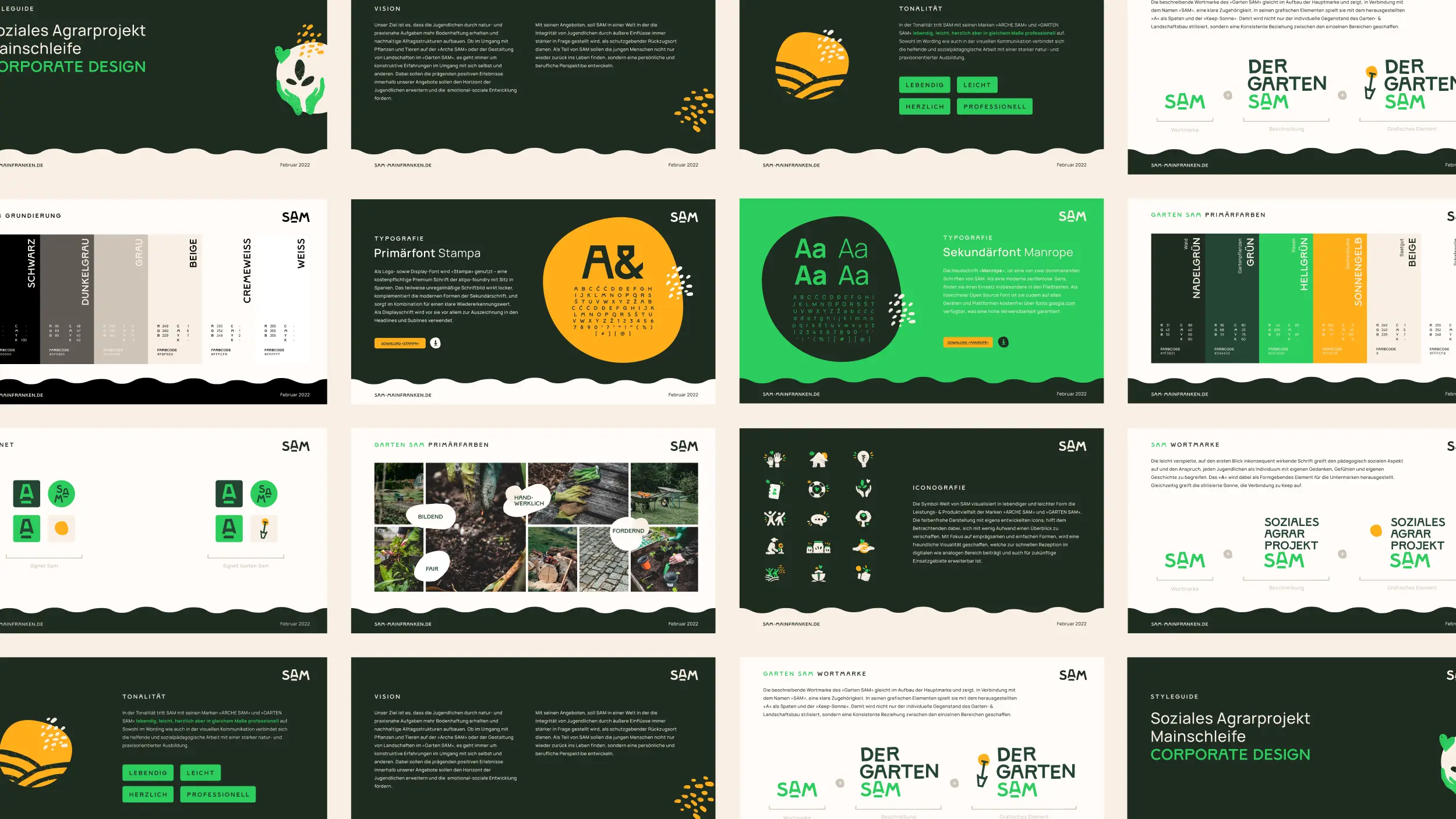
From the architecture came a brand that holds. For SAM and the sub-brands ARCHE SAM and GARTEN SAM we developed the corporate design, the website including development, and the copywriting. Plus print, vehicle livery and workwear. From strategy and brand architecture came a through-line, from the logo to the van. What matters isn't a single artefact. It's the framework behind it: it can take on further fields of work without being thought from scratch. Inside, the brand gives the young people something they can identify with. Outside, it speaks clearly to clients.
Client
Der Garten SAM
Industry
Release
– today
Team


Book a call
01 Context
Social work has many faces. One organisation, three fields of work, different audiences, and the aim to meet all of them with the same warmth and professionalism. That's where SAM stood, a meeting place for young people with special needs, and a project of KEEP Jugendhilfe in Schwarzach am Main. Three offers under one roof, each with its own job: ARCHE SAM, an educational retreat, GARTEN SAM, the garden and landscape work, and SAM as the bracket over them. The brief: a brand that holds all of that together, without the single fields losing their own face. A brand with room to grow. And with a point of view that's the same inside and out: every person is special, and SAM has a place for each of them.
02 Method
The strategic fork was the brand architecture. Instead of three loose offers side by side, we built SAM as an umbrella with independent sub-brands. ARCHE SAM and GARTEN SAM stand on their own, but belong together visibly. The connecting element we developed from the brand itself: a shared "A" and a stylised sun in the logo, which every single brand carries. So each field stays recognisable as its own brand, and still sits in the whole. In the design we translated the organisation's point of view directly: a slightly playful type that picks up the educational and social brief, own colour worlds per sub-brand, and a world of symbols for web and print. Light, warm, and as professional as it is kind. So the helping work meets a training that is practical, and close to nature.
03 Result
From the architecture came a brand that holds. For SAM and the sub-brands ARCHE SAM and GARTEN SAM we developed the corporate design, the website including development, and the copywriting. Plus print, vehicle livery and workwear. From strategy and brand architecture came a through-line, from the logo to the van. What matters isn't a single artefact. It's the framework behind it: it can take on further fields of work without being thought from scratch. Inside, the brand gives the young people something they can identify with. Outside, it speaks clearly to clients.
Client
Der Garten SAM
Industry
Release
– today
Team
Book a call
Not enough? Ask your AI about us
Let's find out if we're a fit.
Let’s get to know each other and see whether we’re the right fit for your project. From there, we can shape a solution around what you actually need.
Friday, October 9, 2026
1
2
3
4
5
6
7
8
9
10
11
12
13
14
15
16
17
18
19
20
21
22
23
24
25
26
27
28
29
30
31
10:30
11:30
14:30
15:30
16:30
17:30
Let's find out if we're a fit.
Let’s get to know each other and see whether we’re the right fit for your project. From there, we can shape a solution around what you actually need.
Friday, October 9, 2026
1
2
3
4
5
6
7
8
9
10
11
12
13
14
15
16
17
18
19
20
21
22
23
24
25
26
27
28
29
30
31
10:30
11:30
14:30
15:30
16:30
17:30