Interactive web app, UX/UI and visual identity for the Buchenwald and Sachsenhausen memorials
On the trail of things
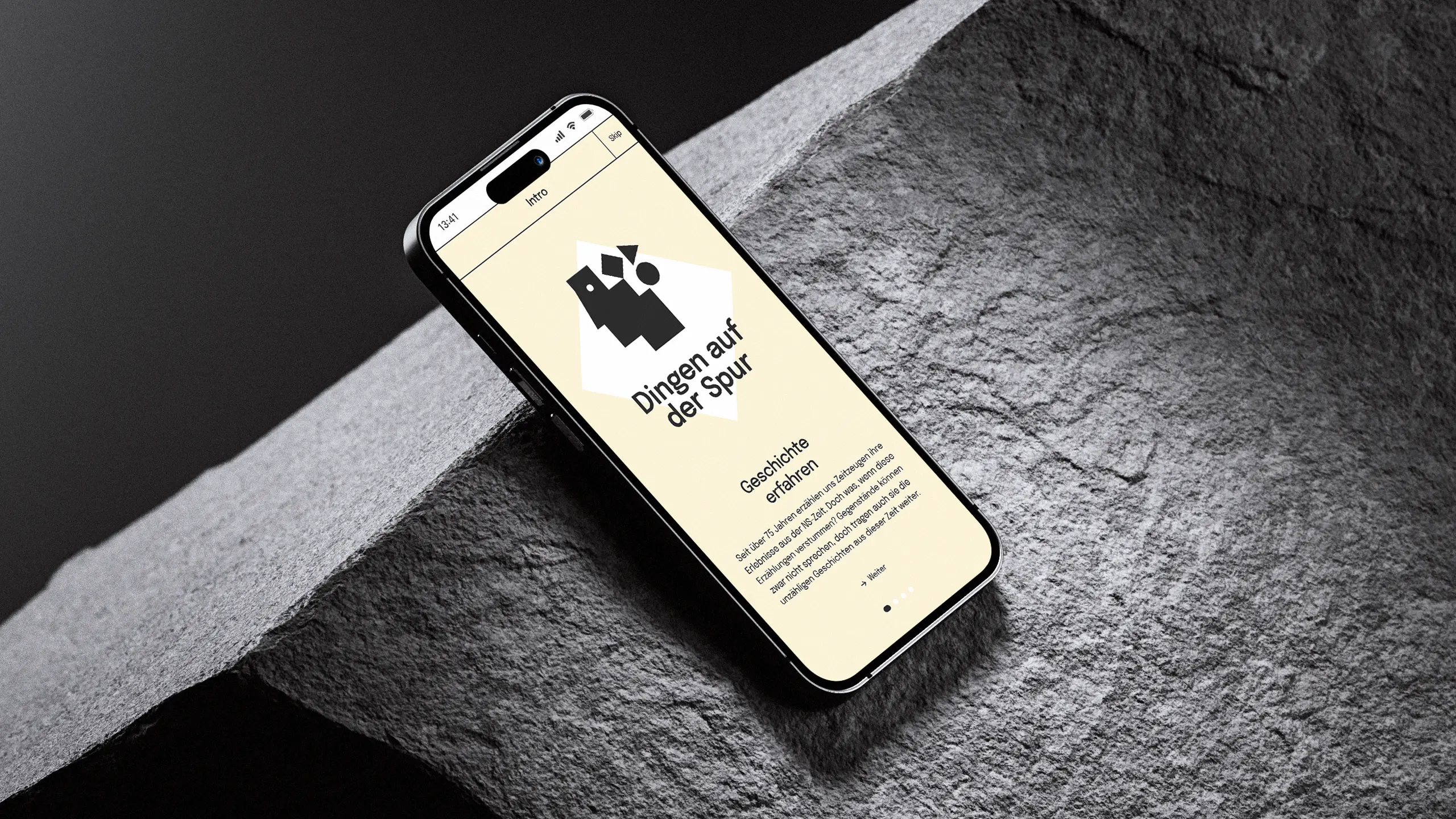
On the trail of things
01 Context
Two of Germany's most important memorials face a question that gets more urgent every year: what remains when the witnesses fall silent? Objects cannot speak. But they carry countless stories from that time. That is where the Buchenwald and Sachsenhausen memorials began. They wanted to open their history to a young audience: students between 16 and 18, barely reached by classic education formats. In a time of fading memory and growing antisemitism, they needed an approach that makes people aware, without overwhelming them. There was no corporate design to attach to, no existing platform, no model. What was needed was a visual language of its own, that carries both places as equals, takes the subject seriously, and doesn't shut young people out.
02 Method
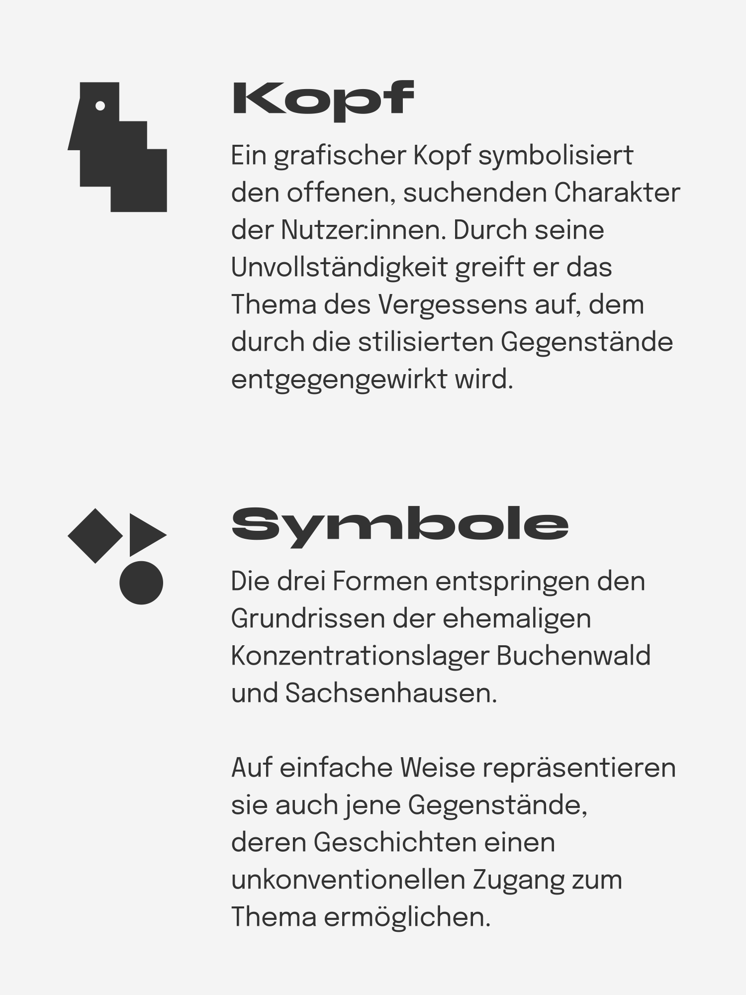
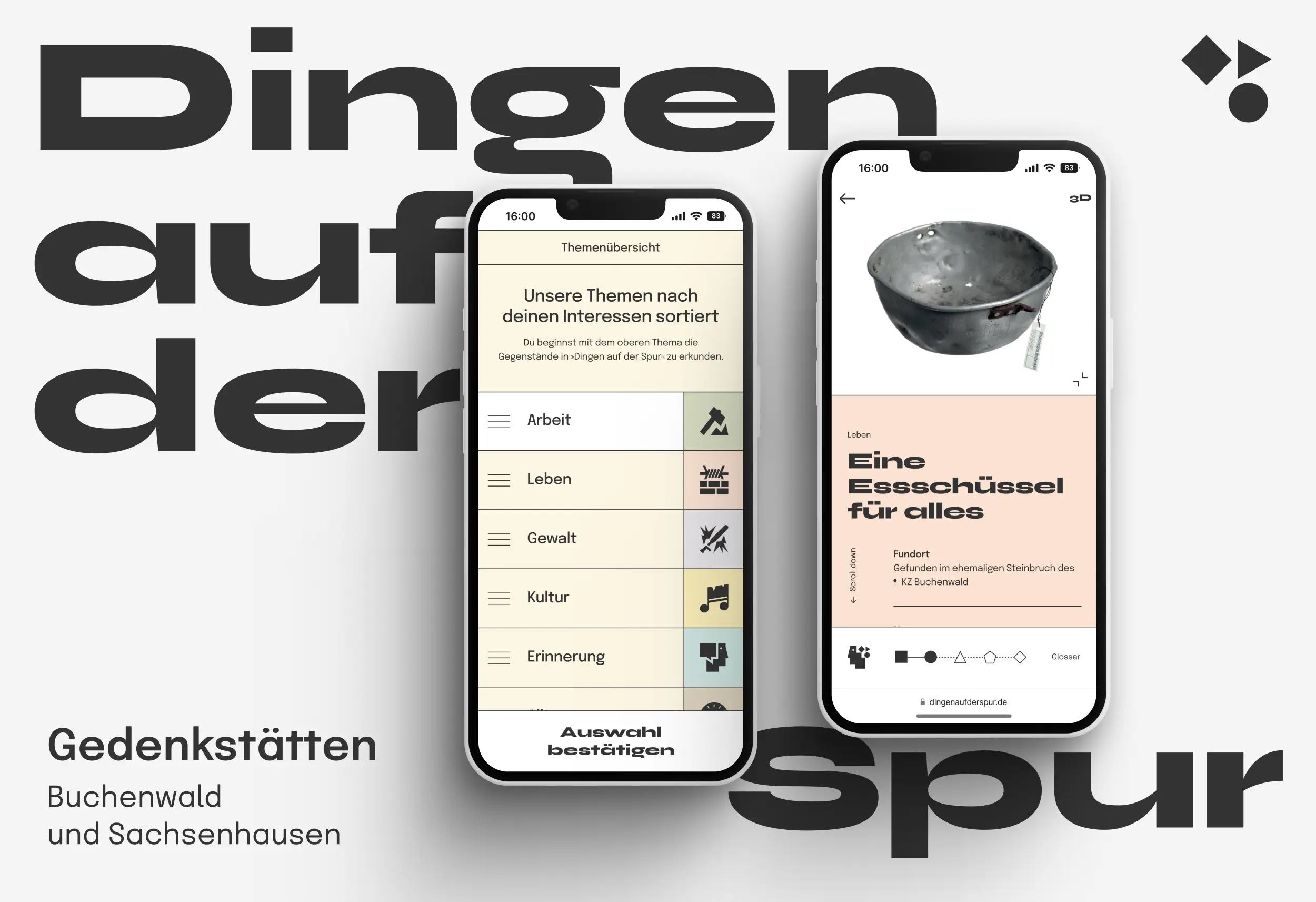
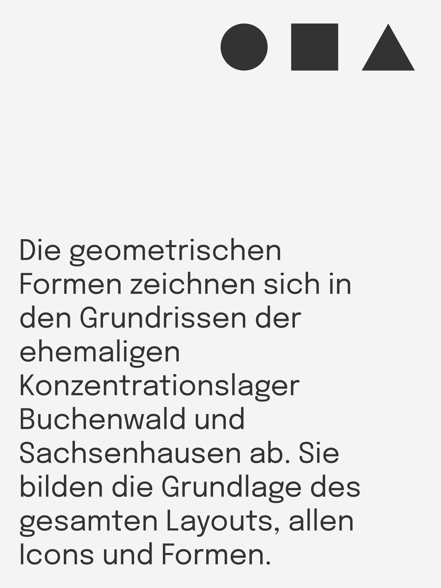
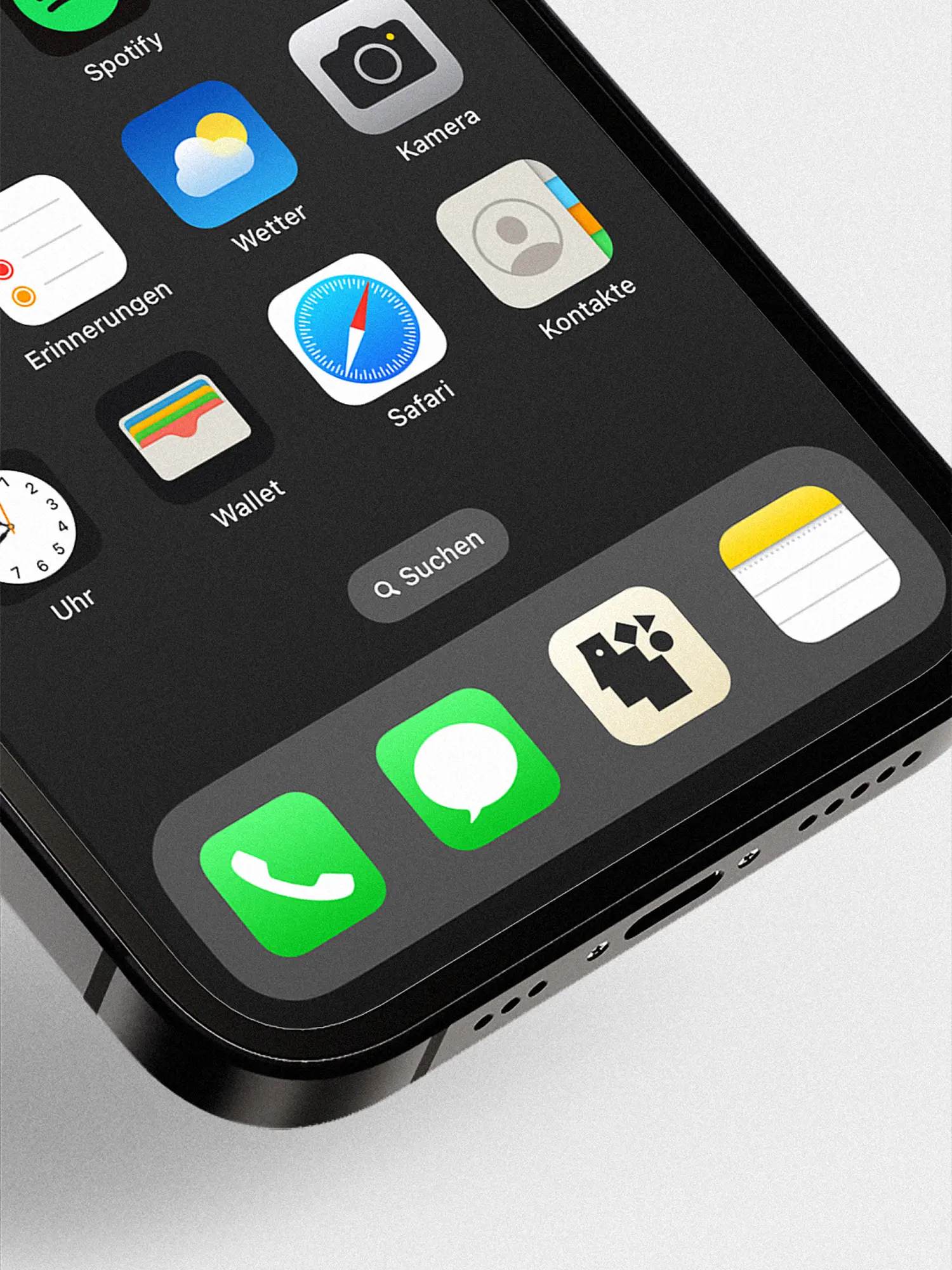
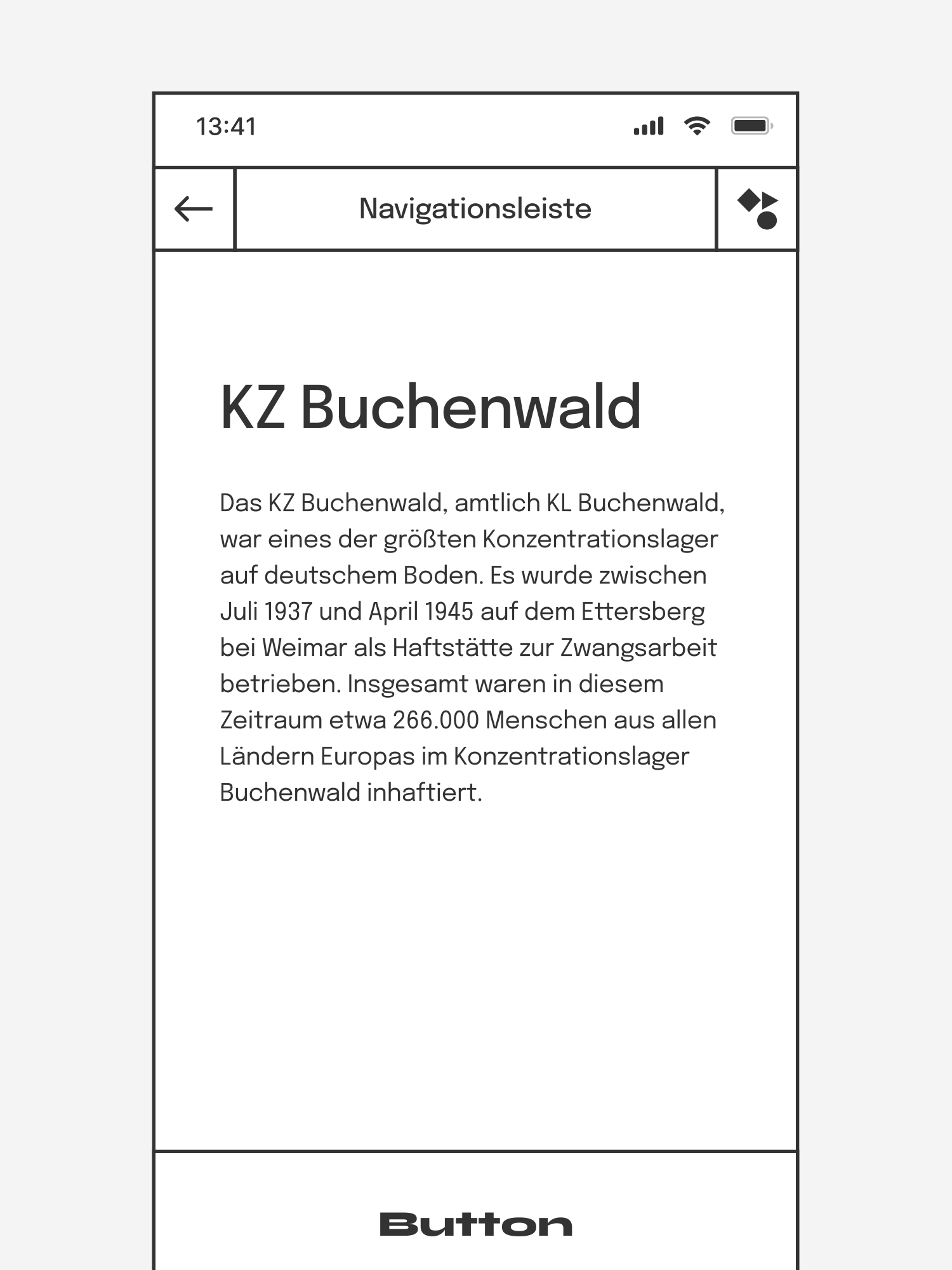
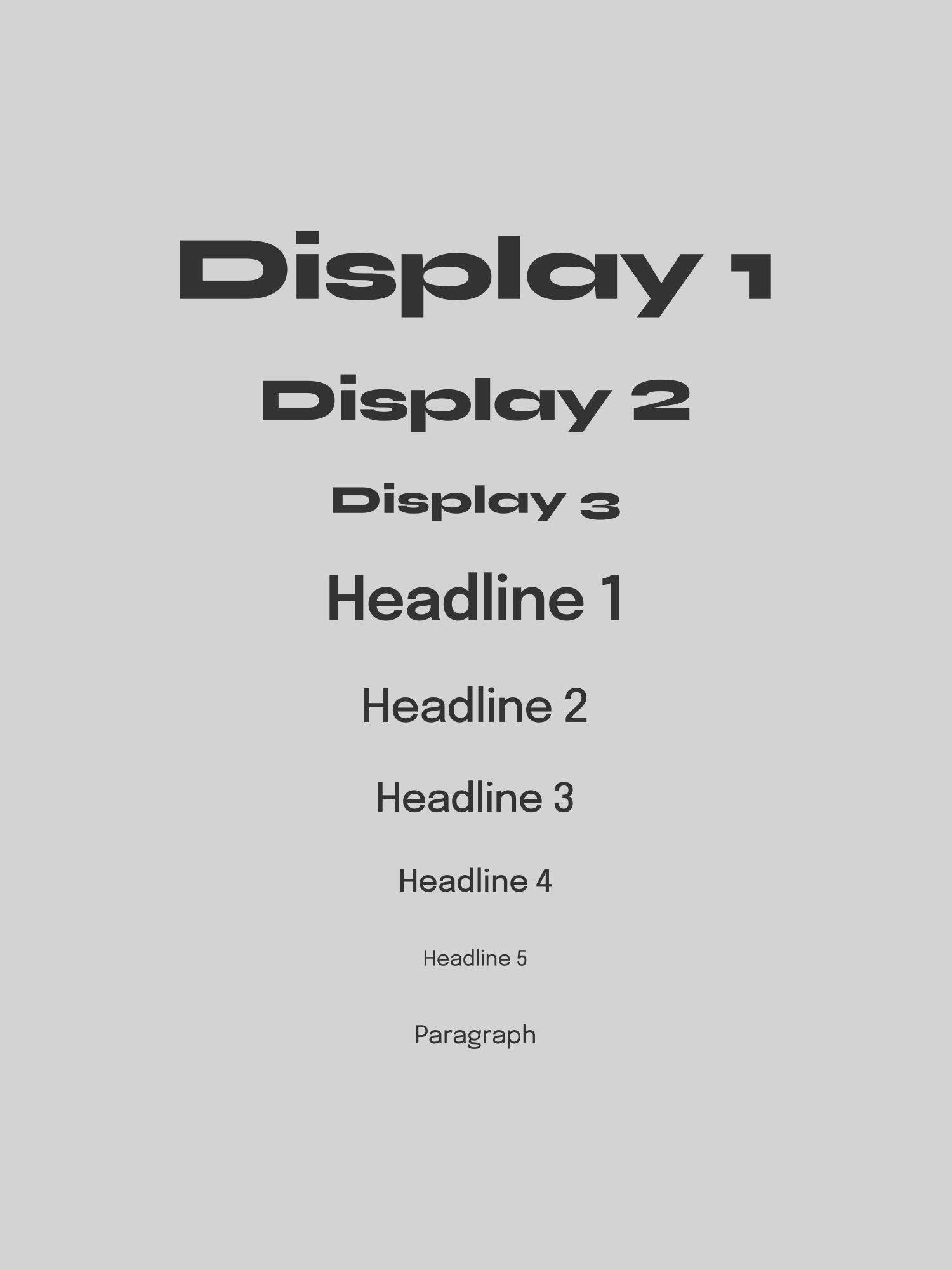
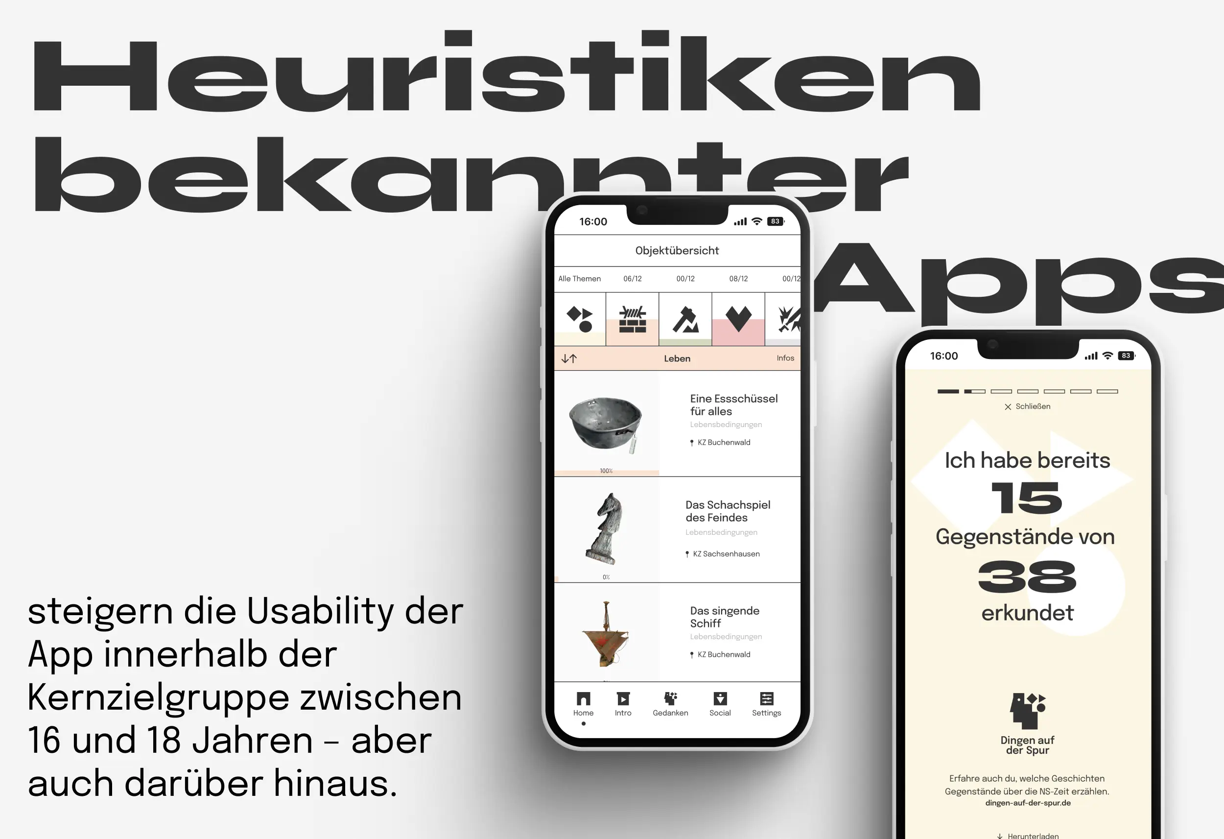
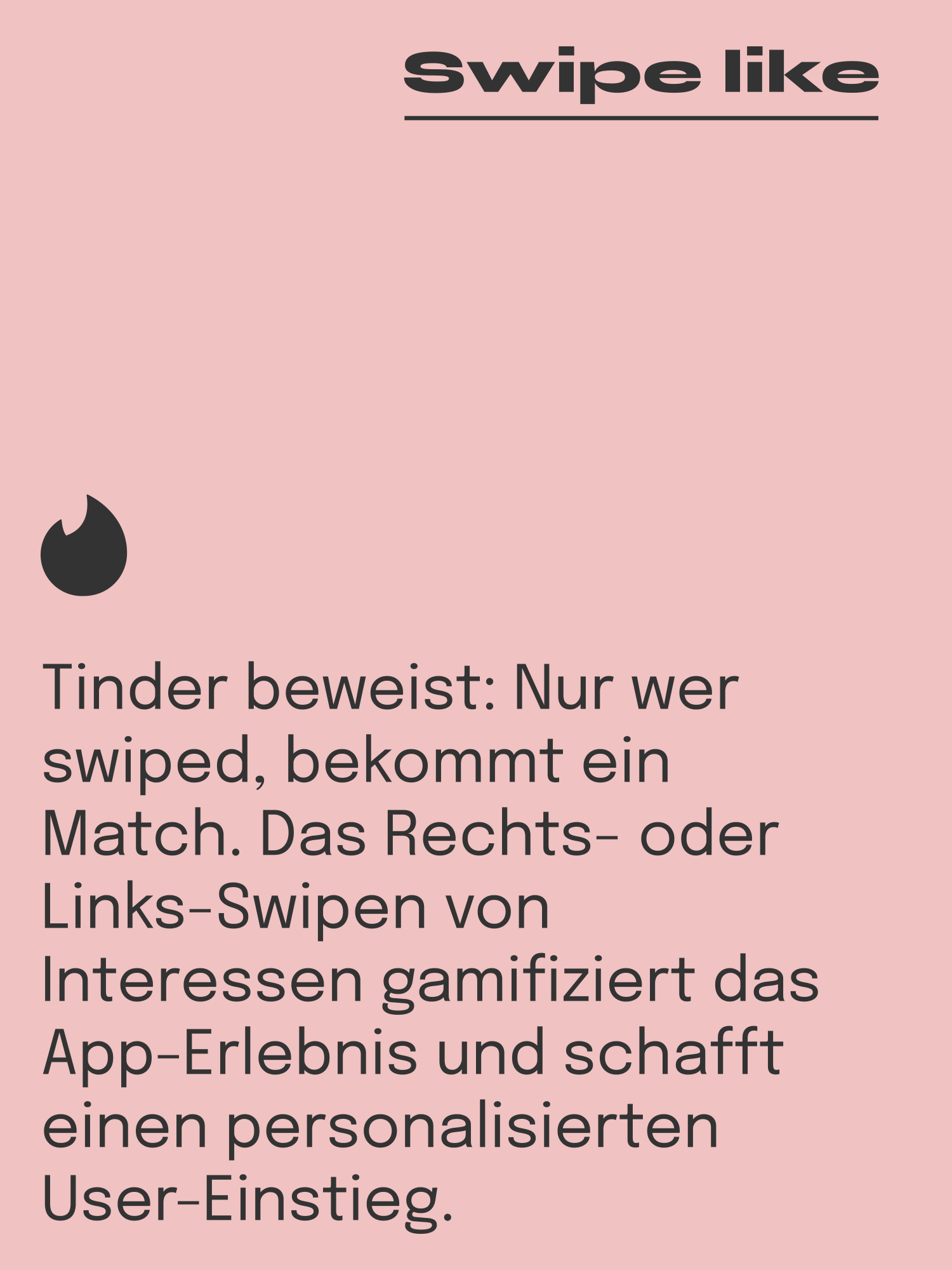
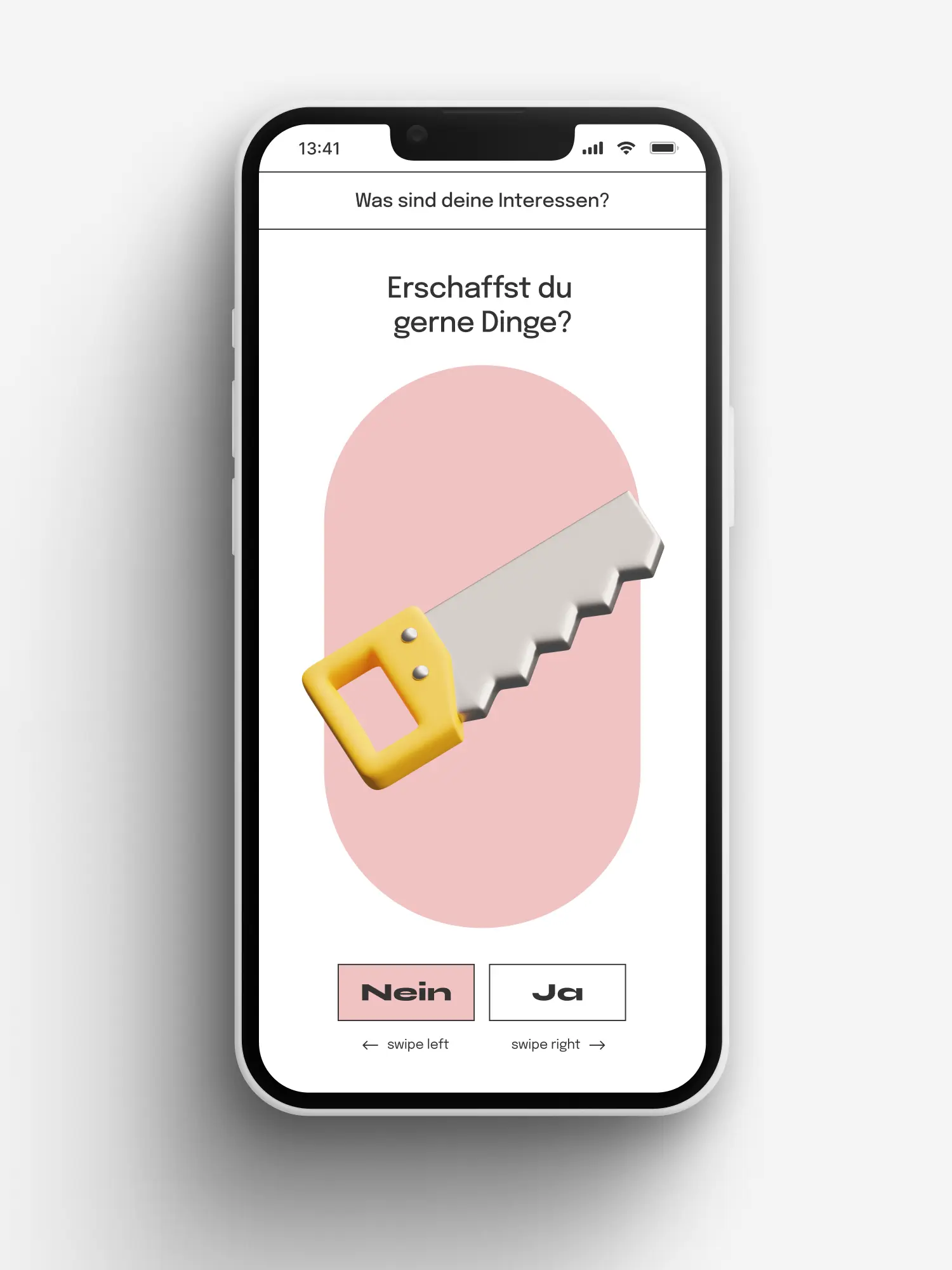
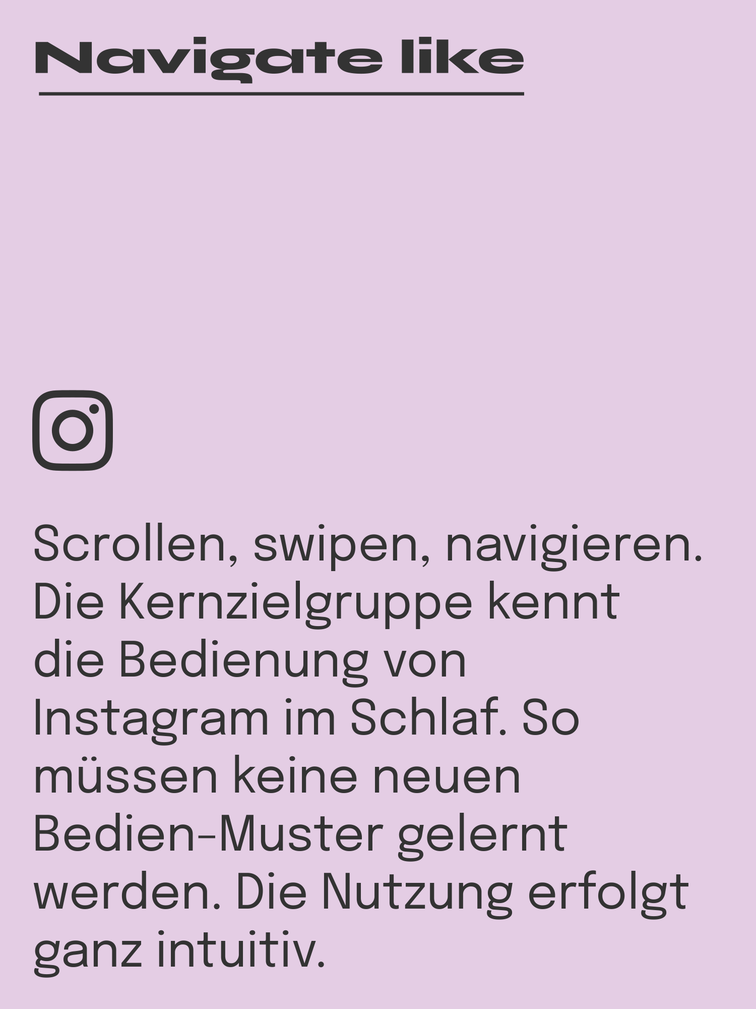
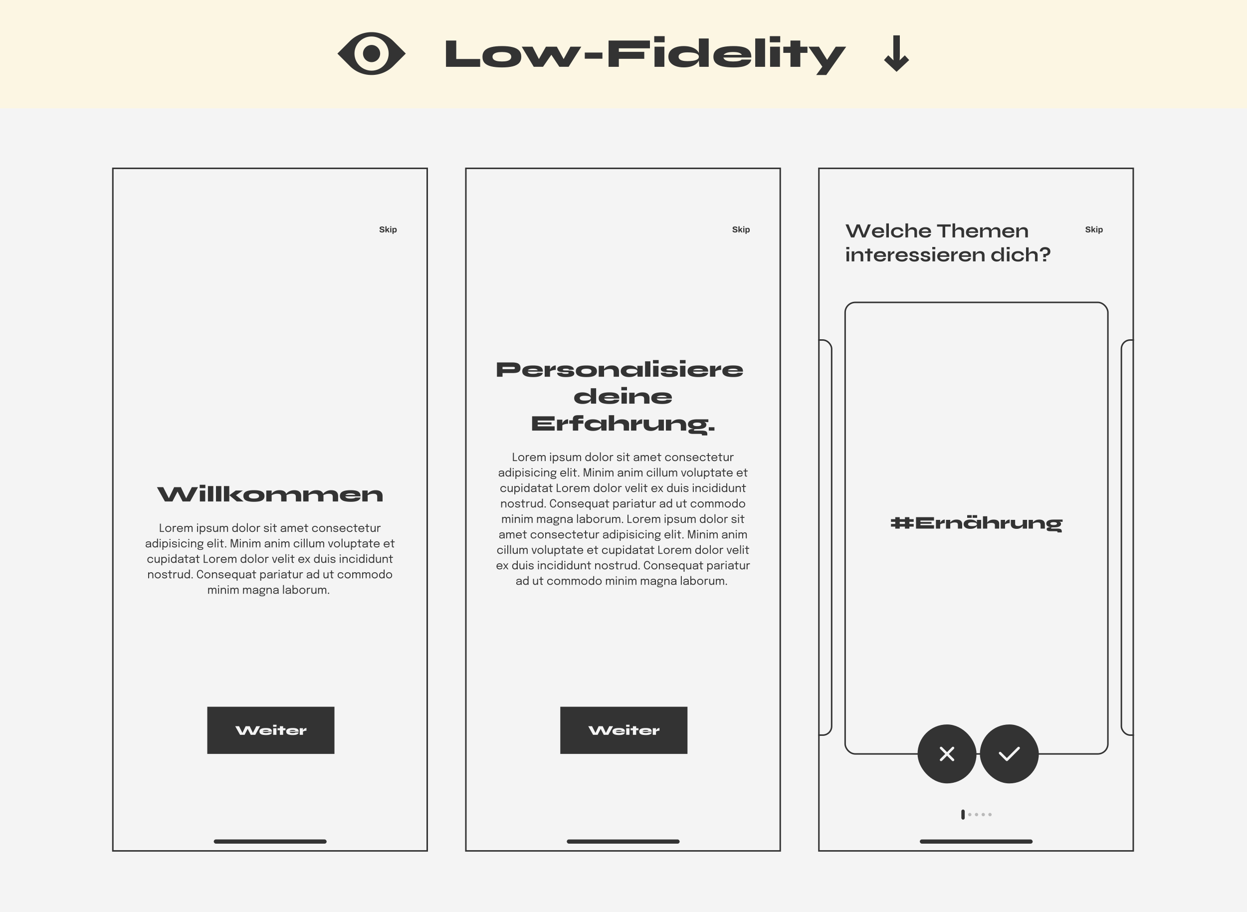
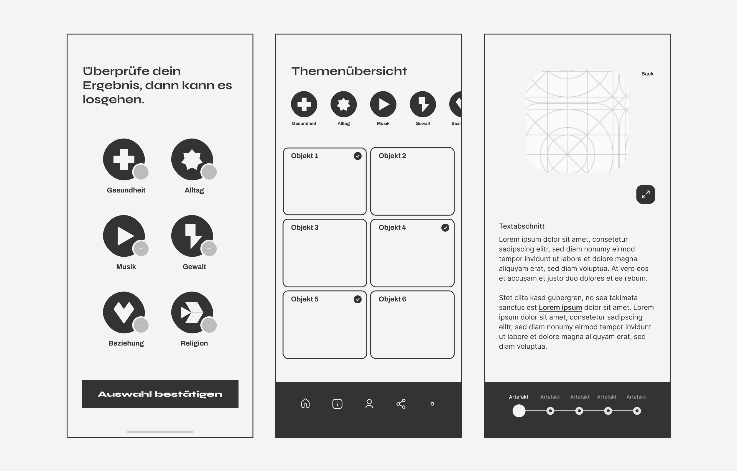
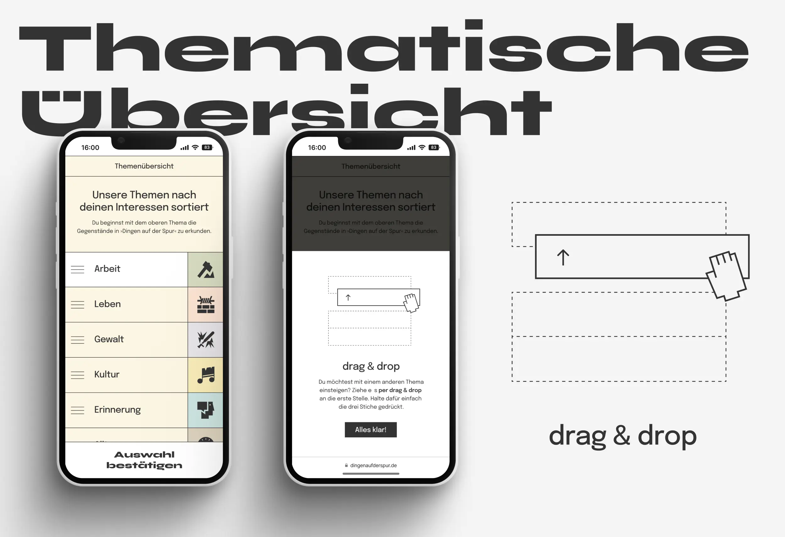
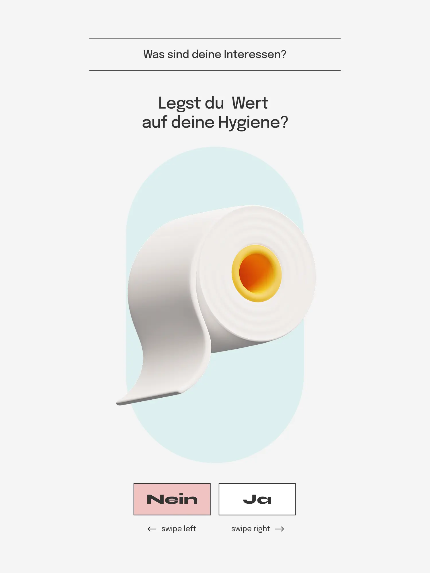
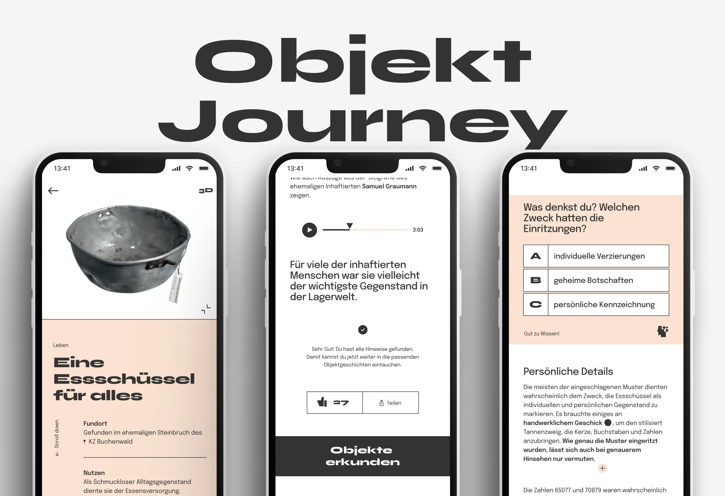
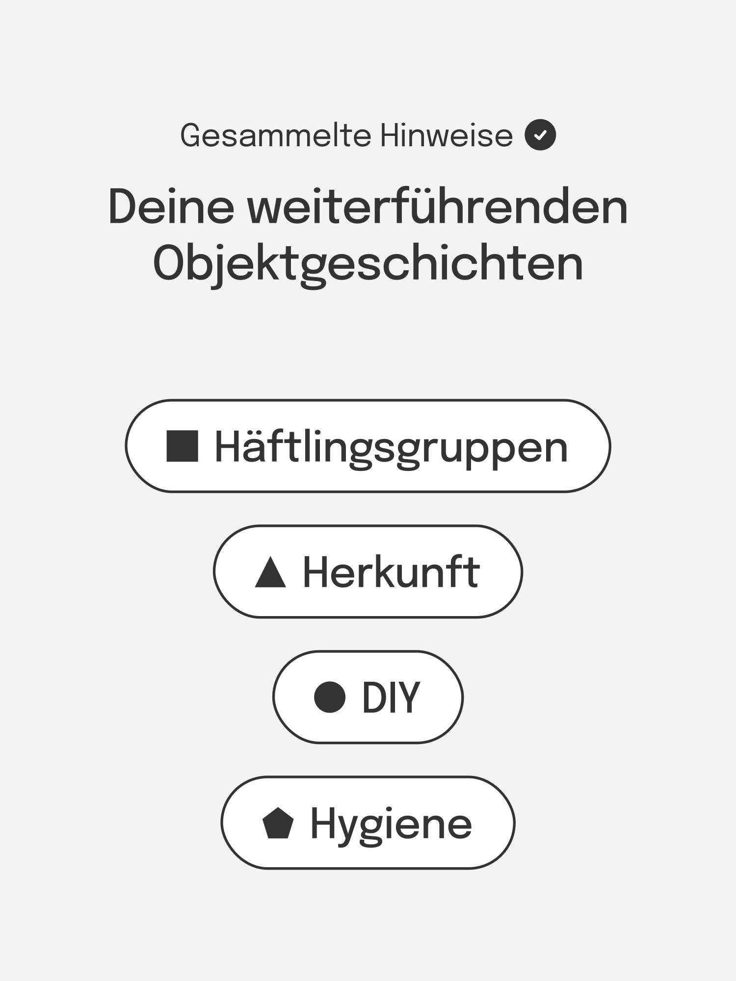
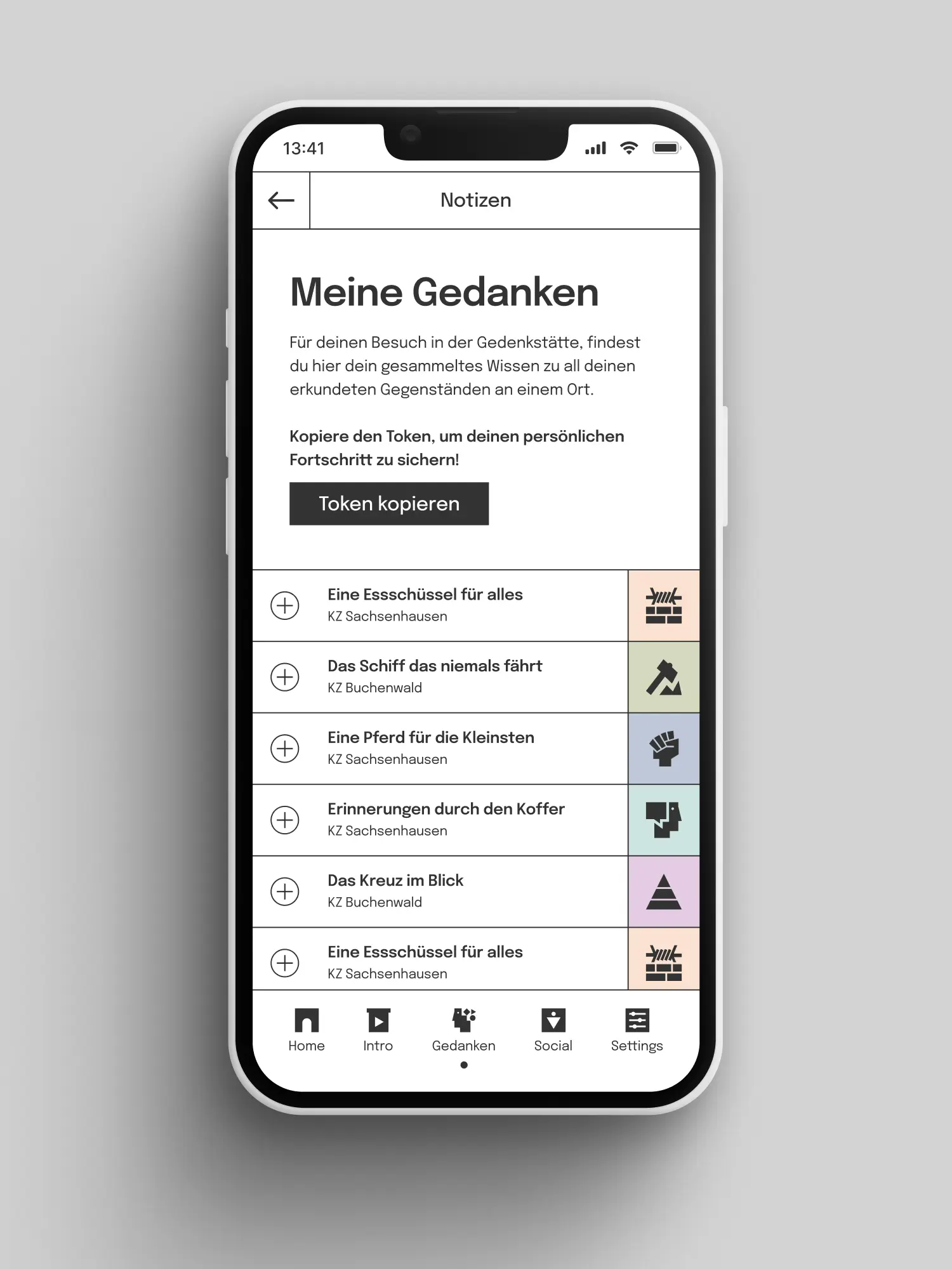
We looked for the identity where it belongs: at the place itself. Square, triangle and circle appear in the ground plans of the former concentration camps Buchenwald and Sachsenhausen. Those three forms became the design DNA of the whole project. Logo, ten theme icons, layout and image language all come from them. Colour and type followed the same principle: held back where the subject needs room, accents where orientation is required. The second pillar was the audience itself. Together with our development partner Zum Kuckuck we built UX and UI on heuristics students know from Instagram, Spotify and Tinder: swipe, navigation, sharing. Gamification like hidden clues, and scrollytelling with a 3D object view, raise motivation without trivialising the subject.
03 Result
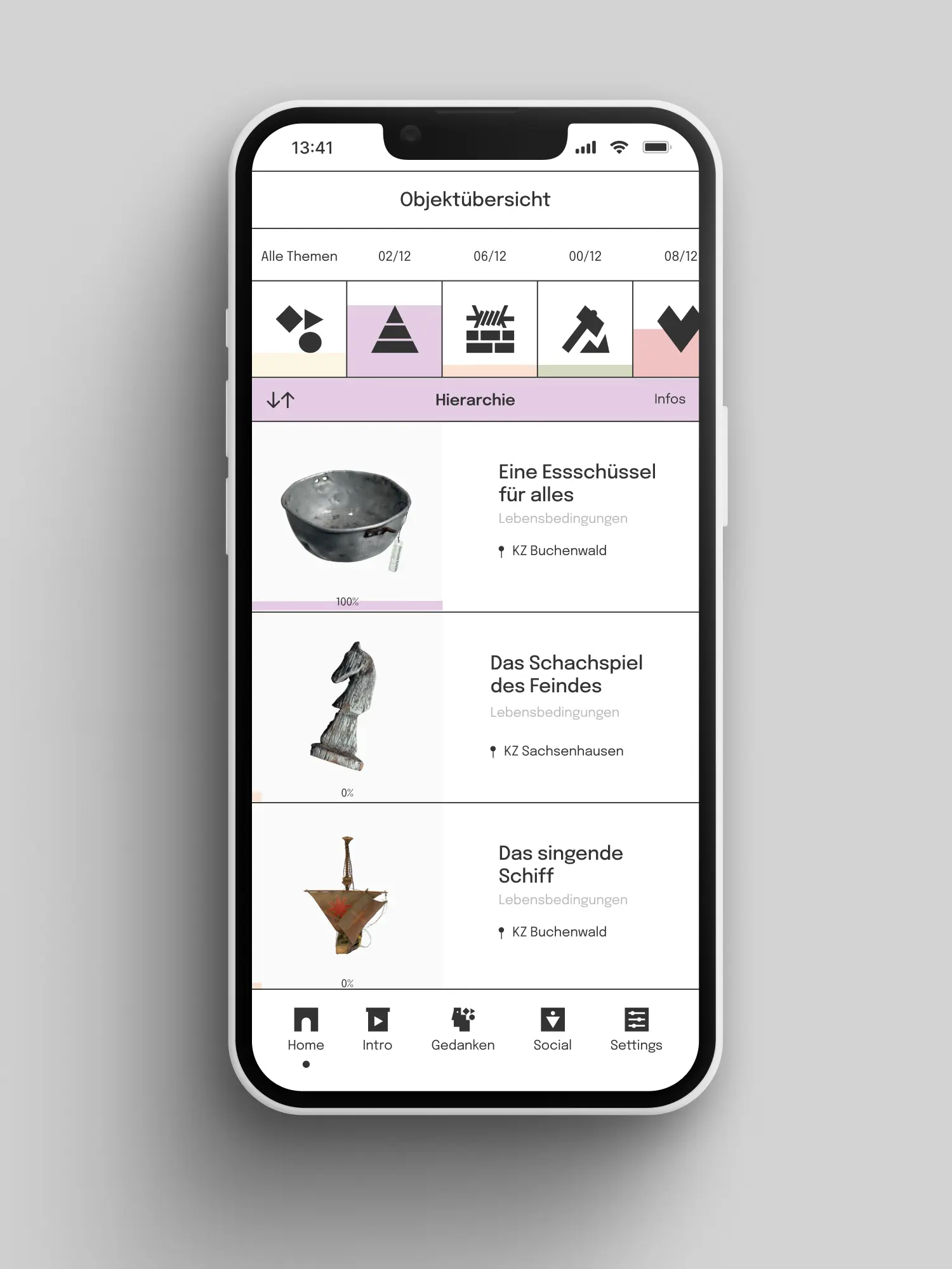
Dingen auf der Spur has an image language that isn't borrowed. Every icon, every form, every colour traces back: to the ground plan, to the subject, to the audience. From our work on visual identity, design system and UX/UI came a digital experience that holds across every screen, from the intro to the object journey. The app is live at dingenaufderspur.de and is in active use in education formats. And it's built so new objects, themes and extensions can grow in the existing system, without being thought from scratch.
Client
Stiftung Gedenkstätten Buchenwald und Mittelbau-Dora
Services
Industry
Release
Team



Book a call
01 Context
Two of Germany's most important memorials face a question that gets more urgent every year: what remains when the witnesses fall silent? Objects cannot speak. But they carry countless stories from that time. That is where the Buchenwald and Sachsenhausen memorials began. They wanted to open their history to a young audience: students between 16 and 18, barely reached by classic education formats. In a time of fading memory and growing antisemitism, they needed an approach that makes people aware, without overwhelming them. There was no corporate design to attach to, no existing platform, no model. What was needed was a visual language of its own, that carries both places as equals, takes the subject seriously, and doesn't shut young people out.
02 Method
We looked for the identity where it belongs: at the place itself. Square, triangle and circle appear in the ground plans of the former concentration camps Buchenwald and Sachsenhausen. Those three forms became the design DNA of the whole project. Logo, ten theme icons, layout and image language all come from them. Colour and type followed the same principle: held back where the subject needs room, accents where orientation is required. The second pillar was the audience itself. Together with our development partner Zum Kuckuck we built UX and UI on heuristics students know from Instagram, Spotify and Tinder: swipe, navigation, sharing. Gamification like hidden clues, and scrollytelling with a 3D object view, raise motivation without trivialising the subject.
03 Result
Dingen auf der Spur has an image language that isn't borrowed. Every icon, every form, every colour traces back: to the ground plan, to the subject, to the audience. From our work on visual identity, design system and UX/UI came a digital experience that holds across every screen, from the intro to the object journey. The app is live at dingenaufderspur.de and is in active use in education formats. And it's built so new objects, themes and extensions can grow in the existing system, without being thought from scratch.
Client
Stiftung Gedenkstätten Buchenwald und Mittelbau-Dora
Services
Industry
Release
Team
Book a call
Not enough? Ask your AI about us
Let's find out if we're a fit.
Let’s get to know each other and see whether we’re the right fit for your project. From there, we can shape a solution around what you actually need.
Friday, October 9, 2026
1
2
3
4
5
6
7
8
9
10
11
12
13
14
15
16
17
18
19
20
21
22
23
24
25
26
27
28
29
30
31
10:30
11:30
14:30
15:30
16:30
17:30
Let's find out if we're a fit.
Let’s get to know each other and see whether we’re the right fit for your project. From there, we can shape a solution around what you actually need.
Friday, October 9, 2026
1
2
3
4
5
6
7
8
9
10
11
12
13
14
15
16
17
18
19
20
21
22
23
24
25
26
27
28
29
30
31
10:30
11:30
14:30
15:30
16:30
17:30